


Abstract
Measuring and understanding the evolution of wealth inequality is a key challenge for researchers, policy makers, and the general public. This paper breaks new ground on this topic by presenting a new method to estimate and study wealth inequality. This method combines fiscal data with household surveys and national accounts in order to provide annual wealth distribution series, with detailed breakdowns by percentiles, age, and assets. Using the case of France as an illustration, we show that the resulting series can be used to better analyze the evolution and the determinants of wealth-inequality dynamics over the 1970–2014 period. We show that the decline in wealth inequality ends in the early 1980s, marking the beginning of a rise in the top 1% wealth share, though with significant fluctuations due largely to asset price movements. Rising inequality in savings rates coupled with highly stratified rates of returns has led to rising wealth concentration in spite of the opposing effect of house price increases. We develop a simple simulation model highlighting how changes in the combination of unequal savings rates, rates of return, and labor earnings that occurred in the early 1980s generated large multiplicative effects that led to radically different steady-state levels of wealth inequality. Taking advantage of the joint distribution of income and wealth, we show that top wealth holders are almost exclusively top capital earners, and increasingly fewer are made up of top labor earners; it has become increasingly difficult in recent decades to access top wealth groups with one's labor income only.
1. Introduction
Measuring the distribution of wealth involves a large number of imperfect and sometimes contradictory data sources and methodologies. Consequently, the lack of reliable data series has made it very difficult thus far for economists to study wealth inequality and test quantitative models of wealth accumulation and distribution. In this paper, we develop a new method to estimate wealth-inequality dynamics. Using the case of France as an illustration, we show that measurement limitations can to some extent be overcome, and that the new resulting series can be used to better understand the determinants of wealth concentration. This paper has two main objectives.
Our first objective is related to the measurement of wealth inequality. We develop a new method combining fiscal data with household surveys and national accounts—hereinafter referred to as the Mixed Income Capitalization-Survey (MICS) method—and derive new French wealth series from 1970 onwards. In our view, the MICS method allows researchers to overcome the limitations of using different data sources and methods separately.1 Following Saez and Zucman (2016), a debate has emerged over whether the capitalization method (combined with fiscal data) or wealth surveys are most appropriate to estimate wealth inequality (Kopczuk 2015; Bricker et al. 2016; Fagereng et al. 2016; Lundberg and Waldenström 2018).2 The main limitation of wealth surveys is that they suffer from underrepresentation of the wealthiest and underreporting of assets.3 The income capitalization method therefore seems to be the most appropriate method for assets that generate taxable income flows (particularly equities and bonds) and for certain parts of the distribution (particularly the top), which are not well covered in surveys. In contrast, household surveys provide an invaluable source of information regarding certain tax-exempt assets and certain parts of the distribution (particularly the bottom), which are not usually well covered in fiscal sources. The MICS method is based both on the income capitalization method and on a survey-based method. For assets that generate taxable income flows (tenant-occupied housing assets, business assets, bonds, and equities), we use a “pure” capitalization method as deployed by Saez and Zucman (2016). The idea is to recover the distribution of each asset by capitalizing the corresponding capital income flows as observed in income tax data. This is done in two steps. For each asset class and each year, we start by computing a capitalization factor that maps the total flow of taxable income to the amount of wealth recorded in the household balance sheet of the French national accounts. We then obtain wealth by multiplying each capital income component by the corresponding capitalization factors.4 For assets that do not generate taxable income flows (life insurance and pension funds, deposits, and owner-occupied housing assets), we develop an imputation procedure using all available housing and wealth surveys. The MICS method improves on traditional approaches that estimate wealth inequality. Estate tax data combined with the estate multiplier approach have long been the main basis for long-run studies of wealth dynamics, because they are the oldest existing data source on wealth in most countries.5 However, we favor the use of our MICS method over the 1970–2014 period for several reasons. First, our new wealth series are annual, fully consistent with macroeconomic household balance sheets, and cover the entire wealth distribution. Second, they can be broken down by percentile, age, and asset categories. Third, the MICS method allows us to estimate the joint distribution of income and wealth as well as the determinants of wealth-inequality dynamics such as rates of return, savings rates, and capital gain rates by wealth groups. In order to assess the validity of our MICS method, we compute alternative wealth-inequality series constructed using the estate multiplier method and inheritance tax data.6 We show that the two methods deliver consistent estimates, which is reassuring and gives us confidence in the robustness of our results.
Our second objective is to use these new series in order to better understand the recent evolutions and the determinants of wealth inequality in France. Piketty, Postel-Vinay, and Rosenthal (2006) document a huge decline in the top 10% wealth share following the 1914–1945 capital shocks. Our wealth series complement this work by revealing a number of new facts for the 1970–2014 period. First, we show that the decline in wealth inequality ends in the early 1980s, marking the beginning of a moderate rise in the top 10% wealth share.7 This small rise masks two underlying dynamics: a strong increase in the top 1% wealth share (+50% from 1984 to 2014) and a continuous decline in the top 10–1% wealth share. Second, we decompose wealth shares by asset classes. The bottom 30% own mostly deposits, and then housing assets become the main form of wealth for the middle of the distribution. As we move toward the top 10% and the top 1% of the distribution, financial assets (other than deposits) gradually become the dominant form of wealth. These large differences in asset portfolio may have important impacts on wealth inequality. In the short term, opposing movements in asset prices between housing and financial assets generate large fluctuations in wealth inequality. In the long term, the rise of financial assets, which started in the early 1980s, coincides exactly with the rise in the top 1% wealth share. Approximately 75% of the increase in the aggregate stock of financial assets has benefited the top 1% wealth group; the proportion of financial assets held by the wealthiest top 1% doubled from 35% in 1984 to 70% in 2014. Third, we conduct simulation exercises to better understand the impact of asset price movements on wealth inequality. We show that the top 10 and top 1% wealth shares would have been substantially larger had housing prices not increased so quickly relative to other asset prices over the 1984–2014 period. It should be noted, however, that rising housing prices may have an ambiguous and opposing impact on inequality: Although they raised the market value of the wealth owned by the members of the middle class who were able to access real-estate property—thereby raising the middle 40% wealth share relative to the top 10% wealth share—rising housing prices could also have made it more difficult for individuals in the lower class, that is, those in the bottom 50% (or those in the middle class who had no family wealth), to access real estate. Fourth, we take advantage of the joint distribution of income and wealth to document the evolution of total, capital, and labor income shares accruing to the top 1% wealth group over the 1970–2014 period. We begin to highlight the strong contrast between labor and capital income shares accruing to the top 1% wealth holders. The top 1% wealth group owns 22%–35% of total capital income versus 3%–4.5% of total labor income (and 17%–29% of total wealth). Labor and capital income shares have also followed opposing trends. The labor income share accruing to the top 1% wealth holders has decreased almost continuously, falling by 38% over the 1970–2014 period. In contrast, the evolution of capital income shares mirrors that of wealth shares, declining until the early 1980s, followed by a notable increase (+59% from 1984 to 2014). These different patterns can be easily explained. Top wealth holders are almost exclusively top capital earners, and increasingly fewer are made up of top labor earners. Indeed, the probability of top labor earners belonging to the top 1% wealth group has declined consistently since the 1970s. Whereas top 1% labor earners had a 29% probability to belong to the top 1% wealth group in 1970, this probability fell to 17% in 2012.
Finally, we investigate the reasons for wealth-inequality dynamics. Our objective is not to make predictions about the future evolution of wealth concentration, but rather to identify the drivers of the change in wealth-inequality dynamics occurring around the early 1980s. We refine the steady-state formula from Saez and Zucman (2016) in order to highlight the role of three key parameters: unequal labor incomes, unequal rates of return, and unequal savings rates by wealth groups. Our simple steady-state simulations deliver two main messages. First, labor income inequality among wealth groups has not played an instrumental role in wealth-inequality dynamics over the 1970–2014 period. Second, the change in the inequality of savings rates combined with highly stratified rates of returns by wealth groups and the growth slowdown likely explains the strong change in wealth-inequality dynamics observed since the early 1980s. The main limitation of our approach is that we are not able to fully explain why savings rates and rates of return changed in the manner that they did. More work is needed to better understand the potential mechanisms underlying these changes (growth slowdown, changes in taxation, or more global factors such as financial regulation and deregulation).
More generally, our study complements the literature on the historical evolutions of wealth inequality in France (Piketty, Postel-Vinay, and Rosenthal 2006, 2014, 2018; Piketty 2014),8 and on the link between wealth and returns (Bach, Calvet, and Sodini 2016; Fagereng et al. 2020). Our paper also relates to the huge literature, recently surveyed by Piketty and Zucman (2015), De Nardi and Fella (2017), and Benhabib and Bisin (2018), which use dynamic quantitative models to replicate and analyze the observed wealth inequality. We should also emphasize that this paper is part of a broader multicountry project in which we attempt to construct “distributional national accounts” (DINA) in order to provide detailed annual estimates of the distribution of income and wealth based on the reconciliation of different fiscal sources, household surveys, and macroeconomic national accounts (see Bozio et al. 2018; Garbinti, Goupille-Lebret and Piketty 2018; Piketty, Saez, and Zucman 2018, for work on income inequality in the United States and France).9
The remainder of this paper is organized as follows. Section 2 presents our data sources and methodology. In Section 3, we present our detailed wealth-inequality series over the 1970–2014 period, starting with the distribution of wealth, and then moving on to the joint distribution of income and wealth. Section 4 discusses the possible interpretation behind our findings and presents our simulation results. Finally, Section 5 offers concluding comments. This paper is supplemented by an Online Data Appendix including our complete series and additional information about data sources and methodology.
2. Concepts, Data Sources, and Methodology
In this section, we begin to present the different data sources and methods we can rely on to measure wealth and its distribution. We then describe the concepts, data sources, and main steps of the methodology that we develop in order to construct our wealth distribution series. Complete methodological details of our data sources and computations specific to France are presented in the Online Data Appendix along with an extensive set of tabulated series, data files, and computer codes.10
2.1. Measuring Wealth Inequality
In Scandinavian countries, wealth tax data are (Norway) or used to be (Denmark, Sweden) close to these ideal data sources.11 Because few countries have a wealth tax with such properties,12 researchers have to rely on three alternative and imperfect sources of data and methods: estate multiplier method using inheritance or estate tax data, survey data, or capitalization method using income tax data.13
2.1.1. Estate Multiplier Method
Inheritance and estate tax returns have long been the main basis for long-run studies of wealth dynamics, because they are the oldest existing data source on wealth in most countries. By definition, these data sources provide information only on the distribution of wealth at death. The idea of the estate multiplier method is to recover the wealth distribution among the living from the distribution of inheritances (wealth at death), by reweighting each decedent by the inverse of its age–gender cell. This method, however, has two main limitations: (i) It may be difficult to properly account for differential mortality rates by wealth group, and (ii) people may change their behavior just before death (Kopczuk 2007), making their estates less representative of the wealth of the living.14
2.1.2. Household Wealth Surveys
The key advantage of wealth surveys is that they include detailed sociodemographic and wealth questionnaires, which allows for the direct measurement of a broad set of assets for a representative sample of the entire population. In particular, they provide an invaluable source of information regarding certain tax-exempt assets and certain parts of the distribution (particularly the bottom), which are not usually well covered in fiscal sources. As highlighted by Davies and Shorrocks (2000), the main limitation of these data is that they may suffer from underrepresentation of the wealthiest and underreporting of assets. For France, the use of wealth surveys raises two additional concerns. First, these data are available only for a relatively recent period (since 1986), and, second, the coverage of the top of the wealth distribution has improved substantially over time, which can give an upward bias to the observed rise in wealth concentration.
2.1.3. Income Capitalization Method
where bjt = Ajt / |$\mathop \sum \nolimits_k {y_{\textit{kjt}}}\ $|is the time-varying asset-specific capitalization factor equal to the aggregate value of each asset (Ajt) divided by the corresponding aggregate fiscal capital income flow (|$\mathop \sum \nolimits_k {y_{\textit{kjt}}})$| at time t. The key advantage of this method is that it provides estimates of wealth inequality that are fully consistent with macroeconomic household balance sheets and cover particularly well the top of the distribution and capital income. This method, however, faces two important limitations. First, it relies on the assumption of fixed rates of return by asset class.15 Second, some assets do not generate observable taxable asset income flows and need to be imputed using alternative data sources.
2.2. MICS Method
In order to estimate wealth inequality, we have developed a new method—the MICS method—by combining fiscal data with household surveys and national accounts. In this approach, we start from income tax data and use the income capitalization method to compute assets that generate taxable income flows (tenant-occupied housing assets, business assets, bonds, and equities). We then impute assets that do not generate taxable income flows (owner-occupied housing assets, deposits and savings accounts, and life insurance assets) using household surveys. The key contribution of this method is to allow researchers to overcome the drawbacks of using different data sources and methods separately: The estimation of the top of the distribution relies mainly on income tax data and the capitalization method, whereas the bottom parts of the distribution are mainly imputed using household surveys. Note that in countries where wealth surveys are available over a long period of time, a symmetric approach could be to start from wealth surveys and supplement them with estimates of wealth at the top using external sources of data such as named lists or administrative data (see Bricker et al. 2016; Blanchet et al. 2018; Kuhn et al. 2018). We now describe the concepts, data sources, and main steps of the methodology that we develop in order to construct our wealth distribution series.
2.2.1. Wealth and Income Concepts
Our wealth and income distribution series are constructed using official national accounts established by the Institut National de la Statistique et des Études Économiques (Insee), since 1969 for national wealth accounts and since 1949 for national income accounts.16 The wealth series rely on a concept of “net personal wealth” based on categories from national accounts. More specifically, net personal wealth is defined as the sum of nonfinancial assets and financial assets, net of financial liabilities (debt), held by the household sector.17 All of these concepts are estimated at market value and defined using the latest international guidelines for national accounts (namely European Commission et al. (2009)). We break down nonfinancial assets into three asset categories: business assets, owner-occupied housing assets, and tenant-occupied housing assets. Housing assets include the value of the building and the value of the land underlying the building. Business assets are composed of all nonfinancial assets held by households other than housing assets. In practice, these are mostly the business assets held by self-employed individuals. (But, these also include other small residual assets.) We break down financial assets into four categories: deposits (including currency and savings accounts), bonds (including loans), equities (including investment fund shares), and life insurance (including pension funds). We therefore have eight asset categories (owner-occupied and tenant-occupied housing assets, business assets, four financial asset categories, and debt).
Our income series rely on a concept of “pretax national income” (or more simply pretax income) also based on categories from national accounts.18 By construction, average pretax income per adult is equal to average national income per adult.19 More specifically, pretax national income is defined as the sum of all income flows going to labor and capital, after taking into account the operation of the pension system, as well as disability and unemployment insurance, but before taking into account other taxes and transfers.20 That is, we deduct pension and unemployment contributions (as defined by European Commission et al. (2009) national accounts guidelines) from incomes, and add pension and unemployment distributions (as defined by European Commission et al. (2009)).21 Our concept of pretax income can be split into various components. Pretax labor income includes wages (net of pension and unemployment contributions), pension, and unemployment benefits, and the labor component of self-employment income (which we assume for simplicity to be equal to 70% of total self-employment income). Pretax capital income includes rental income (which can be split into tenant-occupied and owner-occupied rental income22); the capital component of self-employment income (30% of self-employment income); dividends; and interest income (which can be split into interests from deposits and savings accounts, from life insurance assets, and from bonds and debt assets).23
Pretax rates of return are computed for each asset and each year over the 1970–2014 period by dividing each capital income component by the corresponding asset value as reported in the household balance sheet of the national accounts.24
Whereas the MICS method is implemented at the household level, our wealth and income distribution series always refer to the distribution of personal wealth and pretax income among equal-split adults, that is, the net wealth and income of married couples is divided by 2.25 This choice is dictated primarily by the need to ensure consistency between our 1970–2014 series and the historical French wealth series computed at the individual level by Piketty et al. (2006). It also makes our series directly comparable to historical series from other countries estimated using estate tax returns and the estate multiplier approach. Note that the number of households has been growing faster than the number of adults, because of the decline in marriage rates and the rise in single-headed households. Computing inequality across equal-split adults neutralizes this demographic trend. Using the equal-split adult as the unit of observation is therefore a meaningful benchmark to compare inequality over time, as it abstracts from confounding trends in household size. Alternatively, researchers interested specifically in the impact of changes in household structure trends on wealth inequality should also use household-level data.26
2.2.2. Income Tax Returns and Capitalization Method
The first step of the MICS method consists of computing assets that generate taxable income flows using the capitalization method along with income tax data and national accounts. In order to apply the income capitalization method, we use the microfiles of income tax returns that have been produced by the French Ministry of Finance since 1970. We have access to large annual microfiles since 1988. These files include about 400,000 tax units per year, with a large oversampling at the top. (They are exhaustive at the very top; since 2010, we also have access to exhaustive microfiles, including all tax units, that is, approximately 37 million tax units in 2010–2012.) Before 1988, microfiles are available for a limited number of years (1970, 1975, 1979, and 1984) and are of a smaller size (about 40,000 tax units per year). These microfiles for income tax contain detailed, individual-level information on fiscal labor income (wages, pension and unemployment benefits) and household-level information on taxable asset income flows. We split mixed income (or self-employment income) into a labor component—which we assume for simplicity to be equal to 70% of total mixed income—and a capital component (30% of total mixed income). The income capitalization method is applied on four categories of capital income reported in the tax data (self-employment income, tenant-occupied rental income, interest income from bonds, and income from dividends).27 We carefully map each of them to the corresponding wealth category in the household balance sheets from the national accounts (business assets, tenant-occupied housing assets, bonds, and equities).28 Then, for each asset class and each year,29 we compute asset-specific capitalization factors equal to the aggregate value of each asset as reported in the household balance sheets divided by the corresponding aggregate fiscal capital income flow. Finally, we obtain the household asset value by multiplying each household capital income component by the corresponding capitalization factors.30 In addition, we adjust proportionally each of these fiscal capital income components in order to match their counterpart in national accounts.31 By construction, this procedure ensures that the aggregate values of each estimated asset and its resulting income flow are fully consistent with the totals reported in the household balance sheets.
The next step is to deal with assets that do not generate taxable income flows. Indeed, some capital income components are fully tax-exempt and therefore not reported in income tax returns. Tax-exempt capital income includes three main components: income going to tax-exempt life insurance assets,32 owner-occupied rental income, and other tax-exempt interest income paid to deposits and savings accounts. It is worth stressing that some of these components have increased significantly in recent decades.33 In particular, life insurance assets did not play an important role until the 1970s, but gradually became a central component of household financial portfolios during the 1980s and 1990s. As a result, these elements are either missing or underreported in income tax returns and the corresponding assets cannot be recovered using the capitalization method. To overcome this issue, we develop an imputation procedure based on wealth and housing surveys.
2.2.3. Imputation Based on Household Surveys
We use available wealth and housing surveys in order to impute owner-occupied housing, life insurance assets, and deposits and savings accounts. The French National Statistical Institute (Insee) has conducted housing and wealth surveys every 4–6 years since 1955 and 1986, respectively.34 Housing surveys constituted a representative sample of 54,000 dwellings in 2013. They provide a detailed description of housing conditions and household expenditure, as well as households’ sociodemographic characteristics. The key variables of the survey used in our methodology are occupancy status (tenants or homeowners), values of owner-occupied housing assets and associated debts, age of the head of the household, and total household. Wealth surveys describe the household's financial, real estate, and professional assets and liabilities in France. Wealth surveys also provide a description of the sociodemographic characteristics of the households as well as household income, gifts, and inheritances received during their lifetime. The key survey variables used in our methodology are the values of assets to be imputed (owner-occupied housing assets and associated debts, life insurance assets, and deposits and savings), age of the head of the household, labor income, and financial income.
where higjt is a dummy for being an asset holder and is computed using the extensive margin, |$\mathop \sum \nolimits_k {h_{\textit{kgjt}}}$| is the number of households from group g that hold asset j at time t, Shjgt is the share of total asset j owned by group g, and Ajt is the aggregate stock of asset j at time t reported in the household balance sheet of national accounts. One drawback of this simple approach is that for a given year, group, and asset, each asset holder holds exactly the same imputed amount. Therefore, the simple method mutes the within-group variability of asset holdings along the intensive margin.
where |$\mathop \sum \nolimits_k {h_{\textit{kcgjt}}}$| is the number of households in percentile c of group g that hold asset j at time t and |$\mathop \sum \nolimits_g \mathop \sum \nolimits_c {\textit{Sh}_{\textit{jcgt}}} = 1$|. This procedure can be seen as a two-step hot-deck procedure where the information is taken from external sources, that is, housing and wealth surveys. It offers the advantage of respecting the initial survey distribution of asset holdings39 without creating outliers.
Finally, we attribute the corresponding asset income flows (owner-occupied rental income, interests from deposits and savings accounts, interests from life insurance assets) on the basis of average rates of return observed in national accounts for this asset class.
We now present some practical details regarding the implementation of our survey-based imputations. First, the imputations of owner-occupied housing assets rely on housing surveys for the 1970–1992 period and on wealth surveys for the 1992–2014 period.40 Second, in the absence of any wealth surveys before 1986, the imputation of deposits, and life insurance assets over the 1970–1986 period relies exclusively on the statistics (intensive and extensive margins) from the 1986 wealth survey. Note that this limitation should not have an impact on our results. Indeed, life insurance assets represent only 2%–3% of total wealth over the 1970–1984 period and therefore play a marginal role in wealth inequality over this period. In addition, the intensive and extensive margins computed for the imputation of deposits and savings accounts have not changed dramatically over time. Third, as housing and wealth surveys are not available every year, we rely on linear interpolation techniques to compute the intensive and extensive margins for the missing years.
2.2.4. Wealth Series
Our MICS method allows us to estimate the joint distribution of income and wealth for the 1970–2014 period. The resulting wealth and income series are fully consistent with macroeconomic household balance sheets of French national accounts, cover the entire wealth and income distributions, and are annual. The series can also be broken down by asset categories. Deposits, life insurance, and owner-occupied housing assets are imputed from household surveys. Equities, bonds, tenant-occupied housing, and business assets are derived from the capitalization method. Figure 1 documents the composition of aggregate personal wealth and therefore the share of overall wealth that is either derived from the capitalization method or imputed from household surveys since 1970.41 The share of wealth imputed using surveys increases markedly from 37% in 1970 to 63% in 2014, mainly due to the continuous decline in business assets over the period. Online Appendix Figures D.2 and D.3 also show how this share evolves both along the wealth distribution and over time. The key fact to keep in mind is the following: Whereas most of the top 1% wealth share is derived from the capitalization method, the bottom 50% wealth share consists mainly of assets imputed using surveys. We will return to this point in more detail when considering the evolution of the wealth composition (at the aggregate level and by wealth groups) in the next section.
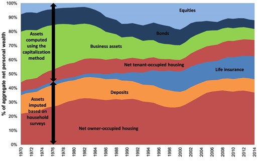
Composition of aggregate personal wealth, France, 1970–2014.
The validity and the precision of our MICS method rely on two specific assumptions. The key assumption of the capitalization method is that the rate of return has to be uniform within an asset class. As discussed in detail in Saez and Zucman (2016), this assumption may be violated in the presence of idiosyncratic returns or asset-specific returns correlated with wealth. Note that this hypothesis does not imply that rates of return have to be constant along the wealth distribution, as returns can rise with wealth because of portfolio composition effects. The key assumption of our survey-based imputation method is that each asset-specific distribution by imputation group is unbiased.42
2.2.5. Robustness Checks
Although we are not able to explicitly test the veracity of all our methodological assumptions, we conduct several robustness checks and sensitivity tests. We begin to test the quality of our survey-based imputations by applying our two imputations methods (simple and refined) directly to the 1992–2010 wealth surveys rather than to income tax data.43 Table 1 compares the resulting wealth shares and Gini coefficients to those obtained by looking at the directly reported wealth in the surveys. It shows that our imputation methods capture the level of wealth concentration in the wealth surveys extremely well. Trends in wealth concentration are very similar as well: Top 10% and top 1% wealth shares increase, whereas bottom 50% and middle 40% shares decrease over the period. If anything, our imputation methods tend to slightly overestimate bottom 50% wealth shares and slightly underestimate top 1% wealth shares. However, the discrepancy is strongly reduced when using the refined method.44 Then, we apply several alternative imputation methods regarding owner-occupied housing and financial assets. In Online Appendix Figures D.4–D.6, we assess the sensitivity of our results to the imputation of owner-occupied housing assets by varying either the type of surveys used (housing vs wealth surveys) or the complexity of the imputation groups (age groups * total income instead of age groups * labor income * financial income) over the 1992–2014 period. The general conclusion is that the overall impact of alternative imputation methods on the wealth distribution series is negligible.45 Another indication that our mixed capitalization method works well comes from the use of the 1984–2010 microfiles on inheritance tax returns.46 We apply the estate multiplier method—reweighting each decedent by the inverse mortality of its age-gender cell—to recover the distribution of wealth among the living and compare it to that derived from our mixed capitalization method.47 It is a particularly convincing way to check that the assumption of uniform rates of return within each asset class is not driving our results, as the estate multiplier approach does not require this assumption. We found that the resulting estate multiplier method estimates for the wealth distribution are extremely close to those of the MICS method (see Figures 2(a) and 2(b)).48 The reasons why we favor our mixed method over inheritance-based approaches are twofold. First, France is a country where access to inheritance data has deteriorated—annual data are no longer available.49 Second, our mixed method enables us to more comprehensively understand the wealth-inequality dynamics of recent decades, given that our methodology delivers information on both wealth and income over the 1970–2014 period, and provides detailed breakdowns by age and asset categories.
(a) Estate multiplier versus capitalization method: France, 1970–2014. (b) Estate multiplier versus capitalization method: France, 1970–2014.
Testing the survey-based imputation methods using wealth surveys.
| Wealth shares | ||||||
|---|---|---|---|---|---|---|
| Imputed | Imputed | |||||
| Simple | Refined | Simple | Refined | |||
| Observed | method | method | Observed | method | method | |
| Year | Top 1 | Top 10 | ||||
| 1992 | 13.0% | 9.8% | 11.4% | 45.3% | 39.0% | 43.8% |
| 1998 | 14.9% | 12.5% | 13.3% | 47.4% | 41.7% | 44.3% |
| 2004 | 13.6% | 12.4% | 12.7% | 48.0% | 42.4% | 44.9% |
| 2010 | 18.8% | 17.4% | 18.0% | 51.1% | 47.1% | 49.4% |
| Year | Middle 40 | Bottom 50 | ||||
| 1992 | 46.6% | 48.6% | 47.4% | 8.1% | 12.4% | 8.8% |
| 1998 | 45.5% | 46.7% | 46.3% | 7.1% | 11.6% | 9.4% |
| 2004 | 46.1% | 46.9% | 46.7% | 6.0% | 10.7% | 8.4% |
| 2010 | 44.1% | 44.7% | 44.1% | 4.9% | 8.2% | 6.4% |
| Year | Gini | |||||
| 1992 | 0.63 | 0.55 | 0.62 | |||
| 1998 | 0.65 | 0.58 | 0.61 | |||
| 2004 | 0.66 | 0.59 | 0.63 | |||
| 2010 | 0.69 | 0.64 | 0.67 | |||
Notes: This tables depicts inequality indicators from the wealth surveys using the reported wealth or the imputed wealth implied by our survey-based imputation methods. The unit of analysis is the household level (see Section 2.2.5).
3. Wealth Inequality Series (1970–2014)
We now present our benchmark-unified series for wealth distribution in France over the 1970–2014 period. We start with the evolution of wealth inequality and the asset composition of wealth shares since 1970. We then move on to the study of the joint distribution of income and wealth.50
3.1. Evolution of Wealth Inequality (1970–2014)
3.1.1. Wealth Shares
Table 2 reports the wealth levels, thresholds, and wealth shares for 2014. In 2014, average net wealth per adult in France was about €200,000. Average wealth within the bottom 50% of the distribution was just over €20,000, that is, about 10% of the overall average, so that their wealth share was close to 5%. Average wealth within the next 40% of the distribution was slightly less than €200,000, giving the group a 40% share of total wealth. Average wealth within the top 10% was approximately €1.1 million, about 5.5 times average wealth, resulting in a 55% wealth share.
Wealth thresholds and wealth shares in France, 2014.
| Wealth group | Number of adults | Wealth threshold | Average wealth | Wealth share |
|---|---|---|---|---|
| Full Population | 51,721,509 | €0 | €197,379 | 100.0% |
| Bottom 50% | 25,860,754 | €0 | €20,157 | 5.1% |
| Middle 40% | 20,688,603 | €79,556 | €183,470 | 37.2% |
| Top 10% | 5,172,000 | €419,019 | €1,139,121 | 57.7% |
| Including top 1% | 517,200 | €1,938,369 | €4,740,783 | 24.0% |
| Including top 0.1% | 51,720 | €8,003,951 | €17,971,681 | 9.1% |
| Including top 0.01% | 5,172 | €29,177,748 | €62,647,783 | 3.2% |
| Including top 0.001% | 517 | €100,275,956 | €212,662,956 | 1.1% |
Notes: This table reports statistics on the distribution of wealth in France in 2014 obtained by our MICS method. The unit is the adult individual (20-year-old and over; net wealth of married couples is split into two). Fractiles are defined relative to the total number of adult individuals in the population.
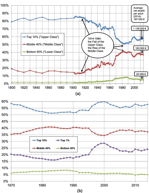
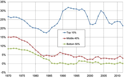
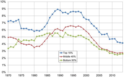
Figure 3 shows the evolution of wealth shares owned by these three groups over the 1800–2014 period (panel a) and over the 1970–2014 period (panel b). To put our 1970–2014 series into a long-term perspective, we have linked them to the wealth series estimated by Piketty, Postel-Vinay, and Rosenthal (2006) over the 1800–1969 period. The authors show that the top 10% wealth share was relatively stable at very high levels—between 80% and 90% of total wealth—during the 19th and early 20th centuries, up until World War I. They also document a huge decline in the top 10% wealth share following the 1914–1945 capital shocks. Our 1970–2014 wealth series complement this work by revealing a number of new insights about the decline in the top 10% wealth share. We show that this decline continued until the early 1980s, falling to its lowest point in 1983–1984 (owning slightly more than 50% of total wealth).51 The fall in the top 10% wealth share was accompanied by a rise in the wealth shares of both the middle class (middle 40%) and the lower class (bottom 50%). Although the top 10% wealth share declined continuously over the 1914–1984 period, the determinants of this decline seem to have changed. As shown in Table 3, the rise in the bottom 90% share during the 1914–1945 period is not due to a large accumulation of wealth by this group during this period. It simply reflects their relatively smaller loss in wealth—in proportion to their initial wealth level—as compared to the top 10%. In contrast, over the 1945–1984 period, all wealth groups experienced a significant rise in their absolute wealth levels, though the real rate of wealth growth becomes increasingly lower towards the top of the wealth distribution. From the early 1980s to 2014, we observe a moderate rise in the top 10% wealth share. However, the underlying dynamic for this period is rather one of a marked increase in the top 1% wealth share (+50% from 1984 to 2014, Figure 3(b)) and a corresponding erosion of the wealth share of the entire bottom 99%. Indeed, the moderate increase in the top 10% wealth share reflects a strong rise in the wealth share of the top 1% and a continuous decline in the top 10–1% wealth share.52 The three decades preceding 2014 were characterized by a strong divergence of real wealth growth rates between the top 1% and the rest of the distribution (Table 3). Over the period 1984–2014, the average annual growth rate experienced by the top 1% was 4%, whereas this figure fell to 2.5% for both the top 10–1% and the middle 40%, and 1.2% for the bottom 50%. There were also strong short-run fluctuations in wealth shares over this period, with a large rise in the top 1% share up to 2000, followed by a sharp decline. As we will see in Section 4, this is entirely due to significant movements in relative asset prices. (Stock prices were very high compared to housing prices in 2000, which favored the upper class relative to the middle class.)
(a) Wealth concentration in France, 1800–2014 (wealth shares, % total wealth). (b) Wealth concentration in France, 1970–2014 (wealth shares, % total wealth).
Real wealth growth by time periods in France.
| 1800–1900 | 1914–1945 | 1945–1984 | 1984–2014 | |||||||||
|---|---|---|---|---|---|---|---|---|---|---|---|---|
| Wealth group | Average annual growth rate | Total cumulated growth | Share of total cumulated growth | Average annual growth rate | Total cumulated growth | Share of total cumulated growth | Average annual growth rate | Total cumulated growth | Share of total cumulated growth | Average annual growth rate | Total cumulated growth | Share of total cumulated growth |
| Full population | 0.8% | 130% | 100% | –3.1% | –62% | 100% | 4.5% | 437% | 100% | 2.7% | 129% | 100% |
| Bottom 50% | 0.7% | 97% | 1% | –1.2% | –30% | 1% | 7.3% | 1346% | 9% | 1.2% | 46% | 3% |
| Middle 40% | 0.5% | 72% | 11% | –1.3% | –34% | 7% | 6.1% | 840% | 45% | 2.4% | 109% | 34% |
| Top 10% | 0.9% | 144% | 88% | –3.5% | –67% | 92% | 3.5% | 272% | 46% | 3.1% | 158% | 63% |
| Including top 10–1% | 0.7% | 109% | 29% | –2.3% | –52% | 25% | 4.3% | 389% | 34% | 2.6% | 119% | 33% |
| Including top 1% | 1.0% | 173% | 59% | –4.4% | –76% | 66% | 2.4% | 144% | 12% | 4.1% | 243% | 30% |
| Including top 0.1% | 1.2% | 223% | 29% | –5.1% | –80% | 34% | 1.7% | 90% | 3% | 4.9% | 340% | 12% |
| Including top 0.01% | 1.3% | 251% | 10% | –5.6% | –83% | 14% | 1.6% | 83% | 1% | 5.1% | 373% | 4% |
Notes: This table reports real wealth growth in France over the 1914–2014 period. The unit is the adult individual (20-year-old and over; net wealth of married couples is split into two). Fractiles are defined relative to the total number of adult individuals in the population.
3.1.2. Wealth Composition
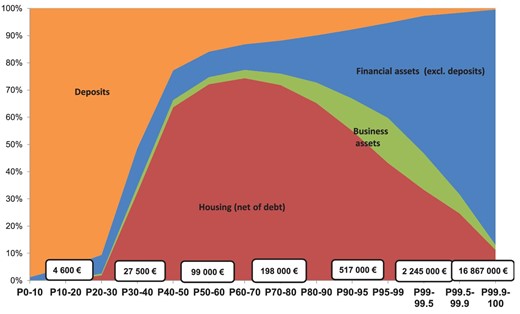
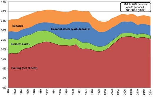
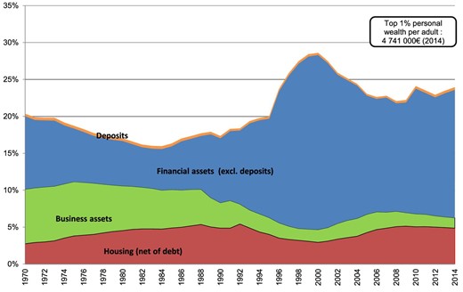
Before we move to inequality breakdowns by asset categories, it is important to recall that the composition and level of aggregate wealth changed substantially in France over the 1970–2014 period (see Online Appendix Figures D.11 and D.12). The shares of housing assets and financial assets increased substantially, whereas the share of business assets declined markedly (due to the fall in self-employment). Financial assets (other than deposits) increased strongly after privatization programs in the late 1980s and the 1990s, reaching a series high in 2000 (stock market boom). In contrast, housing prices declined in the early 1990s, and rose strongly during the 2000s, concurrent to falling stock prices. These opposing movements in relative asset prices have had an important impact on the evolution of wealth inequality, because different wealth groups own substantially different asset portfolios. As one can see from Figure 4, the majority of the wealth owned by the bottom 30% of the distribution in 2012 was in the form of deposits. Housing assets then became the main form of wealth for the middle of the distribution, but as one moves toward the top 10% and the top 1% of the distribution, financial assets (other than deposits) gradually become the dominant form of wealth. These financial assets largely consist of substantial equity portfolios. We find the same general pattern throughout the 1970–2014 period, except that business assets played a more important role at the beginning of the period, particularly among middle to high wealth holders (see Online Appendix Figures D.13–D.16). By decomposing wealth by asset categories, one can clearly see the impact of asset price movements on wealth shares, and particularly the impact of the 2000 stock market boom on the top 1% wealth share (see Figures 5 and 6 and Online Appendix Figures D.17–D.19).53 We return to this issue in Section 4.
Asset composition by wealth level, France 2012.
Decomposition of the middle 40% wealth share (% aggregate wealth).
Decomposition of the top 1% wealth share (% aggregate wealth).
3.2. Evolution of Capital and Labor Income Shares for the Top 1% Wealth Group (1970–2014)
The previous section has highlighted that both the top 1% wealth share and the proportion of financial assets held by the wealthiest top 1% have increased dramatically since the early 1980s. But are these changes linked to an increase in labor and capital income shares accruing to top wealth holders? And to what extent is the top 1% wealth group made up of top labor earners and top capital earners? The use of our MICS method allows us to generate the joint distribution of income and wealth and investigate these questions. We begin to document the evolution of total, capital, and labor income shares accruing to the top 1% wealth group over the 1970–2014 period. We then study how the correlation between top wealth holders and top labor and capital income earners has evolved over time.
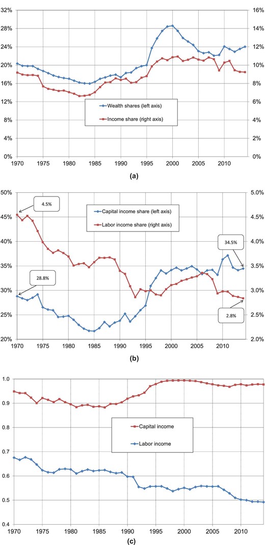
Figure 7(a) depicts the evolution of income and wealth shares accruing to the top 1% wealth group over the 1970–2014 period. The evolution of the income share almost mirrored that of the 1% top wealth share: a decline until the early 1980s followed by an important increase (+35% from 1984 to 2014). The rise in the share of income accruing to top wealth groups could be the result of several factors evolving differently over time, including changes in macroeconomic labor and capital shares, the concentration of capital and labor income, and so on. We rely on two simple formulas to better understand the evolutions at play.
(a) Wealth and income shares accruing to the top 1% wealth group. (b) Labor and capital income shares of the top 1% wealth group. (c) Top 1% alignment coefficients between wealth and capital/labor income.
with αt and (1 − αt) the capital and labor shares in the economy, and |$\textit{sh}_{{Y_{\textit{tot}}},t}^{\textit{p,w}}$|, |$\textit{sh}_{{Y_L},t}^{\textit{p,w}}$|, |${\rm{and}}\ \textit{sh}_{{Y_K},t}^{\textit{p,w}}$| the shares of total income, labor income, and capital income accruing to wealth group p (for instance, the wealthiest 1% of individuals) at time t, respectively.
with |$\textit{sh}_{{Y_L},t}^{\textit{p,L}}$| the share of labor income held by top labor income earners and |$\textit{sh}_{{Y_K},t}^{\textit{p,K}}\ $|the share of capital income held by top capital income earners at time t.
The alignment coefficient for labor income (|$Y_{\textit{L,t}}^{\textit{p, w}}/$||$Y_{\textit{L,t}}^{\textit{p,L}}$|) is the labor income share of top wealth holders divided by the labor income share of top labor income earners. The corresponding definition applies for capital income. These alignment coefficients capture the extent to which top labor (respectively capital) income earners are also at the top of wealth distribution. An alignment coefficient for labor income of 1 means that top wealth holders and top labor income earners are the same individuals, whereas a coefficient of 0 means that there is no overlap between the two populations. The patterns displayed by the top 1% alignment coefficients are particularly striking (Figure 7(c)). The top 1% alignment coefficient for capital income was always above 0.85 over the 1970–2014 period and almost equal to 1 from the mid-1990s onwards.58 In other words, top capital earners and top wealth holders appear to be almost the same population. In contrast, the top 1% alignment coefficient for labor income is much lower and decreases continuously from 0.68 in 1970 to 0.49 in 2014. This seems to denote an increasing polarization between top labor earners and top wealth holders over time.
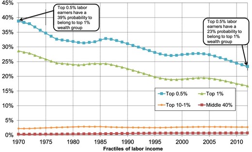
Figure 8 confirms our previous interpretation by showing that the probability that a top labor earner belongs to the top 1% wealth group has declined continuously since the 1970s. Indeed, whereas the top 0.5% labor earners had a 39% probability to belong to the top 1% wealth group in 1970, this fell to just 23% by 2012. The same findings hold for the top 1% labor earners, whose probability of reaching the top 1% wealth group decreased from 29% to 17% over the same period. Two opposing effects could be at play here. Whereas the rise in top labor income shares in recent decades (Garbinti et al. 2018) should, in principle, make it easier for top labor earners to accumulate large wealth holdings, the very large rise in the aggregate wealth-to-income ratio and the aggregate inheritance flow (Piketty 2011) should have made it more difficult for top labor earners with no family wealth to access top wealth groups. Although our findings suggest that the second effect tends to dominate, this question remains open and is left for future research.59
Probability for top labor earners to belong to the top 1% wealth group.
4. Accounting for Wealth Inequality: Models and Simulations
The objective of this section is to present and conduct different simulation exercises in order to better understand the evolution of wealth inequality. In the previous section, we have documented (i) a strong increase in the top 1% wealth share since the early 1980s, (ii) large short-term fluctuations in wealth inequality, and (iii) large differences in asset portfolios between wealth groups. The first simulation exercise analyzes the impact of asset price movements on wealth inequality. It shows that wealth inequality would have been substantially larger had housing prices not increased so quickly relative to other asset prices around 2000. In the second simulation exercise, we investigate the drivers of long-term wealth inequality and quantify their effects. In particular, we are looking for the factors behind the reversal in the trend of wealth inequality that occurred in the early 1980s. We highlight the key role of changes in the inequality of savings rates in the strong change in wealth-inequality dynamics observed since the early 1980s.
4.1. Understanding the Impact of Asset Price Movements on Wealth Inequality
where Aj,t is the amount of asset j at time t, Sj,t is the total savings (or investment flow) of asset j between t and t+1, which captures a volume effect, gws j,t = Sj,t/Aj,t is the savings-induced wealth growth rate, where Aj,t, Aj,t+1, and Sj,t are expressed in constant prices, (1 + qj,t) is the rate of real capital gains of asset j from t to t+1, that is, the excess of asset price inflation over consumer price inflation, which is estimated as a residual.
Table 4 reports the rates of real capital gain by asset categories over the 1970–2014 period.62 It shows that over this period, housing prices increased faster than other asset prices (on average they rose 2.4% faster per year than consumer price inflation vs 0.3% faster for the general asset price index). However, this increase in housing prices has been far from steady: The housing boom was particularly strong in certain years (+10.4% over the 2000–2005 period) and not in others, thereby generating large short-run fluctuations in wealth inequality.
Average annual rates of real capital gains by asset categories in France, 1970–2014.
| Asset categories | 1970–2014 | 1970–1995 | 1970–2000 | 1995–2000 | 2000–2005 |
|---|---|---|---|---|---|
| Net personal wealth | 0.3% | –1.1% | –0.5% | 2.4% | 5.0% |
| Housing assets | 2.4% | 1.1% | 1.3% | 2.5% | 10.4% |
| Business assets | 0.1% | –1.8% | –0.9% | 3.5% | 8.8% |
| Financial assets (excluding deposits) | –3.4% | –5.2% | –4.1% | 1.8% | –3.9% |
| Deposits | –4.1% | –6.2% | –5.3% | –1.2% | –1.9% |
| Financial assets | –3.7% | –5.7% | –4.6% | 1.2% | –3.5% |
| Including equities/shares/bonds | –2.5% | –4.3% | –2.9% | 4.2% | –3.7% |
| Including life insurance/pension funds | –6.7% | –10.0% | –8.8% | –2.9% | –3.9% |
| Including deposits/savings accounts | –4.1% | –6.2% | –5.3% | –1.2% | –1.9% |
| Debt | –5.6% | –8.7% | –7.5% | –1.4% | –2.1% |
| Housing net of debt | 4.7% | 3.7% | 3.8% | 4.2% | 14.9% |
Notes: This table reports the average annual real rates of capital gains by asset categories over the 1970–2014 period. Real capital gains are computed using national accounts and correspond to asset price inflation in excess of consumer price inflation.
where Aijt is the observed amount of asset j owned by individual i at time t and Pj,t is the observed asset price index. Finally, we compute individual wealth and the resulting shares by wealth groups for each counterfactual scenario.
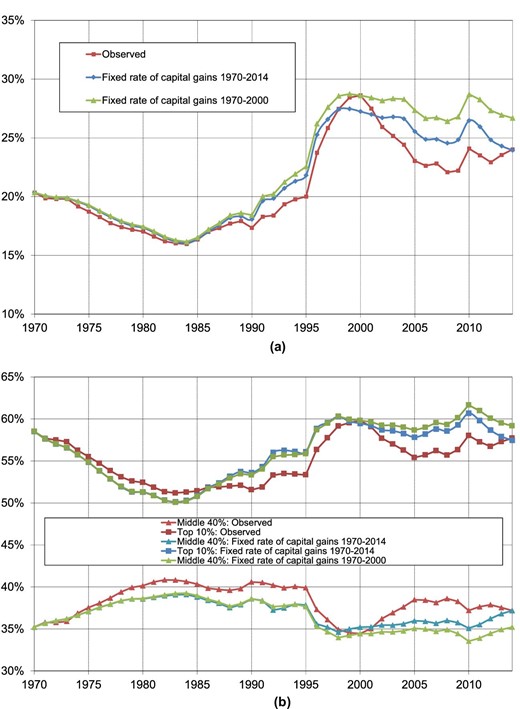
Figure 9 reports the simulated top 1% wealth shares (panel a) and top 10% and middle 40% wealth shares (panel b) according to these two counterfactual scenarios. When we replace the time-varying rates of real capital gains by their averages over the 1970–2014 period,63 all simulated series end, by construction, with the same inequality level as the observed series in 2014. The difference is that we now see a gradual increase in inequality, rather than a sharp rise until 2000 followed by a decline. This confirms that the only reason for this inverted-U-shaped pattern is variations in relative asset prices, and more specifically those that occurred during the stock market boom of 2000 (together with the low housing prices of 2000). Once this is corrected in our simulated series, this sharp decline disappears: The long-term parameters at play during this period led to a rising concentration of wealth.64 Second, Figure 9 also reports the simulated series that we obtain by replacing time-varying rates of capital gains by their averages over the 1970–2000 period—that is, over the period ending just before the housing boom of the 2000s. We find that the top 1% and top 10% shares would have increased a lot more by 2014, illustrating that the housing boom of the 2000s played an important role in limiting the rise in inequality.65 More generally, the long-term increase in top 10% and top 1% wealth shares over the 1984–2014 period would have been substantially larger had housing prices not increased so quickly relative to other asset prices. It should be noted, however, that rising housing prices may have an ambiguous and opposing impact on inequality. Higher housing prices not only raised the market value of the wealth of middle class members who were able to access real estate property, thereby increasing the middle 40% wealth share relative to the top 10% wealth share, but also made it more difficult for members of the lower class, or indeed members of the middle-class members with no family wealth, to access real estate property.66
(a) The role of asset price fluctations in the top 1% wealth share. (b) The role of asset price fluctations in wealth inequality.
4.2. Simulating Long-Term Wealth Inequality
with |$W_t^p$| and |$W_{t\! +\! 1}^p$| being the average real wealth of group p at time t and t+1 (for instance, group p be the top 10% wealth group),|$\ Y_{Lt}^p$| the average real labor income of group p at time t,|$\ \ r_t^p$| the average rate of return of group p at time t,|$\ q_t^p$| the average rate of real capital gains of group p at time t (real capital gains defined as the excess of average asset price inflation over consumer price inflation), and|$\ s_t^p$| the synthetic savings rate of group p at time t.
For each wealth group p, the rate of returns (|$r_t^p$|) is computed by weighting each asset-specific rate of return—such as that reported in the national accounts—by the proportion of each asset in the wealth of the group. We follow the same methodology to compute the rates of capital gains by wealth groups (|$q_t^p$|).67 We define synthetic savings rates in the same way as Saez and Zucman (2016). That is, we can observe variables |$W_t^p$|, |$W_{t + 1}^p$|,|$\ Y_{Lt}^p$|, |$r_t^p$|, and |$q_t^p$| in our 1970–2014 series, and from this we compute |$s_t^p$| as the synthetic savings rate that can account for the evolution of the average wealth of group p.68 We call it the “synthetic” savings rate for two reasons. First, it is defined based on pretax income and therefore, mechanically, it picks up any changes in the average tax rate between groups and over time: For a constant savings rate out of disposable income, if taxes increase for group p, disposable income falls, and the synthetic savings rate decreases.69 Second, it should be thought of as some form of average savings rate of the group (taking into account all the intergroup mobility effects). It clearly does not mean that all individuals in wealth group p save exactly that much. In practice, there is always a lot of mobility between wealth groups over time.70 In this paper, we do not attempt either to disentangle changes in taxation from changes in savings rates out of disposable income or to study this mobility process as such; instead, we focus on this synthetic savings rate approach.71 This allows us to perform simple simulations to illustrate some of the key forces at play.
with |$\textit{sh}_w^p$| (respectively |$\textit{sh}_{\textit{YL}}^p$|) being the share of wealth (respectively labor income) held by wealth group p (for instance, p = top 10% wealth group), g the economy's growth rate, s the aggregate savings rate, r the aggregate rate of return, sp the synthetic savings rate of wealth group p, and rp the rate of return of wealth group p (given their portfolio composition).
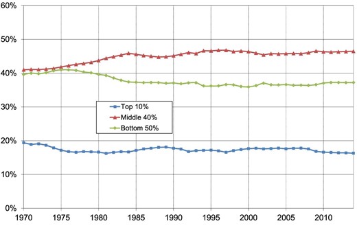
This formula can be easily derived (see Online Appendix A) and is intuitive.74 For instance, if sp = s and rp = r (i.e. the top wealth group has the same savings rate and rate of return as the average), then |$\textit{sh}_w^p = \textit{sh}_{\textit{YL}}^p$|, that is, wealth inequality is exactly the same as labor income inequality. But if sp > s and/or rp > r, that is, the top wealth group saves more and/or has a higher rate of return than the average, then this can generate large multiplicative effects and lead to very high steady-state wealth concentration. The important point is the strength of these multiplicative effects. In order to illustrate them, we make the following computations. First, we compute the evolution of the synthetic savings rates for the different wealth groups over the 1970–2014 period.75 The results are represented in Figure 10. The high levels of wealth concentration that we observe in France over this period can be accounted for by highly stratified savings rates between wealth groups: Whereas top 10% wealth holders save on average between 20% and 30% of their annual income, middle 40% and bottom 50% wealth groups save a much smaller fraction of their income.76 It is also striking to see that middle and bottom wealth groups saved more in the 1970s (with a savings rate of about 15% for the middle 40% and 8% for the bottom 50%) than what we have observed during the 1980s and 1990s (with a savings rate of around 5% for the middle 40% and close to 0% for the bottom 50%). As we will see later, this appears to be the key force that accounts for the rising wealth concentration in France over this period. This is similar to the results found by Saez and Zucman (2016) for the US case. Then, we compute the evolution of the labor income shares accruing to wealth groups (Figure 11). The labor income shares accruing to the top 10% and bottom 90% wealth groups are constant over the 1970–2014 period.77 Next, we compute the evolution of flow rates of return (excluding capital gains, which we assume to be zero in our simulations) for the different wealth groups over the 1970–2014 period. The results are represented in Figure 12. As one can see, the top 10% wealth group tends to have substantially higher rates of return. This large inequality of rates of return is due to the large portfolio differences that we have documented earlier. In particular, top wealth groups own more financial assets such as equity that have higher rates of return than housing or deposits (see Table 5).78
Synthetic savings rates by wealth group.
Labor income share by wealth group.
Flow returns by wealth group (before all taxes).
Average annual rates of return by asset categories in France, 1970–2014.
| Flow return | Real | ||
|---|---|---|---|
| (rent, interest, | capital | Total | |
| Asset categories | dividend, etc.) | gains | return |
| Net personal wealth | 5.9% | 0.3% | 6.2% |
| Housing assets | 3.6% | 2.4% | 6.1% |
| Business assets | 5.4% | 0.1% | 5.6% |
| Financial assets (excluding deposits) | 12.0% | –3.4% | 8.2% |
| Deposits | 4.1% | –4.1% | –0.2% |
| Financial assets | 9.3% | –3.7% | 5.3% |
| Including equities/shares/bonds | 12.3% | –2.5% | 9.4% |
| Including life insurance/pension funds | 11.2% | –6.7% | 3.7% |
| Including deposits/savings accounts | 4.1% | –4.1% | –0.2% |
| Debt | 7.1% | –5.6% | 1.0% |
| Housing net of debt | 2.8% | 4.7% | 7.6% |
Notes: This table reports the average total returns on personal wealth by asset categories over the 1970–2014 period. The total returns are the sum of the flow returns and the real rates of capital gains from the national accounts. The returns are gross of all taxes but net of capital depreciation. Real capital gains correspond to asset price inflation in excess of consumer price inflation.
Source: See our companion paper Garbinti, Goupille-Lebret, and Piketty (2017, Apx. A Tab. A23a, A24a, and A25a).
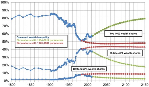
Finally, we use the estimates of sp, rp, and |$sh_{YL}^p$| by wealth groups in order to simulate long-term wealth inequality. Table 6 reports the parameters used for these simulations as well as the implied steady-state levels of wealth inequality using the steady-state formula (equation (12)). Figure 13 depicts the long-term trajectories for wealth shares using the transition equation (equation (11)) and the different sets of parameters reported in Table 6. For simplicity, we consider only two simulation exercises. First, we assume that the same inequality of savings rates, rates of return, and labor income that we observe on average over the 1984–2014 period will persist in the following decades. The conclusion is that wealth inequality is predicted to gradually increase in the future, and, finally, converging toward a level similar to that observed in the 19th and early 20th centuries (with steady-state top 10%, middle 40%, and bottom 50% wealth shares of about 83%, 15%, and 2%, respectively).79 The other simulation consists of assuming that the same inequality of savings rates, rates of return, and labor income that we observe on average over the 1970–1984 period would have persisted between 1984 and 2014 and continue during the following decades. The conclusion is that the top 10% wealth share would have continued its declining path observed before 1984 and would have gradually converged toward a substantially lower level of wealth concentration (with a steady-state top 10% wealth share of about 48%).80
Simulations of long-term wealth-inequality trajectories.
Simulations of steady-state wealth shares.
| Fixed parameters by wealth group | Steady-state agregate parameters | Steady-state shares | |||||||
|---|---|---|---|---|---|---|---|---|---|
| Wealth groups | Labor income share | Pretax rate of return | Savings rate | Growth rate | Pretax rate of return | Savings rate | Wealth share | Pretax income share | |
| 1970–1984 | Top 10% | 17.4% | 6.4% | 22.8% | 2.8% | 5.5% | 12.9% | 48% | 27% |
| Including top 1% | 3.9% | 7.6% | 24% | 15% | 8% | ||||
| Including top 10–1% | 13.4% | 5.9% | 22% | 33% | 19% | ||||
| Bottom 90 % | 82.6% | 4.6% | 9.2% | 52% | 73% | ||||
| Including middle 40% | 54.0% | 4.4% | 11.3% | 43% | 49% | ||||
| Including bottom 50% | 28.6% | 5.3% | 4.7% | 9% | 23% | ||||
| 1984–2014 | Top 10% | 17.3% | 4.1% | 25.0% | 1.8% | 3.9% | 9.7% | 83% | 32% |
| Including top 1% | 3% | 5.1% | 28% | 35% | 12% | ||||
| Including top 10–1% | 14% | 3.4% | 23% | 49% | 20% | ||||
| Bottom 90 % | 82.7% | 2.7% | 2.4% | 17% | 68% | ||||
| Including middle 40% | 45.1% | 2.8% | 3.7% | 15% | 38% | ||||
| Including bottom 50% | 37.6% | 2.6% | 0.7% | 2% | 30% | ||||
Notes: This table reports the parameters used for the steady-state simulations (fixed parameters by wealth group) as well as the implied steady-state agregate parameters (growth rate, pretax rate of return, savings rate) and the levels of wealth and pretax income inequality using the steady-state formula. The unit is the adult individual (20-year-old and over; net wealth of married couples is split into two). Fractiles are defined relative to the total number of adult individuals in the population. See Online Appendix A for more details on the steady-state formula and its calibration.
Table 7 investigates the drivers of the different levels of steady-state wealth inequality simulated. Panel A depicts alternative steady-state top 10% wealth shares, when successively replacing each parameter by its average over the 1984–2014 period and keeping all other parameters constant to their averages over the 1970–1984 parameters. In panel B, we do a symmetric exercise by successively replacing each parameter by its average over the 1970–2014 period (and keeping all other parameters constant to their averages over the 1984–2014 parameters). Table 7 shows that the strong increase in the inequality of savings rates and the decrease in the economy's growth rate between 1970–1984 and 1984–2014 are the main factors responsible for the increase in steady-state wealth inequality. In contrast, the decrease in the inequality of rates of returns over the period tends to slightly attenuate this increase in steady-state wealth inequality. Finally, labor income inequality has remained constant over the period and does not play an instrumental role in wealth-inequality dynamics.
Simulations of top 10% steady-state wealth shares based on hypothetical scenarios.
| Top 10% wealth group | Bottom 90% wealth group | Steady-state wealth share | ||||||||
|---|---|---|---|---|---|---|---|---|---|---|
| Economy's growth rate g | Labor income share | Pretax rate of return | Savings rate | Savings rate | Pretax rate of return | Steady-state savings rate s | Steady-state pretax rate of return r | Top 10% | Bottom 90% | |
| Panel A: baseline with 1970–1984 parameters | 2.8% | 17.4% | 6.4% | 22.8% | 9.2% | 4.6% | 12.9% | 5.5% | 48% | 52% |
| Taking 1984–2014 inequality in savings rates | 2.8% | 17.4% | 6.4% | 25.0% | 2.4% | 4.6% | 9.7% | 6.1% | 83% | 17% |
| Taking 1984–2014 inequality in rates of return | 2.8% | 17.4% | 4.1% | 22.8% | 9.2% | 2.8% | 12.2% | 3.3% | 42% | 58% |
| Taking 1984–2014 inequality in labor income | 2.8% | 17.3% | 6.4% | 22.8% | 9.2% | 4.6% | 12.9% | 5.5% | 48% | 52% |
| Taking 1984–2014 changing growth rate | 1.8% | 17.4% | 6.4% | 22.8% | 9.2% | 4.6% | 15.6% | 5.9% | 69% | 31% |
| Panel B: baseline with 1984–2014 parameters | 1.8% | 17.3% | 4.1% | 25.0% | 2.4% | 2.8% | 9.7% | 3.9% | 83% | 17% |
| Taking 1970–1984 inequality in savings rates | 1.8% | 17.3% | 4.1% | 22.8% | 9.2% | 2.8% | 12.9% | 3.4% | 48% | 52% |
| Taking 1970–1984 inequality in rates of return | 1.8% | 17.3% | 6.4% | 25.0% | 2.4% | 4.6% | 17.1% | 6.3% | 95% | 5% |
| Taking 1970–1984 inequality in labor income | 1.8% | 17.4% | 4.1% | 25.0% | 2.4% | 2.8% | 9.7% | 3.9% | 83% | 17% |
| Taking 1970–1984 changing growth rate | 2.8% | 17.3% | 4.1% | 25.0% | 2.4% | 2.8% | 7.9% | 3.8% | 77% | 23% |
Notes: This table reports the simulation of top 10% steady-state wealth shares according to different scenarios. Panel A depicts alternative steady-state top 10% wealth shares, when replacing successively each parameter by its average over the 1984–2014 period and keeping all other parameters constant to their averages over the 1970–1984 parameters. In panel B, we do a symmetric exercise by replacing successively each parameter by its average over the 1970–2014 period and keeping all other parameters constant to their averages over the 1984–2014 parameters.
These simulation exercises should not be taken at face value: We do not pretend to be able to predict the future evolution of wealth inequality. Economic and political events are likely to shift the steady-state level during any transition path. This has occurred multiple times in the past and it is likely to continue in the future. The main contribution of our exercise is to better understand the drivers of the different wealth-inequality dynamics observed from the early 20th century. These simple simulations convey two main messages. First, the inequality of labor income has not played an instrumental role in wealth-inequality dynamics over the 1970–2014 period. Second, changes in the inequality of savings rates and economy's growth rate, coupled with highly stratified rates of returns by wealth groups, are likely to explain the change in wealth-inequality dynamics observed in the early 1980s. However, such changes take a long time—many decades and generations—before they fully materialize. This could explain why declining wealth concentration continued long after the capital shocks of the 1914–1945 period. The main limitation of our approach is that we are not able to fully explain why savings rates and rates of return change the way they do. We can think of a number of plausible factors (growth slowdown, rising top income shares, changes in the tax system,81 financial regulation, and deregulation), but the data we employ are insufficient to fully settle the issue.
5. Concluding Comments and Research Perspectives
In this paper, we show that it is possible to combine household surveys, fiscal data, and national accounts in order to improve our capacity to measure and analyze the evolution of the wealth distribution. Using the case of France as an illustration, our contribution is both methodological and substantive.
At the methodological level, our new wealth series offer several advantages over the traditional series derived from the estate multiplier approach. First, they are annual, fully consistent with macroeconomic household balance sheets of the French national accounts, and cover the entire wealth distribution. Second, they can be broken down by percentile, age, and asset categories. Third, our method allows us to estimate the joint distribution of income and wealth as well as the determinants of wealth-inequality dynamics, such as rates of return, savings rates, and rates of capital gains by wealth groups.
At a more substantive level, we use these new series in order to better understand the recent evolutions of wealth inequality in France and its determinants. We begin to show that the decline in wealth inequality ends in the early 1980s, marking the beginning of a rise in the top 1% wealth share, which also had large short-term fluctuations. Then, we document large differences in asset portfolios by wealth group and how asset price movements (housing vs financial assets) have influenced wealth inequality in the short and medium terms. Next, we take advantage of the joint distribution of income and wealth to better characterize top wealth holders over the 1970–2014 period. In particular, we show that top wealth holders are almost exclusively top capital earners, containing increasingly fewer top labor earners. Finally, we show that the change in the inequality of savings rates, coupled with highly stratified rates of return between wealth groups, is likely to explain the strong change in wealth-inequality dynamics observed in the early 1980s.
We hope this work will contribute to stimulate similar work in other countries. The resulting series can then be used to perform simulations based on dynamic wealth accumulation models and allow us to reach a better understanding of the long-run determinants of wealth inequality. In particular, the main limitation of our approach is that we are not able to fully explain why savings rates and rates of return change in the way they do. The comparison between countries with different institutions, economic trajectories, and tax and transfer systems may help us to better understand the potential mechanisms underlying these changes (growth slowdown, changes in taxation, or global factors such as financial regulation and deregulation) and, more specifically, how they shape wealth inequalities.
Acknowledgments
We thank the editor Dirk Krueger, three anonymous referees, Facundo Alvaredo, Mathilde Godard, Emmanuel Saez, Daniel Waldenström, Gabriel Zucman, and numerous seminar and conference participants for helpful discussions and comments. We are also thankful to Vincent Biausque for fruitful discussions about national accounts, and to the DGFiP-GF3C team for its efficient help with fiscal data use and access. The research that has led to these results has received funding from the European Research Council under the European Union's Seventh Framework Programme, ERC Grant Agreement no. 340831, and from the French National Research Agency (ANR) research program (reference: ANR-19-CE41-0011). This work is also supported by a public grant overseen by ANR as part of the « Investissements d’avenir » program (reference: ANR-10-EQPX-17—Centre d’accès sécurisé aux données—CASD). This paper presents the authors’ views and should not be interpreted as reflecting those of their institutions.
Notes
The editor in charge of this paper was Dirk Krueger.
Footnotes
See Section 2.1 for a description of the different methods that can be used to measure wealth distribution.
In particular, Saez and Zucman (2016) argue that, because the SCF fails to capture booming top capital incomes, it may fail to fully capture the booming top wealth. Alternatively, Bricker et al (2016) argue that the return on fixed-income assets used by Saez and Zucman (2016) is questionable and could bias their results.
For example, if the stock of equities recorded in the balance sheet of households is equal to 13 times the flow of dividend income in tax data, we attribute 13,000 euros in equities to a tax unit with 1,000 euros in dividends.
Starting with Lampman (1962) and Atkinson and Harisson (1978), most work has used estate multiplier techniques and inheritance (and estate) tax data to study the long-term evolution of wealth inequality (see, for instance, Kopczuk and Saez 2004; Piketty, Postel-Vinay, and Rosenthal 2006; Roine and Waldenström 2009; Katic and Leigh 2016; Alvaredo, Atkinson, and Morelli 2018 for the United States, France, Sweden, Australia, and the United Kingdom, respectively).
The estate multiplier method consists of reweighting each decedent by the inverse mortality of its age-gender cell to recover the distribution of wealth among the living. It is a particular convincing way to check the robustness of our results because the estate multiplier approach relies on alternative assumptions and wealth data.
In Pikettty, Postel-Vinay, and Rosenthal (2006), the top 10% wealth share decreases continuously from 1913 to 1994. They were not able to account for the reversal of the trend around the early 1980s because the inheritance tax data they use were available only for 1964 and 1994 for the period 1964–1994.
Piketty, Postel-Vinay, and Rosenthal (2014) estimate the rentiers' shares in population and wealth over the 1872–1927 period. Piketty, Postel-Vinay, and Rosenthal (2018) focus on the drivers of the decline in the top 1% wealth share between World War I and the mid-1950s. See also Bourdieu, Postel-Vinay, and Suwa-Eisenmann (2003) and Bourdieu, Kesztenbaum, and Postel-Vinay (2013).
The objective of this multicountry project is to release data series that can be used for future research investigating inequality dynamics and test formal models. All updated series will be made available on the World Wealth and Income Database website http://WID.world.
A longer and more complete discussion of the general methodological issues involved in creating DINA estimates (not specific to France) is presented in Alvaredo et al. (2016).
For France, wealth tax data is limited to top groups and exclude a large share of business and financial assets, that is, all real and financial assets necessary for their owner to carry on a profession as a principal business.
The reason for using national accounts concepts is not that we believe they are perfectly satisfactory. Our rationale is simply that national accounts are the only existing attempt to define notions such as income and wealth in a common way, which can be applied to all countries and are independent of country-specific and time-specific legislation and data sources. One of the central limitations of official national accounts is that they do not provide any information about the extent to which wealth and income are distributed among individuals. By using national accounts concepts and producing distributional series based on these concepts, we hope we can contribute to address one of the important shortcomings of existing national accounts and to close the gap between inequality measurement and national accounts.
Note that in contrast to the US financial accounts, the household balance sheet of the French national accounts does not include nonprofit institutions and hedge funds. Nonprofit institutions have a dedicated balanced sheet. Hedge funds are included in the balance sheet of financial corporations. As hedge funds are excluded from the household sector, the household balance sheet includes only equities in hedge funds owned by households.
The reason for using our concept of pretax national income rather than the concept of fiscal income is that the latter naturally varies with the tax system and legislation that is being applied in the country/year under consideration. In contrast, pretax national income is defined in the same manner in all countries and time periods, and aims to be independent of the fiscal legislation of the given country/year.
National income is defined as GDP minus capital depreciation plus net foreign income, following standard national accounts guidelines European Commission et al. (2009).
In our companions papers (Bozio et al. 2018; Garbinti et al. 2018), we analyze the evolution of pretax and posttax inequality using our concept of pretax national income as well as three alternative income concepts also based on categories from national accounts: pretax factor income, posttax disposable income, and posttax national income.
The same rule applies to fiscal income in most countries: Contributions are deductible, and pensions are taxed at the time they are distributed.
Note that rental income is net of capital depreciation and mortgage interests.
Note that in order to match national income, our concept of pretax income has to be net of capital depreciation, gross of all taxes (e.g. corporate taxes and production taxes), and also includes the income received indirectly by individuals (e.g. corporate retained earnings). One needs to make implicit incidence assumptions on how to attribute them. Corporate retained earnings and corporate taxes are distributed proportionally to total financial income, excluding interest income paid to deposits and savings accounts, that is, to dividends, life insurance income, and interests from bonds and debt assets. We assume that property taxes fall on tenant-occupied rental income and owner-occupied rental income. Finally, production taxes other than property taxes fall proportionally on each type of income. See Alvaredo et al. (2016) for a detailed presentation of the methodology related to the construction of homogeneous series of pretax income. See also Garbinti et al. (2018) and Piketty et al. (2018) for an application to the French and US cases. In particular, Garbinti et al. (2018, Apx. A) includes complete methodological details and series of aggregate pretax income by income categories from national accounts.
Table 5 reports the average rate of return by asset categories over the 1970–2014 period. Online Appendix Table C.2 reports the annual rates of return by asset categories over the 1970–2014 period.
One advantage of this procedure is that it does not require one to collect data on property regimes, that is, on how wealth is split among couples. One drawback is that it may underestimate the rise of inequality if there is a process of individualization of wealth (Fremeaux and Leturcq 2020).
Note that Online Appendix Figure D.27 shows that wealth shares computed from the wealth surveys at the household level or at the individual level are very similar.
Ideally, we would like to capitalize capital income and accrual capital gains together, that is, the annual change in asset value due to price effects. Unfortunately, income tax data include only realized capital gains and we have not tried to capitalize them for two reasons. First, realized capital gains represent only capital gains resulting from the sale of an asset. This implies that (i) a large fraction of accrual capital gains of the current period is excluded from tax data, and (ii) the realized capital gains reported correspond to the cumulative of all past accrual capital gains (since the purchase of the asset) rather than those of the current period. Second, a significant share of realized capital gains is fully tax-exempt and therefore not reported in income tax data (capital gains resulting from the sale of owner-occupied housing assets). Note that disregarding capital gains or fully capitalizing them has no impact on the total amount of wealth estimated. It will affect only the concept of income to capitalize (taxable income, on the one hand, or the sum of taxable income and realized capital gains, on the other hand), and, consequently, the value of each asset-specific capitalization factor (see equation (2)). In Section 4, we will rely on a concept of capital gains (accrual capital gains) provided by the French National Accounts that is more accurate to assess the impact of asset price fluctuations on wealth inequality (see Section 4.1 for more details).
Saez and Zucman (2016) gather bonds, deposits, and savings accounts into a unique asset class (fixed-income claim), which is obtained by capitalizing taxable interests. As the returns associated with these two categories of fixed-income claim may be very different, capitalizing them together could be problematic (Kopczuk 2015; Bricker et al. 2016). Because deposits and savings accounts do not yield taxable interests in France, we are able to disentangle bonds from deposits and savings accounts. While bonds are estimated by capitalizing taxable interests (interests from bonds), deposits and savings accounts are imputed using our survey-based imputation method (see Section 2.2.3).
We interpolate the missing years 1971–1974, 1976–1978, 1980–1983, 1985–1987, and 2013–2014 by using annual aggregate series by asset categories and by assuming linear trends in within-asset-class distribution. As an alternative strategy, we also use annual income tax tabulations (broken down by income categories) and found that this makes very little difference.
If wealthy people are able to reclassify labor income into more slightly taxed capital income, it could lead to an overestimation of their wealth. In this context, carried interest returns and stock options are of particular concern. In France (as in the United States), carried interest returns are considered as realized capital gains, whereas it would make more sense to classify them as labor income (because the fund managers who receive carried interest returns do not own the underlying assets). Because we do not capitalize realized capital gains, there is no risk of overestimating the wealth of the fund managers by our method. Let us also note that tax avoidance may bias our estimate: If the richest individuals had more opportunity to underreport capital income, we would likely underestimate their total wealth.
The adjusted capital income flow of asset j received by household i at time t (zijt) is obtained by multiplying each fiscal capital income component (yijt) by |${Z_{\textit{jt}}}/\mathop \sum \nolimits_k {y_{\textit{kjt}}},$| that is, the ratio between the aggregate income flows observed in the national accounts (Zjt) and in the income tax data |$(\mathop \sum \nolimits_k {y_{\textit{kjt}}}$|). This is equivalent to multiplying each household asset value with the average rates of return observed in national accounts for this asset class. Let us define rjt = Zjt/Ajt as the rate of return of asset j at time t reported in the household balance sheet of national accounts. Using equation (2), it is straightforward to show that the adjusted capital income flow becomes
More precisely, this category regroups income attributed to life insurance and pension funds. Before 1998, life insurance income was entirely exempt from income tax. Since 1998, only capital income withdrawn from the account has been taxed (see Goupille-Lebret and Infante 2018 for more details). As a result, total life insurance income reported in the tax data corresponds to less than 5% of its counterpart in national accounts. Due to this limitation, we do not try to capitalize taxable income from life insurance assets and rely exclusively on our survey-based imputation method to impute life insurance assets.
Online Appendix Figure D.1 depicts the evolution of tax-exempt capital income over the 1970–2014 period.
These wealth surveys were called « enquête actifs financiers » in 1986 and 1992, and « enquête patrimoine » since 1998. Housing surveys have always been called « enquête logement ». The 2010 wealth survey is the French component of the Eurosystem HFCS survey and is more sophisticated than previous surveys. They include answers with exact amounts (rather than answers by wealth brackets, which were used in previous surveys) and a large oversampling at the top (although the sample size of the survey is unfortunately still insufficient to go beyond the 99th percentile).
For example, we define approximately 200 groups for the imputation of owner-occupied housing asset. We first split the sample into 10 age groups (<25, 25–30, 31–39, 40–49, 50–54, 55–60, 61–65, 66–70, 71–80, >80). We then divide each age group into 4 percentile groups of financial income (P0-50, P50-90, P90-99, P99-100). Finally, we further split each of these 40 groups (10 age groups * 4 groups of financial income) into 5 percentile groups of labor and replacement incomes (P0-25, P25-50, P50-75, P75-90, P90-100). The number of imputation groups by asset is reported in Online Appendix Table C.12.
However, there is a trade-off between the number of dimensions to use and the number of households included in each group.
For owner-occupied housing, we also compute a debt-to-wealth ratio for each group, that is, the debt/gross value of the owner-occupied housing.
Let us consider the following example. For year 2010, if 80% of the households in a group own a primary residence, then the total gross value of the housing asset this group owns represents 0.5% of the total value reported in the survey and their mortgage represents 50% of the gross value of their housing asset, then the extensive margin is 80%, the intensive margin is 0.5%, and the debt ratio is 50%. In the same group defined in the income tax returns, the asset holders (who represent 80% of the considered group) will be supposed to hold 0.5% of the 4,484 billion euros that the gross owner-occupied housing asset represents in 2010 (as reported in the household balance sheets of French national accounts). If the group represents 100,000 tax units, it means that each of the 80,000 tax units who own this asset will hold 0.5% * 4,484 billion/80,000, that is, 280,000 euros of gross owner-occupied housing. The remaining 20,000 tax units of this group will not hold any housing assets. Finally, as the debt ratio is equal to 50% in our example, the mortgage associated with the housing asset will be equal to 140,000 euros.
At the percentile level within each imputation group.
Wealth surveys are available only since 1986. We do not use the 1986 wealth survey for the imputation of owner-occupied housing assets because this survey does not include any variable for debts and does not provide a decomposition of real assets between business assets and owner-occupied and tenant-occupied housing assets. Housing surveys do not provide a decomposition of total income between financial income, and labor and replacement income. For the 1970–1992 period, our groups are therefore defined according to two dimensions: age and total income.
See Online Appendix Figure D.25 for the share of imputed assets expressed in % of gross wealth and debt.
More specifically, we assume that the estimated shares of assets held by each group are unbiased once conditioned for age, labor income, and financial income.
Ideally, we would like to test the entire MICS method, that is, the capitalization method and the survey-based imputation methods, on wealth surveys. Unfortunately, wealth surveys do not provide a decomposition of financial income between interests from bonds and dividends. In addition, the concept of business assets used in the wealth surveys refers to all real and financial assets necessary for their owner to carry on a profession as a principal business. Given these limitations, applying the capitalization method to wealth surveys would rely on a unique capitalization factor for interest from bonds, dividends, and self-employment income. Therefore, this robustness check would not provide a convincing way to test the quality of our capitalization method, which relies on a distinct capitalization factor for each of these capital income components.
In addition, Online Appendix Table C.9 shows that the refined method is able to closely reproduce the entire distributions of the three assets to be imputed (owner-occupied housing, deposits, and life insurance) as well as their variability (as measured by the standard deviation). In contrast, the simple method performs more poorly. Online Appendix Table C.10 investigates whether our imputation methods may distort the joint distribution of income and wealth. It depicts total income shares accruing to wealth groups as well as wealth shares accruing to either total income groups or labor income groups. The tables show that both methods are able to reproduce the joint distribution of income and wealth extremely well.
We show that wealth concentration is not affected by our imputation choices. In Online Appendix Figures D.7–D.9, we investigate the sensitivity of our results to different imputation methods for financial assets. First, we impute life insurance proportionally to taxable interests and dividends rather than relying on imputation methods based on wealth surveys. Second, we capitalize all financial incomes together (interest from debt assets or savings accounts, life insurance income, and dividends). Note that both sensitivity checks are upper-bound scenarios in terms of wealth concentration. We show that, although the two sensitivity checks imply a slightly more important level of wealth concentration, the different trends, as well as our different results and interpretations, remain unchanged.
These microfiles have been produced by the French Finance Ministry every 6–7 years since 1977. We have access to the 6 existing waves of the files: 1984, 1987, 1994, 2000, 2006, and 2010. Each file contains between 3,000 and 5,000 individual estate tax returns (as compared to a total of about 300,000 estate tax returns filed each year). Hopefully, the wealthiest decedents are heavily oversampled, so that these files are representative of the very top of the distribution.
In more sophisticated variants, we also include corrections for tax-exempt assets (particularly life insurance) and/or different mortality rates by level of wealth. See Online Appendix D of our working paper Garbinti, Goupille-Lebret and Piketty (2016) for a complete description of our step-by-step methodology.
See also Online Appendix Figure D.26 and Table C.13, which compare wealth shares and wealth levels by wealth group computed with our MICS method with those obtained by looking at the wealth directly reported in the surveys.
Of course, the conclusion could be different in other countries such as the United Kingdom (see the recent work of Alvaredo, Atkinson, and Morelli 2018).
We also study wealth inequality by age in our Online Appendix D (see Figures D.21 and D.22).
In Pikettty, Postel-Vinay, and Rosenthal (2006), the top 10% wealth share decreases continuously from 1913 to 1994. They were not able to account for the reversal of the trend around the early 1980s because inheritance tax data were available only for the years 1964 and 1994, over this 30-year period.
See Online Appendix Figure D.10 for a comparison of top 1% and top 10–1% wealth shares over the 1970–2014 period.
While financial assets, excluding deposits, represent approximately 20%–25% of total wealth owned by the middle 40% wealth group from the 1990s, Figure 5 shows that the 2000 stock market boom has almost no impact on the financial assets of this group. Indeed, most financial assets owned by the middle 40% wealth group are made of life insurance assets, which are almost entirely invested in euro funds, and therefore have not benefitted from the 2000 stock market boom (see Table 4).
In formula (6), the capital income share accruing to the wealth group p can alternatively be defined as |$\textit{sh}_{{Y_{\textit{K,t}}}}^{\textit{p,w}} = \frac{{r_t^{p,w}}}{{r_t^{tot}}} \cdot sh_{w,t}^{p,w}$|, where |$r_t^{p,w}$| and|$\ sh_{w,t}^{p,w}$| are the rate of return and the wealth share of wealth group p at time t, respectively. By definition, wealth inequality is equal to capital income inequality if rates of returns are identical among wealth groups. Because higher wealth individuals tend to own assets with higher rates of return—typically equity rather than housing or deposits—capital income concentration among wealth holders is higher than wealth concentration.
It is also worth stressing that even if labor income shares are much smaller than capital income shares accruing to the top 1% wealth holders, labor income still represents a non-negligible fraction of their total income (25%–40%). This comes from the fact that the labor share (1−αt) is typically very large, around 75%–85% of national income. See Online Appendix Figure D.23(a) for the evolution of aggregate capital and labor shares and Online Appendix Figure D.23(b) for the decomposition of the income share accruing to the top 1% wealth group between labor and capital incomes over the 1970–2014 period.
One concern could be that the development of stock options and carried interest returns since 2000s may have impaired the distinction between labor and capital incomes. It is unlikely to affect the trends depicted in Figure 7(b) for two reasons. First, whereas carried interest returns are considered as capital gains in income tax data and therefore excluded from labor income, including the entire aggregate flow of carried interest returns (€400 million in 2011) into labor income accruing to the top 1% wealth group increases their labor share by less than 1%. Second, the French tax authority qualifies gains resulting from the grant or the acquisition of stocks as wages. Only the differences between the sale price and the value of the shares on the date on which they were acquired by the beneficiary are considered as capital gains.
This formula is derived from the one presented in Roine and Waldenstrom (2015). However, we consider the relationship between top wealth holders and top capital/labor earners instead of the relationship between top income earners and top capital/labor earners.
This means that the capital income share held by the top 1% wealth holders is almost equal to the one accruing to the top 1% capital earners.
This is consistent with the estimates by Piketty (2011) comparing the living standards attained by top labor earners and top inheritors across cohorts, concluding that the latter were catching up with the former in recent decades. See also Alvaredo, Garbinti, and Piketty (2017) for estimates of the recent rise in the share of inheritance in aggregate wealth accumulation.
See table 8.220—Households (S14) balance sheet and changes in balance sheets from the French national accounts.
See Piketty and Zucman (2014) for a detailed description of this approach.
The complete annual series of rates of real capital gains by assets are reported in Online Appendix Table C.3.
The constant capital gains are equal to the average changes of the various asset prices over the 1970–2014 period, for example, 2.4% for housing assets (see Table 4).
One potential concern with the capitalization method is that it can potentially overestimate the level of inequality during a stock boom as the wealthiest individuals tend to benefit more from higher returns (within a given asset class) than the rest of the population (maybe because they pick more risky assets within a given asset class). In this case, top wealth shares would tend to be upwardly biased, and particularly so during booms (see Bach, Calvet, and Sodini 2016 on Swedish data). In the case of France, however, we show in the simulations that the huge hump-shape around 2000 is entirely due to short-term price fluctuations (Figure 9).
In contrast to the middle 40% and top 10% wealth groups, the bottom 50% is not affected by short-term fluctuations in housing and stock prices as deposits are the main form of wealth for this group (Online Appendix Figure D.28).
See, for instance, Bonnet et al. (2018), which shows that the apparent stability of home ownership among young households since the 1970s masks growing disparities between the best and the least well-off and, in particular, highlights the important role played by family support (gift assistance, inheritance, and other forms of aid) in these growing disparities.
Both rates of return and capital gains by assets are computed using national accounts (see Sections 2.2.1 and 4.1). See Table 5 for average rates of return and real capital gain rates by asset categories over the 1970–2014 period. See also Online Appendix Tables C.1–C.7 for complete annual series by asset categories and by wealth groups.
Note that savings rates include all savings made directly or indirectly by households; that is, retained earnings/undistributed profits are considered as (indirect) savings in our framework.
Let us define |$s_{t}^{p}$|, |${{s}^{\prime}_{t}}^{p}$|, and |${\tau}_{t}^{p}$| as the savings rate out of pretax income, the savings rate out of disposable income, and the average tax rate of wealth group p at time t, respectively. It is straightforward to show that |${s}_{t}^{p} = {{s}^{\prime}_{t}}^{p}$||$( {1 - \tau _{t}^{p}} )$|.
In particular, individuals saving more than the synthetic savings rate of their group will tend to move up the wealth hierarchy, whereas individuals saving less than the average of their group will move down. In the same way, individuals earning more than the average rate of return of their group, and/or more than the average rate of real capital gain of their group, and/or more than the average labor income of their group, will tend to move up the wealth hierarchy.
Incorporating group-specific tax rates into our framework would require the computation of all taxes and transfers received each year by individuals over the 1970–2014 period, when our administrative data include only income taxes. In addition, the absence of panel data prevents us from estimating intergroup mobility.
The introduction of the rate of real capital gains q mitigates the impact of growth on wealth concentration (see Online Appendix A.3 for more details).
The difference from the steady-state formula presented by Saez and Zucman (2016) is that they relate wealth shares to total income shares (including both labor incomes and capital incomes, which themselves depend on wealth shares), so that they do not fully capture multiplicative effects between labor income inequality and steady-state wealth inequality.
Our steady-state formula is derived using the expression β = W/Y = s/g and requires the assumption that the rates of real capital gains |$q_t^p$| are equal to 0. In the Online Appendix, we also extend our formula to include potential capital depreciation or appreciation and show that the intuitions and mechanisms remain the same. When including some exogenous rate of capital depreciation or appreciation |$q_t^p = q$|, the steady-state formula becomes
Let us recall that because our concept of synthetic savings rates reflects savings rates out of pretax income, their evolution could be due to either changes in taxation or changes in savings rates out of disposable income.
Previous work on savings has mainly studied savings rates across income groups. The research generally finds that savings rate increases with current and permanent incomes (see, for instance, Dynan, Skynner, and Zeldes 2004 on US data; Bozio et al 2017 on UK data; Garbinti and Lamarche 2014a on French data). Because wealth and income are strongly correlated, these conclusions are consistent with the gradient highlighted by our estimates. Another strand of the literature has studied the marginal propensity to consume from wealth. For instance, Elinder, Erixson, and Waldenström (2018) find evidence that the rich save new wealth (bequests), whereas the poor consume it. Garbinti and Lamarche (2014b, Tab. 2) also show a large gradient in French savings rates across wealth groups, with the same order of magnitude as our synthetic savings rates. (For instance, the median savings rate equals 30% for the top 20% of wealth distribution.)
The average labor income share held by the top 10% wealth group is 17.4% over the 1970–1984 period and 17.7% between 1984 and 2014. Within the bottom 90% wealth group, we observe a slight decrease in the wealth share of the bottom 50% compensated by a slight increase for the middle 40% from 1970 to 1985. Note also that the labor income share accruing to the top 1% wealth group has decreased continuously over the period (as shown in Figure 7).
It is worth noting that, on average, real capital gains on personal wealth accumulation are relatively small (+0.3% per year) over the 1970–2014 period. The highly positive real capital gains recorded for housing assets (housing prices having increased faster than consumer price inflation) are almost entirely counterbalanced by the negative real capital gains for financial assets (particularly for deposits, bonds, and other nominal assets, which, by construction, incur real capital losses equal to consumer price inflation). Note that average real capital gains are more substantial regarding national wealth accumulation (due to the fact that the real capital losses incurred by the personal sector on public bonds are the counterpart of the real capital gains made by the government sector). See Piketty and Zucman (2014) for detailed decompositions. We can also note that the rate of return is a bit higher for the bottom 50% than for the middle 40% over the 1975–1985 period. Indeed, returns on net housing (the main asset of the middle 40%) are substantially lower than those of the savings accounts (the main asset of the bottom 50%) during this period.
According to the projections depicted in Figure 13, the half-life to the new steady state based on the 1984–2014 parameters is 49 years (year 2063).
According to the projections depicted in Figure 13, the half-life to the new steady state based on the 1970–1984 parameters is 49 years (year 1992).
Recent work by Piketty, Postel-Vinay, and Rosenthal (2018) highlights the strong impact of the rise in taxation of income and inheritance in reducing top savings rates and top wealth shares between World War I and the mid-1950s. In contrast, our work documents changes in the synthetic savings rates of bottom and middle wealth groups (Figure 10) over the recent period. It calls for a better understanding of the mechanisms at stake for the lower part of the distribution (and particularly the impact of redistributive and employment policies).
References
European Commission, International Monetary Fund, Organization for Economic Cooperation and Development, United Nations, and World Bank (
