


Abstract
The recent advance of single-cell copy number variation (CNV) analysis plays an essential role in addressing intratumor heterogeneity, identifying tumor subgroups and restoring tumor-evolving trajectories at single-cell scale. Informative visualization of copy number analysis results boosts productive scientific exploration, validation and sharing. Several single-cell analysis figures have the effectiveness of visualizations for understanding single-cell genomics in published articles and software packages. However, they almost lack real-time interaction, and it is hard to reproduce them. Moreover, existing tools are time-consuming and memory-intensive when they reach large-scale single-cell throughputs. We present an online visualization platform, single-cell Somatic Variant Analysis Suite (scSVAS), for real-time interactive single-cell genomics data visualization. scSVAS is specifically designed for large-scale single-cell genomic analysis that provides an arsenal of unique functionalities. After uploading the specified input files, scSVAS deploys the online interactive visualization automatically. Users may conduct scientific discoveries, share interactive visualizations and download high-quality publication-ready figures. scSVAS provides versatile utilities for managing, investigating, sharing and publishing single-cell CNV profiles. We envision this online platform will expedite the biological understanding of cancer clonal evolution in single-cell resolution. All visualizations are publicly hosted at https://sc.deepomics.org.
Introduction
The intratumor heterogeneity (ITH) is one of the principal causes of cancer therapy resistance, tumor recurrence and deaths [1]. An accurate understanding of the subclone structure and evolutionary history benefits precise treatments for individual patients [2]. Although the traditional bulk DNA-Seq studies have contributed perspicacity into tumor biology, they are restricted to offering the mixed signals of tumor cells or clones, which hold genotype diversity, leading to the mask of ITH [3]. For instance, if the averaged read-out overrepresents the genomic data from the prevailing cluster of the tumor cells, rare subclones will be veiled from the signals. The dedicated deconvolution computational approaches for bulk DNA-Seq can only provide a model of the mixture of cell types or subclones and their evolution history [4–6].
Over the past decade, the remarkably increasing interest in developing single-cell DNA sequencing (scDNA-Seq) wet-lab protocols in both academia and industry overcome this hurdle by profiling DNA reads with single-cell resolution. The first emergence was in 2011, Navin et al. [7] developed the scDNA-seq for breast cancer cells. The pioneering research platforms including high-density FACS assays [8, 9], microfluidic [10] and nanowell [11] were restricted by sequencing hundreds to 1000 cells at a time [12]. With the rapid development of high throughput technologies, commercial platforms such as Mission Bio [13] and 10x Genomics [14] arose with the aid of droplet systems. Likewise, researchers have proposed several high-throughput protocols including combinatorial indexing methods [15, 16] and acoustic cell tagmentation, recently elevated by Navin’s team [17]. The explosion of scDNA-Seq studies involves a range of cancer types, including bladder cancer [18], breast cancer [7, 10, 11, 17, 19–24], colorectal cancer [25, 26], gastric cancer [14], leukemia cancer [27–32], melanoma cancer [3], etc. To summarize, the abovementioned cancer studies exploit the single-molecule resolution to decipher the etiology of ITH [14], metastasis [21] and therapeutic resistance [12].
Currently, the typical applications of scDNA-Seq may go into the following aspects: (i) delineating the copy number (CN) profiles and phylogeny architecture of every single molecule [7, 17]; (ii) inferring tumor cell clumps that share similar clonal substructure [17]; (iii) building the clonal lineage within a tumor [7], along time [23] or among multi lesions [21]; (iv) resolving mutation co-occurrence and mutual exclusivity across subclones and patients [19, 26]. To boost productive scientific exploration, validation and sharing, researchers can investigate these analysis results by a series of plots (Figure 1A): (i) CNV heatmap, cell phylogeny tree [19, 20, 22]; (ii) ploidy stairstep and distribution [33], embedding map [17, 23]; (iii) clonal lineage and prevalence across time and space [7, 21, 23]; (iv) focal CNV among subclones and patients. Nevertheless, the dedicated visualization tools for single-cell genomics and CN evolution fail to provide the complete set of the abovementioned figures. As listed in Table 1, Ginkgo [34] is an online single-cell CNV caller that only provides static CNV heatmap figures and is incompatible with large-scale single-cell data. E-Scape [35] provides interactive visualization of cell CNV heatmap and clonal evolution (in fishplot and subclone lineage tree) across time and space. Powered with R Shiny, it requires R programming skills. Meanwhile, there exists memory and time deficiency when dealing with thousands of single cells. 10x Loupe scDNA Browser [14] focuses on interactively visualizing the CNV profile of single-cell genomics, including cell CNV heatmap, cell meta heatmap, zoomable cell dendrogram, gene track, zoomable genomic region and search local genomic region. However, it only accepts the data generated from the 10x genomics CNV solution and pipeline.
| scSVAS applications | Key functionalities | Ginkgo [34] | E-Scape [35] | Loupe [14] |
|---|---|---|---|---|
| Common features | Online platform | √ | – | – |
| Interactive plot | – | √ | √ | |
| Code free | √ | – | √ | |
| SCI color palette | – | – | – | |
| Dark-light theme | – | – | – | |
| Downloadable high-quality figures | √ | √ | √ | |
| CNV View | Cell CNV heatmap | √ | √ | √ |
| Cell meta heatmap | – | – | √ | |
| Zoomable cell dendrogram | – | – | √ | |
| Group CN heatmap/stairstep | – | – | – | |
| CNV Heatmap | Cell CNV heatmap | √ | √ | √ |
| Cell meta heatmap | – | – | √ | |
| Zoomable cell dendrogram | – | – | √ | |
| Gene Track | – | – | √ | |
| RepeatMasker Track | – | – | – | |
| Zoomable genomic region | – | – | √ | |
| Search local genomic region | – | – | √ | |
| Cell Phylogeny | Zoomable (top-down/circular) cell dendrogram | – | – | – |
| Cell-gene CNV heatmap | – | – | – | |
| Cell-bin CNV heatmap | – | – | – | |
| Ploidy Stairstep | Cell/group/total ploidy stairstep | – | – | – |
| Ploidy Distribution | Cell/group/total ploidy distribution | – | – | – |
| Embedding Map | 2D embedding plot | – | – | – |
| Scatterplot/hexagonal binning | – | – | – | |
| Color annotation: cell density/gene CNV/meta information | – | – | – | |
| Time Lineage | Evolution fishplot with different layout | – | √ | – |
| Fishplot with bullet shape | – | – | – | |
| Circular/acute lineage tree | – | – | – | |
| Cell ensemble presentation | – | – | – | |
| Space Lineage | Subclone lineage tree | – | √ | – |
| Lesion lineage tree | – | – | ||
| Zoomable anatomy image | – | – | – | |
| Movable lesion pointer | – | – | – | |
| Space Prevalence | Subclone lineage tree | – | √ | – |
| Lesion lineage tree | – | – | ||
| Clonal frequency matrix/bipartite graph between subclone and lesion | – | – | – | |
| Clonal Lineage | Subclone lineage tree | – | – | – |
| Group CNV heatmap | – | – | – | |
| Cell ensemble presentation | – | – | – | |
| Clonal stairstep comparison | – | – | – | |
| Customized gene selection and gene set annotation | – | – | – | |
| Recurrent Event | Recurrent stairstep comparison | – | – | – |
| Recurrent focal gain/loss | – | – | – | |
| Customized gene selection and gene set annotation | – | – | – |
![(A) Thumbnails of 11 scSVAS visualization applications. (B) Functionalities comparison between scSVAS, Ginkgo [34], E-Scape [35] and 10x Loupe scDNA Browser [14]. (C) scSVAS unique features compared with the other three tools. SCI: Scientific Journal. Freepik and macrovector/Freepik design the cartoon anatomy image, we acknowledge for the free license.](https://oup.silverchair-cdn.com/oup/backfile/Content_public/Journal/bib/23/1/10.1093_bib_bbab452/1/m_bbab452f1.jpeg?Expires=1750337871&Signature=liFdCJ8xZqP33Lt7LxkuKnUmQV3Y0biIXXllbZMbA5qr1ZKrebFCUU0uVwUcPp7c~AyMQAwOLiNnQsEqLzQoCmr~Wk3xDS2TpDTSiaHLmlSN8segDOftnxPkTb4qj8YsIAWRN4h24Fkvc5n2TByqExGmfr-b9Cjj8KZe1k-1LrODdonhKYF6c~Q8wRgruLfW1KyxT49CgwefTzTiky1u~dOzfixqCXrxY1zDMWwXBuBEowRXEpZil~iB7Q6wT9P2t~l8PVJ7Ndx-mmAjaYWXOayZQgcCOF--EipHiV71dqPpMPSRfxSy8EuSSMf~ER3wTbbxfRYO7ZjmV~YmB~2ohA__&Key-Pair-Id=APKAIE5G5CRDK6RD3PGA)
(A) Thumbnails of 11 scSVAS visualization applications. (B) Functionalities comparison between scSVAS, Ginkgo [34], E-Scape [35] and 10x Loupe scDNA Browser [14]. (C) scSVAS unique features compared with the other three tools. SCI: Scientific Journal. Freepik and macrovector/Freepik design the cartoon anatomy image, we acknowledge for the free license.
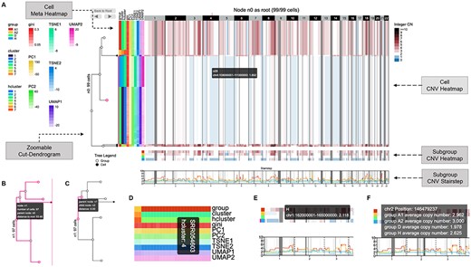
CNV view interface (https://sc.deepomics.org/oviz-project/analyses/view). (A) The full display of CNV view on demo data TNBC_T10. From left to right are zoomable cut-dendrogram, cell meta heatmap and cell CNV heatmap. Subgroup CNV heatmap and stairstep located in the bottom layers. The cell CNV heatmap exhibits the CN of single cells across the entire genome, with single cells as rows and genomic regions as columns. The blue, white and dark red tiles represent CN loss, neutral and gain. Gray tiles denote the CN of the corresponding genomic region is not available. The cut-dendrogram and CNV heatmap indicate two amplified tumor clumps (colored red), and one subclone exhibits loss of heterogeneity (colored with white and blue). When the mouse cursor hovers on the cell CNV heatmap, the tooltip will display the genome position and the CN of a unit. The name of the corresponding leaf node in the cut-dendrogram will also be shown. Furthermore, the genome position, the leaf node and the range of leaf nodes will be highlighted. (B) Zoomable cut-dendrogram node. The tooltip will display the name of the current node, the number of cells in it, the parent node of it and the distance between it and the root node. Further, the subtree and the covered cell range of the current node will be highlighted. (C) Zoomable cut-dendrogram branch. The tooltip will display the names of the associated parent and child nodes and their branch distance. The branch, the parent node and the child node will be highlighted. (D) Cell meta heatmap. The tooltip will display the cell ID and meta-label of a unit. (E) Subgroup CNV heatmap. The tooltip will display the genome position, the CN and the subgroup name. (F) Subgroup CNV stairstep. The tooltip will display the genome position and the average CN of cells for all subgroups.
Therefore, we present an online platform single-cell Somatic Variant Analysis Suite (scSVAS) (https://sc.deepomics.org) for real-time interactive and user-friendly single-cell CNV visualization. scSVAS offers 11 visualization interfaces, including CNV View, CNV Heatmap, Cell Phylogeny, Ploidy Stairstep, Ploidy Distribution, Embedding Map, Time Lineage, Space Lineage, Space Prevelance, Clonal Lineage and Recurrent Event (Figures 1–12, Table 1). To our knowledge, scSVAS is the first online platform specialized for large-scale scDNA CNV visualization that provides an arsenal of functionalities shared between visualization interfaces. For instance, we offer the users an editor to upload the required upstream analysis output and customize the display settings (Supplementary Figure S1 and Table S2). We provide an interactive tooltip to display vital information for each visualization object, assisting users in making scientific discoveries effectively. scSVAS is code free for users. All visualizations are downloadable in high-quality publication-ready format. We support dark and light themes for visualization and offer a collection of scientific (SCI) journal color palettes. Furthermore, scSVAS offers several unique biological visualization interfaces, including the grouped CN heatmap of cell clump; gene set and repeat masker annotation along the local genomic region; a zoomable circular dendrogram of single cells; cell-gene or cell-bin CN heatmap; ploidy stairstep/distribution of specified single cell and cell clump; 2D embedding map plot powered with hexagonal binning; movable lesion pointer to easy adjust the lesion position on zoomable anatomy image; lesion lineage tree; clonal frequency bipartite graph between tumor clone and lesion; ploidy stairstep comparison between parent and child clone; recurrent ploidy stairstep comparison between subclones and patients.
Materials and methods
Online platform framework
scSVAS is deployed on a remote CentOS 7.4 server with 128 GB memory and 60 TB storage. We utilized Ruby on Rails (v5.2.3), Apache (v2.4.6) and PostgreSQL (v12.3) as backend framework; HTML5, Vue.js (v2.6.10) and Oviz [36] (https://oviz.org), an in-house visualization framework written in TypeScript, as frontend support. Supplementary Table S1 lists the full technology stack of scSVAS.
Offline pipeline
For each visualization application, users need to prepare the input files (Supplementary Figure S1 and Table S2). Most of the customized file formats are easy to generate from upstream CNV analysis. At this moment, equipped with scSVAS offline pipeline, scSVAS supports output files from scDNA CNV calling tools 10X cellranger-cnv [14], SCYN and SeCNV. Users can use the provided scripts to generate the required files locally and upload them to the corresponding visualization pages. The offline pipeline is available at https://github.com/deepomicslab/scSVAS. The guidelines to run the offline scripts and prepare the input files are in the online documentation page of https://sc.deepomics.org.
Demo data
All online analyses provide demo files for an instant preview, which are available at Editor on each application page. Supplementary Table S3 demonstrates the demo datasets currently adopted. For CNV View, CNV Heatmap, Cell Phylogeny, Ploidy Stairstep, Ploidy Distribution, Embedding Map and Clonal Lineage, we downloaded the raw FASTQ data of TNBC_T10 with the SRA code SRA018951 [7], profiled the CNV matrix utilizing SCYN and generated the corresponded input files with scSVAS offline pipeline. For Time Lineage, Space Lineage and Space Prevalence, we obtained the input files (AML [37], HGSOC_P7 [38] and PC_A21 [39]) directly from E-Scape’s demo dataset [35]. The lung cancer data present in Recurrent Event are an in-house data and available at the Editor sidebar ‘Demo File Sets’ (https://sc.deepomics.org/oviz-project/analyses/recurrent_event).
Database
To make the scSVAS visualization more informative and user friendly, we utilize several third-party databases and websites. Ensembl [40] database helps to locate the exact gene and transcript in CNV Heatmap, Clonal Lineage, Recurrent Eevent applications. UCSC genome browser [41] provides the cytobands, non-N region and genome repeat annotation for visualization applications if applicable. In Cell Phylogeny, Clonal Lineage and Recurrent Event, redirection to GeneCards [42] www.genecards.org is offered. Furthermore, MsigDB (v7.2) [43] database is adopted for gene set annotation in Clonal Lineage and Recurrent Event.
2.1 Time and memory optimization for large-scale scDNA data
The loading time of a multitude of scDNA data has a significant impact on the user experience. The number of Oviz components needed directly affects the visualization interfaces’ rendering time, especially the CNV heatmap or embedding scatterplot, which carries thousands of single cells and genomic region bins. To reduce the time and space complexity, we apply the strategies of compression and loading on demand.
CNV heatmap is a matrix of CNV count with single cells as rows and genomic regions as columns, which is rendered as a grid of colored rectangles. The number of elements in the matrix could be huge, which dramatically slows down the rendering process. Therefore, we compressed the CNV data with an acceptable compression rate before rendering by merging adjacent DNA segments into larger ones, reducing the number of columns in the processed CNV matrix. We design a functional scaling slider to zoom-in the local genomic region to reverse the zooming process when higher resolution is in demand. The single-cell dendrogram tree (i.e. the nest relation of Oviz components) also could cause significant effects on the rendering speed of the output SVG diagram of the Oviz framework. For instance, an Oviz component directly containing a large number of subcomponents renders slower than rendering the same number of subcomponents that are evenly distributed to several containers. Therefore, we apply the cut-dendrogram to collapse the descending clades as a whole. This design breaks the whole heatmap grid into several fragments that are rendered separately, which dramatically improves the rendering time at around six times compared with generating all colored blocks in one container component. If a higher resolution is required, users can click a node in the cut-dendrogram, the selected node will be regarded as the temporary tree root, and a new subcut-dendrogram will be rendered.
The traditional embedding plot is a scatterplot that placed the single cells in a canvas with their 2D embedding coordinates. Thousands of singleton data points (e.g. single cells) caused colossal time and space burden. Instead of rendering a scatterplot with plenty of points overlapped, we exploit hexagonal binning to aggregates the adjacent data points into different hexagonal bins, which are mutually exclusive and size adjustable on a 2D-Embedding plot, according to the points’ original positions. We use Paths in SVG to define the hexagon shape of data bins, which is size adjustable. Each hexagon has a unique centroid, and all of them are aligned with the same offset and embedded well row by row on a 2D-Embedding plot without any gap.
Results
Single-cell CNV landscape and phylogeny
CNV heatmap is an intrinsic way to visualize the landscape of single-cell CNV profiles in the literature [19, 20, 22, 23, 44]. Efficient visualization of the heatmap with a large (e.g. 1k |$\times $| 5k) size is critical for scientific interpretation. Plotting using R, Python packages or existing heatmap visualization tools like E-Scape are incredibly time-consuming and memory-intensive when it reaches thousands of cells and thousands of genomic regions [35]. It is essential to reduce the size of the heatmap while retaining the heterogeneity among single cells. The 10x Loupe [14] solves this issue by building a single-cell dendrogram in advance, splitting single cells into less than 100 subgroups by cutting the dendrogram and collapsing single cells inside the cluster into one row in the heatmap. Cluster zoom-in/out operation is achieved by clicking the node in the dendrogram. However, 10x Loupe only supports the 10x CNV protocol. Thus, cooperating scSVAS offline pipeline, we build a web interface CNV View as demonstrated in Figure 2 and Table 1. CNV View exhibits the CN of single cells across the entire genome, with single cells as rows and genomic regions as columns. The blue, white and dark red tiles represent CN loss, neutral and gain. Gray tiles denote the CN of the corresponding genomic region is not available. If users offer the cut-dendrogram of cells, a zoomable cut-dendrogram will be displayed on the left (Figure 2A–C). The cell meta-annotation heatmap will be displayed on the left if users provide single-cell meta-information (Figure 2A and D). When users click a node in the cut-dendrogram, the selected node will be regarded as the temporary tree root, and a new subcut-dendrogram will be rendered. The cell CNV heatmap and meta panel will also be updated to fit the current cell range. The ‘Back to Root’ button returns the initial status of the whole CNV view. You may also utilize the left arrow and right arrow buttons to un-do and re-do zooming operations. Compared with Loupe, CNV View further visualizes the aggregate subgroup CNV heatmap and stairstep in the bottom layers (Figure 2A,E,F), which is commonly adopted in reputable publications [22, 23]. Figure 2A exhibits the CNV landscape of 99 triple-negative breast cancer single cells from demo data TNBC_T10 [7]. The cut-dendrogram and CNV heatmap indicate two amplified tumor clumps (colored red), and one subclone exhibits loss of heterogeneity (colored with white and blue).
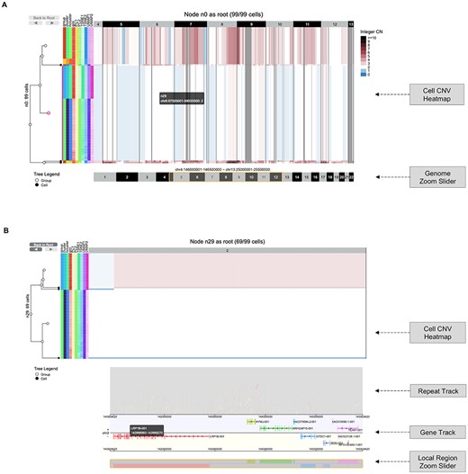
CNV heatmap interface (https://sc.deepomics.org/oviz-project/analyses/heatmap). (A) The display of CNV heatmap with genome zoom slider on demo data TNBC_T10. Users can adjust and drag the slider along the genome region to zoom-in and out. It shows the CNV profiles of five cut-dendrogram clades from chr4:146 000 001 to chr13:25 500 000. This demo figure shows two amplified tumor clumps (colored red), and one subclone exhibits loss of heterogeneity (colored with white and blue). (B) The display of local region chr2:140924620–145924620 CNV heatmap with repeat/gene track and a local region zoom slider on demo data TNBC_T10. The repeat elements in RepeatMasker database are stacked along the 50 M local region in the repeat track. When the mouse cursor hovers, the tooltip will display the names of repeat class, repeat element, repeat family, genome position and strand information of a selected repeat. The gene track lists all transcripts available (e.g. LRP1B) in the 50 M area. When the mouse cursor hovers on it, the tooltip will display the transcript name, gene body interval, exon number and exon intervals for covered gene exon. Users can adjust and drag the slider along the local region to zoom-in and out.
CNV Heatmap (Figure 3) extends CNV View by supporting extra genome region zooming, local region search and local region annotation (repeats and genes). There is a genome zoom slider located at the bottom of the CNV heatmap (Figure 3A). Users can drag the slider to zoom-in and out on the genome region. Users can also upload a bed region file or search for a local genome region. If the local genome region is less than 5 M base pairs, an annotation layer including ‘Repeat track’ and ‘Gene track’ will be displayed (Figure 3B). Figure 3A shows the CNV profiles of five cut-dendrogram clades from chr4:146 000 001 to chr13:25 500 000 on demo data TNBC_T10. Basically, there are two amplified tumor clumps (colored red), and one subclone exhibits loss of heterogeneity (colored with white and blue). Figure 3B displays the CNV profiles of local region chr2:140924620–145924620 with repeat/gene track on demo data TNBC_T10. The repeat elements in the RepeatMasker database are stacked along the 50 M local region in the repeat track. The gene track lists all transcripts available (e.g. LRP1B) in the 50 M area.
Besides, we build Cell Phylogeny (Figure 4) to concentrates on the zoomable cut-dendrogram of single cells. It offers two tree layouts (top-down and circular) and supports cell-gene or cell-region CNV as meta-annotation. Figure 4 suggests the CN of several genes (e.g. ANXA2) and genomics bins varies between cell clumps.
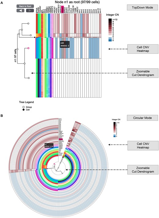
Cell Phylogeny interface (https://sc.deepomics.org/oviz-project/analyses/cell_phylogeny). (A) The display of Cell Phylogeny in top-down mode on demo data TNBC_T10. It shows that the CN of genes (e.g. ANXA2) and genomics bins vary between cell clumps. (B) The display of Cell Phylogeny in circular mode on demo data TNBC_T10. When the mouse cursor hovers on the cell CNV heatmap, the tooltip will display the column name of a unit (such as gene or bin region) and its corresponding leaf node in the cut-dendrogram. Furthermore, the column name, the leaf node and the leaf node’s range will be highlighted.
Single-cell ploidy profile
The tumor CNV in different regions may encounter dramatic gain or loss [33, 45–47]. The plot of ploidy line along the chromosomes can visually show the heterogeneity between tumor subclones by combining genomic coordinates. By collapsing the single cells in the same tumor subclones into one observation, we can infer the pseudo-bulk ploidy of each subclone. Since cancer CNV ploidy line fluctuates along chromosomes, we call it the ‘stairstep plot’. Besides, visualization of ploidy distribution reveals the ITH as well. Thus, we developed two web interfaces Ploidy Stairstep and Ploidy Distribution demonstrated in Figures 5 and 6, respectively. The layout is a matrix of the ploidy stairstep or density plot. The column lists categorical meta-labels available in uploaded files by default. The 1st row exhibits the ploidy of all subgroups for specific categorical meta-labels in an aggregate form. The 2nd line displays the collapsed ploidy of total single cells for bulk sequencing. Subsequent rows list the ploidy of all available subclones, respectively. Figure 5 illustrates that the averaged CNV of all cells would completely mask the heterogeneity, with the total ploidy changing around 2–4. When it goes to subclone-resolution, we can observe the diploid cell clump (group D, cluster 1, hcluster 1) and the loss of heterogeneity cell clump (group H, cluster 3, hcluster 3). CNV gained cell clump (group A1, group A2, cluster 2, cluster 4, hcluster 2 and hcluster 4). Figure 6 illustrates that the TNBC_T10 is a mixture of heterogeneous cells. We have diploid cell clump (group D, cluster 1, hcluster 1), loss of heterogeneity cell clump (group H, cluster 3, hcluster 3) and CNV gained cell clump (group A1, cluster 4 and hcluster 4).
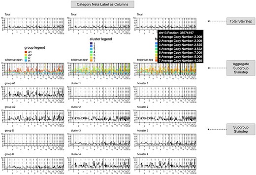
Ploidy Stairstep interface (https://sc.deepomics.org/oviz-project/analyses/ploidy_stairstep) on demo data TNBC_T10. With genome location as the x-axis and CN as the y-axis, the stairstep plot aims to show the fluctuation of CNV along the genome. It illustrates that the averaged CNV of all cells would completely mask the heterogeneity, with the total ploidy changing around 2–4. When it goes to subclone-resolution, we can observe the diploid cell clump (group D, cluster 1, hcluster 1), loss of heterogeneity cell clump (group H, cluster 3, hcluster 3) and CNV gained cell clump (group A1, group A2, cluster 2, cluster 4, hcluster 2 and hcluster 4). When the mouse cursor hovers on the plot, the tooltip will display the genome position and the average CN for each subgroup, respectively.
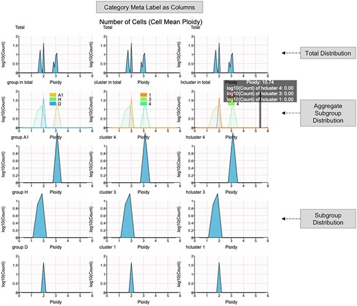
Ploidy Distribution interface (https://sc.deepomics.org/oviz-project/analyses/ploidy_distribution) on demo data TNBC_T10. With cell mean/median ploidy as the x-axis and the number of cells as the y-axis, the ploidy distribution plot aims to reveal the ITH. It illustrates that the TNBC_T10 is a mixture of heterogeneous cells. We have diploid cell clump (group D, cluster 1, hcluster 1), loss of heterogeneity cell clump (group H, cluster 3, hcluster 3) and CNV gained cell clump (group A1, cluster 4 and hcluster 4). When the mouse cursor hovers on the plot, the tooltip will display the current ploidy value and density for each subgroup, respectively.
Single-cell 2D embedding
High-dimensional data could be challenging to visualize. Reducing data into two dimensions is essential for representing the inherent structure of the data [48]. In terms of today’s large-scale scDNA throughput, a vast number of single cells may overlap on the conventional 2D scatter canvas, thus disguising essential information. Embedding Map (Figure 7) defeats this obstacle utilizing hexagonal binning [49, 50], which also has benefits on time and memory complexity. We offer different strategies to color the single-cell data point. If the ‘hexagon mode’ is activated, the embedded cells colored with density will be displayed. With gene CNV profiles, the embedded cells can be annotated by the specified gene’s CN. Moreover, all categorical meta-labels available will be used as color schemes by default. We also provided the scSVAS offline pipeline, which offers linear and nonlinear embedding techniques (e.g. PCA [51], ICA [52], NMF [53], UMAP [54], TSNE [55], PHATE [48] and DeepMF [56]) to generate the input files. Figure 7A shows that nonlinear TSNE and UMAP map single cells from the same subclone closer than PCA. Besides, the scatterplot demonstrates that CN loss of TUBA1B happens in some cells, whereas the overplotting problem prevents us from seeing its full picture. Figure 7B indicates that the loss of gene TUBA1B mainly appears in tumor group H.
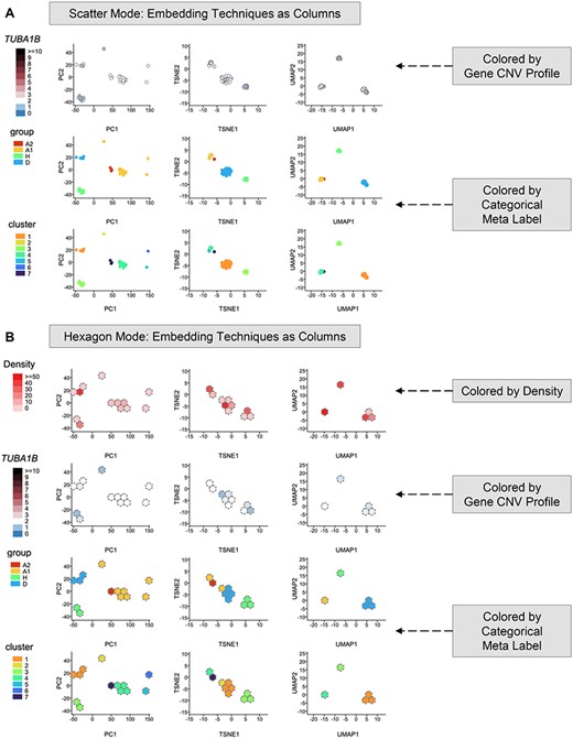
Embedding Map interface (https://sc.deepomics.org/oviz-project/analyses/embedding_map) on demo data TNBC_T10. (A) Embedding Map in scatter mode. This figure shows that nonlinear TSNE and UMAP map single cells from the same subclone closer than PCA. Besides, the scatterplot demonstrates that CN loss of TUBA1B happens in some cells, whereas the overplotting problem prevents us from seeing its complete picture. When the mouse cursor hovers on the scatter point, the tooltip will display the x and y coordinates, the coloring value and the cell ID. (B) Embedding Map in hexagon mode. This figure indicates that the loss of gene TUBA1B mainly appears in tumor group H. The tooltip will display the x and y coordinates, the coloring value, the number of cells in the hexagon bin and the list of cell IDs.
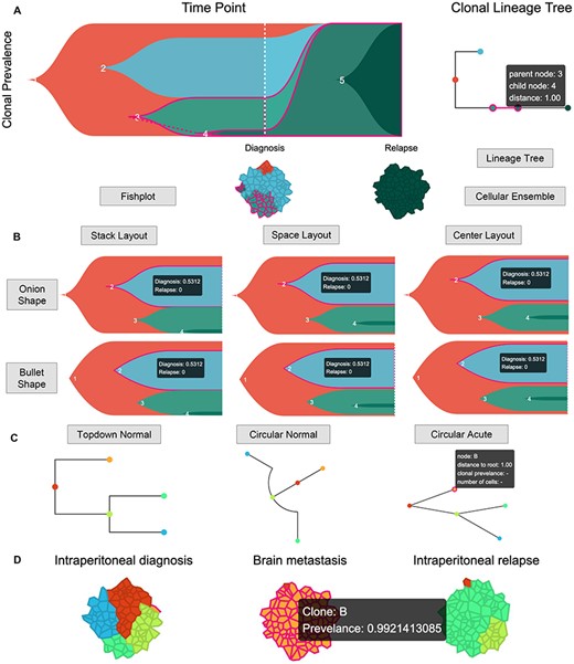
Time Lineage interface (https://sc.deepomics.org/oviz-project/analyses/time_lineage). (A) The whole display of Time Lineage on demo data AML. The top left, top right and bottom place the fishplot, lineage tree and cellular ensemble, respectively. We observed four tumor clumps at the time of diagnosis: subclones 2, 3, 1 and 4 ordered with cellular prevalence from high to low. The fishplot and lineage tree show the tumor originated from subclone 1. Next, it derived to subclones 2 and 3. Then subclone 3 evolved into subclone 4. By the time of relapse, all pre-existed subclones 1–4 were distinct, and the subclone 5 evolved from subclone 4 occupied the entire lesion. When the mouse cursor hovers on the one Oviz object (e.g. the lineage tree branch between subclones 3 and 4), all related Oviz objects (e.g. subclones 3 and 4 in fishplot and cellular ensemble) are highlighted, and tooltips with vital information will appear. (B) The display of fishplot with available shapes and layouts on demo data AML. When the mouse cursor hovers on one subclone, it will be highlighted, and a tooltip with its cellular prevalence at all timepoints will appear. (C) The display of lineage tree with available shapes on demo data HGSOC_P7. The tumor started from subclone A and derived to subclones B and C. Then, subclone C further evolved to subclones D and E. If the mouse cursor hovers on one clone node, it will be highlighted, and tooltips with its node name, distance to root, clonal prevalence and the number of cells will appear. (D) The display of cellular ensemble of five tumor clumps with three timepoints: intraperitoneal diagnosis, brain metastasis and intraperitoneal relapse for demo data HGSOC_P7. If the mouse cursor hovers on the cellular clump, it will be highlighted, and a tooltip with its clonal name and prevalence will appear.
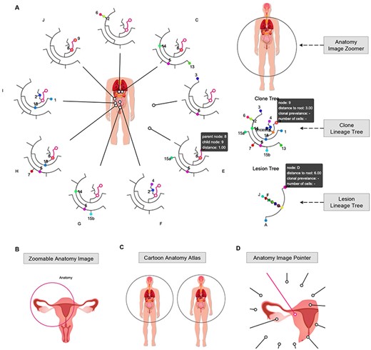
Space Lineage interface (https://sc.deepomics.org/oviz-project/analyses/space_lineage). (A) The full display of Space Lineage on demo data A21. In the left panel, clonal lineage trees from multiple lesions surround a zoomable anatomical image, and each lineage tree is equipped with an image pointer referring to the exact location of the anatomical image. The right panel has the anatomy image zoomer, clone lineage tree and lesion lineage tree from top to bottom. This demo figure shows that 16 tumor clumps were detected in nine primary and metastasis lesions from a prostate cancer patient. The clonal lineage tree suggests that through tumor evolution and metastasis, subclones are scattered in different lesions. When the mouse cursor hovers over one Oviz object (e.g. the lineage tree branch link to clones 8 and 9), associated Oviz objects will be highlighted, and tooltips with essential information will appear. (B) The display of zoomable anatomy image. Users can right click the image circle to active and deactivate it. Users can drag the circle to anywhere they want in the anatomy image to make the left/right position adjustments when the image circle is activated. Users can also adjust the radius of the anatomy image for zooming. (C) Demonstration of cartoon anatomy atlas. Users can select different anatomy images from the license-free cartoon anatomy atlas (male, female, brain, intestines, kidney, liver, lung, pancreas, stomach, thymus, thyroid, urinary system, male reproductive system and female reproductive system). Freepik and macrovector/Freepik design the cartoon anatomy images, we acknowledge for the free license. (D) The display of anatomy image pointer. Users can right click to active the anatomy image pointer and drag it to the exact lesion position.
Clonal dynamics in time and space
Many studies have observed that ITH is one of the principal causes of cancer therapy resistance, tumor recurrence and deaths [1]. An accurate understanding of the subclone structure and evolutionary history benefits precise treatments for individual patients [2]. Unlike the traditional phylogenetic trees as visualized in Cell Phylogeny, the clonal lineage tree more accurately reflects the process of tumor evolution. Ancestors and offspring tumor cells/subpopulations can coexist in a clonal lineage tree; therefore, the internal node can be the single-cell/subpopulation we observed. The tumor accumulates mutations over evolution time, and child tumor cell/subpopulation carries parental and newly acquired aberrations. The tree linkage between parent and child nodes is more about asymmetric subset connections than symmetric distance. There are several forms to visualize the clonal lineage tree with subclones as tree nodes. For example, fishplot presents clonal dynamics over time [37, 57, 58]; sphere of cells (cellular ensemble) present clonal subpopulations of a sample [35, 58], and annotated node-based [35, 58] and branch-based trees present clonal relationships and seeding patterns between samples [58]. Single-cell genomics data help researchers to resolve the ITH among multiple timepoints [23, 59] or lesions [21]. Here, we build three web interfaces Time Lineage, Space Lineage and Space Prevalence to visualize the evolution dynamics between tumor subclones over time and space.
Over the past decades, researchers have been interested in studying the clonal dynamics from multiple timepoints. For example, the time lineage between subclones before and after therapeutic intervention [23, 59]. In scSVAS, web interface Time Lineage (Figure 8A) is composed of fishplot, lineage tree and cellular ensemble. The fishplot conceptually manifests the proportion of tumor subclones at different tumorigenesis stages across different timepoints. We use the bezier curve to fit the trend of subclones over time with two distinct head shapes (bullet and onion) and three layouts (stack, space and center) (Figure 8B). The lineage tree exhibits the evolutionary relationship between tumor subclones; three different shapes (top-down normal, circular normal and circular acute) are served (Figure 8C). The cellular ensemble is an abstract presentation of the tumor’s cellular prevalence at a certain time point (Figure 8D). Figure 8A and B showcases the Time Lineage of demo data AML [37]. We observed four tumor clumps at the time of diagnosis: subclones 2, 3, 1 and 4 ordered with cellular prevalence from high to low. The fishplot and lineage tree show the tumor originated from subclone 1. Next, it derived to subclones 2 and 3. Then subclone 3 evolved into subclone 4. By the time of relapse, all pre-existed subclones 1–4 were distinct, and the subclone 5 evolved from subclone 4 occupied the entire lesion. Figure 8C and D illustrates the lineage history of demo data HGSOC_P7 [38]. The tumor started from subclone A and derived to subclones B and C. Then, subclone C further evolved to subclones D and E. At intraperitoneal diagnosis, the cellular proportion of tumor clumps from high to low were subclones A, C, E and D. By the time of intraperitoneal relapse, subclones A and A B were almost distinct, remaining dominant and secondary tumor clumps D and C, respectively. As for the brain metastasis, tumor clump B taken over the entire lesion.
Space Lineage (Figure 9A) shows the clonal dynamics across multiple lesions. In the left panel, clonal lineage trees from multiple lesions surround a zoomable anatomical image, and each lineage tree is equipped with an image pointer referring to the exact location of the anatomical image. The right panel has the anatomy image zoomer, clone lineage tree and lesion lineage tree from top to bottom. Users can make left/right position adjustments and zoom-in/out of the anatomy image exploiting the anatomy image zoomer (Figure 9B). Users can select different anatomy images from the license-free cartoon anatomy atlas (male, female, brain, intestines, kidney, liver, lung, pancreas, stomach, thymus, thyroid, urinary system, male reproductive system and female reproductive system) (Figure 9C). Instead of the arduous lesion position precalculation required in E-Scape [35], users can right click to active the anatomy image pointer and drag it to the exact lesion position (Figure 9D). Figure 9A manifests the Space Lineage of demo data PC_A21 [39]. There are 16 tumor clumps detected in nine primary and metastasis lesions from a prostate cancer patient. The clonal lineage tree suggests that through tumor evolution and metastasis, subclones are scattered in different lesions.
Space Prevalence (Figure 10) provides the subclone and lesion lineage trees and visualizes the clonal prevalence across subclones and lesions utilizing matrices and bipartite graphs. For instance, subclone 5 was detected in four lesions (C, G, E and H); lesion D are dominant by subclone 3.
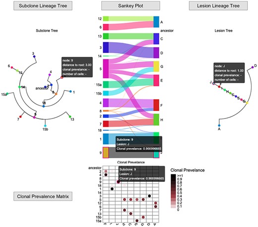
Space Prevalence interface (https://sc.deepomics.org/oviz-project/analyses/space_prevalence) on demo data A21. There are subclone lineage trees, Sankey plot or clonal prevalence matrix and lesion lineage tree from left to right. It visualizes the clonal prevalence across subclones and lesions vividly. For instance, subclone 5 was detected in four lesions (C, G, E and H); lesion D was dominant by subclone 3. The tooltip will display the name of the subclone/lesion, the clone prevalence at each timepoint if available. The corresponding subclone/lesion in the lineage tree, fishplot and Sankey plot will be highlighted.
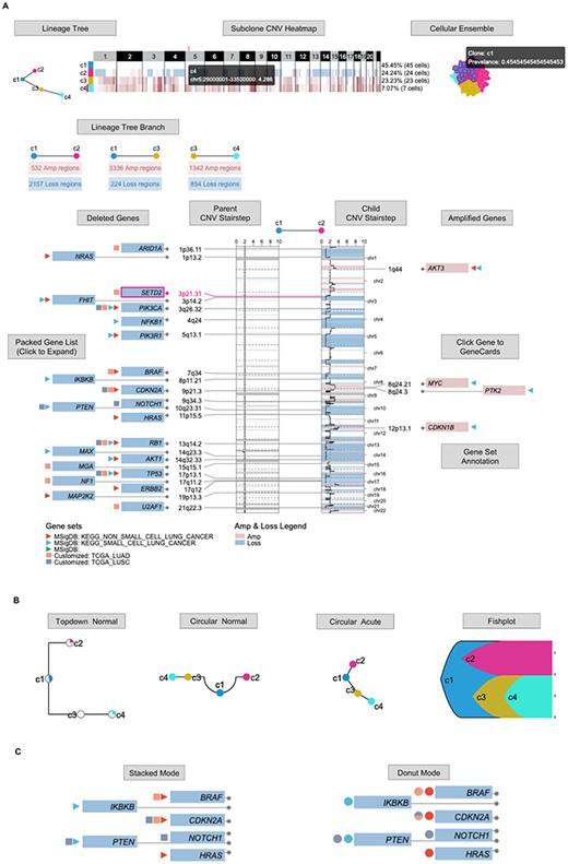
Clonal Lineage interface (https://sc.deepomics.org/oviz-project/analyses/clonal_lineage). (A) The full display of Clonal Lineage on demo data TNBC_T10. This demo figure shows the tumor started from diploid subclone c1, then derived to subclone c2 with 532 amplification regions and 2157 loss regions. Subclone c1 was also derived to subclone c3 with 3336 amplification regions and 224 loss regions. Subclone c3 further evolved to c4 with 1342 amplification regions and 854 loss regions. Compared with the diploid c1 cells, tumor cells in subclone c2 harbors some CNV gain of oncogenes. For instance, AKT3, MYC, PTK2 and CDKN1B. In addition, plenty of carcinogenic genes in subclone c1 displays the loss of heterogeneity, such as PTEN, PIK3CA, NOTCH1, TP53, etc. When the mouse cursor hovers on one Oviz object, all related objects will be highlighted, and the tooltip will display vital information. (B) The display of lineage tree with available shape. (C) The display of gene set annotation with stacked and donut modes.
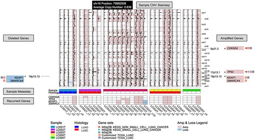
Recurrent Event interface (https://sc.deepomics.org/oviz-project/analyses/recurrent_event) on demo data LC. From left to right, there are deleted gene boxes, sample subclone CNV stairstep and amplified gene boxes. The bottom layers show the sample metadata and recurrent genes. This demo figure indicates recurrent CNV gains on oncogenes CDKN2A, TP53, KEAP1 and SMARCA4 across lung cancer patients.
CNV shift across subclone
The clonal lineage trees (Time Lineage and Space Lineage) vividly show the evolutionary dynamics between tumor subclones. Nevertheless, they fail to display the acquired CNV between parent and child clones over the evolution history. To further illustrate the CNV shifts over the clonal lineage tree branch, we built the web interface Clonal Lineage (Figure 11A), which is composed of lineage tree, subclone CNV heatmap, cellular ensemble, lineage tree branch, parent/child CNV stairstep and gene box. The lineage tree shares four different types: top-down normal, circular normal, circular acute and fishplot as demonstrated in Figure 11B. The group CNV heatmap displays the averaged CN profiles of subclones. The lineage tree branch displays the number of gain and loss regions for each tree branch. The stairsteps depict the detailed CNV shift from the parent node to the child node annotated with deleted and amplified genes. We offer MsigDB [43] and customized gene set annotation with stacked and donut modes (Figure 11C). Users can click the gene to direct to the GeneCards [42] website page. One can click the lineage tree branch to check the different CNV shifts and study the clonal dynamics from multiple timepoint visualization of clonal lineage across time. Figure 11A shows that the tumor started from diploid subclone c1, then derived to subclone c2 with 532 amplification regions and 2157 loss regions. Subclone c1 was also derived to subclone c3 with 3336 amplification regions and 224 loss regions. Subclone c3 further evolved to c4 with 1342 amplification regions and 854 loss regions. Compared with the diploid c1 cells, tumor cells in subclone c2 harbors some CNV gain of oncogenes. For instance, AKT3, MYC, PTK2 and CDKN1B. In addition, plenty of carcinogenic genes in subclone c1 display the loss of heterogeneity, such as PTEN, PIK3CA, NOTCH1, TP53, etc.
Focal gain and loss across cohort
Recurrent focal CNV across a batch of tumor samples may be the possible driver CNV [60]. Here, Recurrent Event (Figure 12) provides the interactive and real-time visualization of focal gains and losses across multiple subclones and samples. In the middle, it displays the CNV stairsteps of all subclones across samples. The left and right gene boxes show the recurrent gain and loss genes, respectively. Similar to Clonal Lineage, customized gene selection and gene set (self-customized and MsigDB) annotation are provided. Besides, the bottom layers demonstrate available meta-sample information and recurrent CNV genes. Figure 12 demonstrates that there are recurrent CNV gains on oncogenes CDKN2A, TP53, KEAP1 and SMARCA4 across lung cancer patients.
Discussion
Visualization of single-cell CNV data plays an essential role in sharing scientific results and acting as an auxiliary tool for data investigation. Several visualizations for understanding single-cell genomics have been demonstrated in published articles and software packages. However, they lack real-time interaction, and writing code to reproduce them is tedious. Moreover, with the stride of high throughput scDNA sequencing, the scale of sequenced cells escalates exponentially [3, 14, 61]. Efficient visualization of single cells with a large (e.g. 1k |$\times $| 5k) size is critical for scientific interpretation. Plotting using R/Python packages or existing single-cell visualization tools is incredibly time-consuming and memory-intensive when it reaches thousands of cells and thousands of genomic regions.
Herein, we introduce an online visualization platform, scSVAS, that offers user-friendly and real-time interactive single-cell genomics data visualization. It offers eleven web visualization interfaces, including CNV View, CNV Heatmap, Cell Phylogeny, Ploidy Stairstep, Ploidy Distribution, Embedding Map, Time Lineage, Space Lineage, Space Prevalence, Clonal Lineage and Recurrent Event. scSVAS is specifically designed for large-scale single-cell analysis. scSVAS is code-free; users have loads of choices to customize the visualization with simple mouse operations and export the visualizations into figures. In addition, we provided an informative user manual and demo cases.
Dedicated tools for visualizing the single-cell genomics and CN evolution include Ginkgo [34], E-Scape [35] and 10x Loupe scDNA Browser [14] (Table 1). With the aid of Oviz [36] visualization framework, the scSVAS platform supports their functionalities and allows more exploratory functions by using informative tooltips, simultaneously highlighting, zoom-in/out, mouse drag-in/drag-out, etc. (Figure 1B and C and Table 1). In particular, both 10x Loupe scDNA Browser and scSVAS (CNV View and CNV Heatmap) show cell CNV heatmap with cell metadata annotation, scSVAS offers extra user options to sort the cells according to meta-label. Moreover, scSVAS provides RepeatMasker annotation when displaying local genomic regions. In another case, both E-Scape and scSVAS (Space Lineage) display clonal evolution dynamics across space, with each lesion lineage tree pointing to the exact position of the anatomy image. scSVAS eliminates the tiresome estimation of accurate coordinates of lesion positions with simple mouse operations, allowing users to activate the lesion pointer and move it to the ideal position on the anatomy image. Furthermore, we provide a zoomable human anatomy atlas (license-free) and extra zoom-in and out functionalities. In addition, scSVAS contributes a more comprehensive set of single-cell CNV analysis results, including top-down and circular cell phylogeny, CNV ploidy stairstep and distribution, CNV embedding map, CNV shift along clonal lineage, subclone-level recurrent CNV, thus affording a one-stop service for single-cell CNV clonal visualization.
Conclusion
scSVAS provides versatile utilities for managing, investigating, sharing and publishing single-cell CNV profiles. We envision this online platform will expedite the biological understanding of cancer clonal evolution with single-cell resolution.
Informative visualization of single-cell copy number analysis results boosts productive scientific exploration, validation and sharing.
We present an online visualization platform, scSVAS (https://sc.deepomics.org), for real-time interactive single-cell genomics data visualization.
scSVAS is specifically designed for large-scale single-cell analysis.
Eleven web interfaces are developed, including CNV View, CNV Heatmap, Cell Phylogeny, Ploidy Stairstep, Ploidy Distribution, Embedding Map, Time Lineage, Space Lineage, Space Prevalence, Clonal Lineage and Recurrent Event.
Data availability
All data used for visualization are available at https://sc.deepomics.org.
Software availability
All functionalities of scSVAS described in the manuscript are free for anonymous access. Users can click https://sc.deepomics.org/oviz-project to try out all visualization applications. The offline pipeline is available at https://github.com/deepomicslab/scSVAS.
Author contributions statement
S.C.L. supervised the project. L.C., Y.Q., R.L. and C.L. implemented the visualization applications. H.L. provided the back-end and front-end framework of the server. L.C. and X.F. prepared the demo data. L.C. wrote the manuscript. S.C.L revised the manuscript. All authors read and approved the final manuscript.
Acknowledgments
We thank Miss Xinye Zhang for her assistance in drawing the application thumbnail illustration. Freepik and macrovector/Freepik design the anatomy images used in Figure 1 and Space Lineage interface, we acknowledge for the free license.
Funding
Hong Kong Innovation and Technology Fund (ITF 9440236).
Lingxi Chen, Ph.D., graduated from the Department of Computer Science, City University of Hong Kong. Currently, she is a PostDoc in the Department of Computer Science, City University of Hong Kong. She is interested in bioinformatics, deep learning, data visualization, and algorithm development.
Yuhao Qing, BSc, graduated from the Department of Computer Science, City University of Hong Kong. Currently, he is a Ph.D. candidate in the Department of Computer Science, the University of Hong Kong. He is interested in data visualization and machine learning systems.
Ruikang Li, BSc, graduated from the Department of Computer Science, City University of Hong Kong. Currently, he is a master candidate in the Department of Computer Science, Duke University. He is interested in algorithm development and data visualization.
Chaohui Li, BSc, graduated from the Department of Computer Science, City University of Hong Kong. Currently, he is a research assistant in the Department of Computer Science, City University of Hong Kong. He is interested in algorithm development and data visualization.
Hechen Li, BSc, graduated from the Department of Computer Science, City University of Hong Kong. Currently, he is a Ph.D. candidate in the School of Computational Science and Engineering, Georgia Institute of Technology. He is interested in algorithm development and data visualization.
Xikang Feng, Ph.D., graduated from the Department of Computer Science, City University of Hong Kong. Currently, he is an assistant professor at the School of Software, Northwestern Polytechnical University. He is interested in bioinformatics, deep learning, and algorithm development.
Shuai Cheng Li, Ph.D., graduated from the Department of Computer Science, University of Waterloo. Currently, he is an associate professor at the Department of Computer Science, City University of Hong Kong. He is interested in bioinformatics, deep learning, and algorithm design.
References
Author notes
Lingxi Chen, Yuhao Qing and Ruikang Li Joint First Authors.
