


Abstract
Cohort or period components of trends can provide a rationale for new research or point to clues on the effectiveness of control strategies. Graphical display of trends guides models that quantify the experience of a population. In this paper, a method for smoothing rates by single year of age and year is developed and displayed to show the contributions of period and cohort to trends. The magnitude of the contribution of period and/or cohort in a model for trends may be assessed by the percentage of deviance explained and the relative contributions of cohort (C) and period (P) individually, known as the C-P score. The method is illustrated using Surveillance, Epidemiology, and End Results data (1975–2014) on lung and bronchial cancer mortality in females and prostate and colorectal cancer incidence in males. Smoothed age-period and age-cohort rates provide a useful first step in studies of etiology and the impact of disease control without imposing a restrictive model. We found that, in this data set, cohort predominates for female lung and bronchial cancer and period predominates for male prostate cancer. However, the effects change with age for male colorectal cancer incidence, indicating an age shift in relevant exposures. These methods are applied on an interactive website for both incidence and mortality at over 20 cancer sites in the United States.
Disease trends provide valuable insight and a useful starting point for the study of etiology and the planning of strategies for disease control. Interpretation of temporal trends depends on perspective. From the standpoint of age or time since birth, trend reflects the aging process. Alternatively, date of occurrence or period may suggest an effect of changes in exposure or implementation of diagnostic practice on the classification of disease. Likewise, one might consider year of birth or cohort, which is the difference between calendar year and age, as a reflection of exposures associated either with birth itself or with a generation. In initial analyses for trends, it is essential to use precise estimates, and here we present an approach for obtaining an accurate estimate of trend. It is also important to use displays that do not require modeling, which introduces strong assumptions that may not hold in practice. By first visualizing trends, one can more confidently proceed to modeling or take alternative steps to study etiology.
Mortality rates are one aspect of cancer etiology that can be important. However, interpretation of these trends mixes the contributions of exposure to causal agents and change in treatment affecting prognosis. It is important to consider both incidence and mortality when developing disease control strategies.
Registration of cancer cases in a defined population began in Connecticut in 1940, and cases were retrospectively identified to 1935 (1). In 1942, the Danish Cancer Registry was founded (2), and cancer registries were found to be so valuable that they have continued to be established throughout the world. In the United States, the Surveillance, Epidemiology, and End Results (SEER) Program was launched in 1973 (3). It covered 9% of the US population in 1975 (SEER 9 registries) and now covers approximately 30% of the nation (4). Information collected on each cancer patient includes demographic characteristics, description of the cancer, treatment, and mortality. These data are publicly available, and results are cited in medical literature and popular media.
Temporal frameworks for disease trends are patient’s age, period (date of occurrence), and cohort (patient’s birth year) (5, 6). Age-period-cohort models provide a formal analysis of the extent of the contribution of each component to trend, but results can be confusing. Limitations arise from the identifiability problem because cohort is the difference between period and age, so that all combinations can be represented by 2 dimensions and not 3 (7–11). In addition, modeling imposes a rigid formulaic structure on results, which can mask nuances in the data. Before model-fitting, it is essential to first appreciate data without imposing structural restrictions. The National Cancer Institute’s SEER website (12) gives age-cohort and age-period displays of trends calculated using the methods described here. This provides a graphical summary of the contributions of cohort and period without imposing the restricted framework of a model.
The precision of rate estimates is inversely related to the number of cases, which is commonly controlled by expanding time intervals to 5 or 10 years for periods and ages. This correspondingly reduces detail in trend lines, which visually masks important elements of trend—for example, the point where the line bends. Here we describe an approach for using windows in time and how they can be used to visually display trends. The SEER website implements these new displays of trends, making them accessible. We describe the approach for estimating rates by single years of age and period that reduces both random error and bias from loss of curvature detail (13). We also quantify overall and individual contributions that cohort and period add to trends from age and constant incremental change in the log rate.
Age-period-cohort modeling is complex and requires a conceptual understanding of statistical issues, as well as familiarity with the use of available software (14, 15). The purpose of the methodology and website described here is to promote entrée to a basic nonparametric representation of data across many cancer sites in a format that is accessible to a broad audience. This representation is useful for gaining an understanding of the forces driving trends and as a starting point for more detailed and sophisticated analyses.
METHOD FOR VISUALIZING TEMPORAL TRENDS IN CANCER RATES
Cancer risk factors often manifest their effect multiplicatively, which is represented by using a log scale for the disease rate axis (16). We describe what to consider in a display of trends when temporal effects are additive on the log scale. In the modeling framework, these are given as an age-period-cohort model, and we consider ways to visualize these effects.
Age, period, and cohort contributions to trend
Risk of degenerative disease, like cancer, usually increases with age, although risk for some sites decreases. In either case, age is an essential factor that must be included in a statistical model.
Changes in risk by period might arise if exposure affects people of all ages. Air pollution, for example, could be such an agent, but it can also result from artifactual changes in data collection. Definitions or changes in medical diagnosis technology often affect all ages at the same time, and these would produce a period effect.
In the 1940s and 1950s, the synthetic estrogen diethylstilbestrol was given to expectant mothers at high risk of spontaneous abortion in the mistaken belief that this would improve the likelihood of a successful birth. Instead, female children of mothers receiving this treatment had a greatly increased risk of vaginal cancer (17–20). The cohort or generation of women born during this time would have greater risk of vaginal cancer, resulting in a cohort effect. Cohort effects are not limited to exposures associated with birth, but they are changes that affect only specific age groups or generations. Military recruits in World War II were given free cigarettes, producing a generational shift in exposure for this carcinogen and a change in this cohort’s risk of smoking-related cancer.
Figure 1 shows age-specific rates for a hypothetical cancer site in which period and cohort effects are either linear or curved. Cohort is indicated on the left horizontal axis and period on the right. Data are typically collected for relevant ages by period, resulting in a rectangular table of rates. If 1975 is the earliest year, the earliest cohort for a 50-year-old would be 1925. Likewise, the earliest cohort for a 40-year-old would be 1935. Hence, tabulation by cohort would appear as a parallelogram, not a rectangle, because some birth years would not have data for some ages. This results in truncated lines for cohort, as displayed in Figure 1. Parallelism depends on the line segments that are equidistant vertically—that is, the distance between trend lines following the vertical grid.
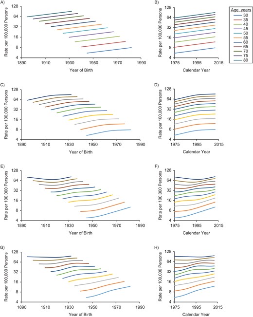
Cohort and period trends for a hypothetical cancer site in which period and cohort trends are either linear or curved by age (ranging from age 30 years (lowest) to age 80 years (highest)). The graph depicts cohort (A) and period (B) trends when both cohort and period are linear; cohort (C) and period (D) trends when cohort is linear and period is curved; cohort (E) and period (F) trends when cohort is curved and period is linear; and cohort (G) and period (H) trends when both cohort and period are curved.
In parts A and B of Figure 1, both period and cohort are linear, and all trends are linear and parallel. It is not possible to distinguish period and cohort contributions, which is the essence of the identifiability problem that arises when all 3 temporal factors are included in the same model (7–9). Parts C and D of Figure 1 show trends when period is curved but cohort linear. Trends are parallel for the period plot, but cohort trends are not parallel. If the cohort trend is curved but the period is linear, the plot resembles parts E and F of Figure 1, in which cohort trends are parallel but period trends are not. Finally, if both period and cohort are curved, then none of the lines are parallel (see Figure 1, parts G and H). Figure 1 depicts the additive contributions of the temporal elements, as shown in equation 1; and only parts G and H of Figure 1, in which both period and cohort have curved effects, show trends that are not parallel. Of course, one might consider a model in which the cohort effect changes with period, which might be represented by inclusion of an interaction term, and trend lines would not be parallel.
Smooth rates
The estimated disease rate for a given age and period is the number of cases or deaths divided by the midyear population. Under broad conditions, this is a maximum likelihood estimator with the standard error of its logarithm given by the reciprocal of the square root of the numerator (21). For many cancer sites, the numerator is small, especially for young ages, yielding a relatively large standard error or an imprecise estimate. (See Web Appendix 1, available at https://dbpia.nl.go.kr/aje.)
The standard error can be reduced by widening the age and/or period window, thus increasing the number of cases. This is commonly done by using 5- or 10-year age and period intervals. While this reduces the standard error, graphical display of trend is a step function, which reduces detail in a curve’s shape. This change effectively introduces bias into the curved trend, so that one is introducing another error into the estimate while trying to improve the standard error. To reduce bias, we vary the age-period window over the range of years and assign the estimate for the window to the center point. We limit window size by specifying the tolerance for the differences between observed and smoothed rates. For a given radius of time, the numerator is the total number of cases within this radius, and similarly the denominator is the sum of midyear populations. Compared with the crude rate, the number of cases is now larger; thus, the standard error of the estimate has been reduced. At the same time, increasing the radius may increase bias for the estimate. More explicit detail on this approach is provided in Web Appendix 1 and Web Figure 1.
Window selection criteria
To assess goodness of fit for smoothed estimates, we compare the expected number of cases (i.e., the smoothed rate estimate times the midyear population) with the observed number. As a measure of goodness of fit, we use Pearson’s χ2 divided by the number of cells being considered. The total number of cases varies over the range of ages, as does the trend’s curvature, which can affect the magnitude of the discrepancy between observed and expected numbers of cases. To assess the variation, age is broken into 5-year categories, and we use the largest radius that is less than a specified goodness-of-fit criterion, a criterion meant to reduce the standard error while limiting bias. The choice of selection criterion is arbitrary, but we have observed that selecting the largest radius that has a goodness-of-fit criterion less than 1.5 works well. (See Web Appendix 2.)
If trends for both age and period were flat, the estimated rate would be unbiased, and the fit measure would approach 1. Alternatively, if the trend is linear, if there is little variability in numerators and denominators for the cells, and if the number of cells is balanced both above/below and right/left of the reference cell, the fit measure again approaches 1. If there is sharp curvature or a change in direction, bias can become important and the fit measure can become large. Likewise, imbalance in the number of cells surrounding the reference cell can introduce bias, indicating poor fit. These values depend on the size of the numerator; that is, higher rates result in more cases, which increases the fit statistic if there is bias. In general, the value of the goodness-of-fit measure increases with the radius, and we select the smoothing radius as the value when the fit statistic crosses the threshold.
Measure of period and cohort contributions to trend
Deviance measures of lack of fit for a statistical model
The baseline model uses only age and drift. If period and cohort are added to this model, deviance is reduced, and the proportion of the reduction measures the strength of the evidence that period and cohort have improved the fit of the age-period-cohort model. When both period and cohort are linear, drift will fully explain their contributions to the temporal trend, and the proportion explained by adding curvature elements will be small. This is because random variation is not accounted for in the model.
Adding period to the model with age and drift is only adding period curvature. Similarly, adding cohort to the age-drift model is including cohort curvature. A comparative measure of the contribution of these variables, the C-P score, is the difference between the cohort contribution (C) and the period contribution (P) divided by the contribution of adding both to the age-drift model. This measure is the same regardless of whether one adjusts only for age and drift or also adjusts for the missing temporal factor. The range of values for the C-P score is −1 to +1, with negative values indicating predominance of period over cohort (i.e., more parallelism in the age-period plot) and positive values indicating the converse (i.e., more parallelism in the age-cohort plot). These values help guide the viewer as to what to look for in the plots. The percentage of deviance explained indicates the extent to which period and cohort taken together can explain model trends. If there is substantial noise in the rates or there are factors missing from the model (e.g., a cohort effect that applies only to premenopausal women), the percentage of deviance will be lower. The C-P score indicates which factor is dominating (i.e., are the lines more parallel on period or cohort?). (See Web Appendix 3.)
ILLUSTRATIONS OF SMOOTHING METHODOLOGY
The methods described in this article are provided on a website that displays age-cohort and age-period graphs for cancer incidence and mortality data for over 20 cancer sites in the United States (12). Users can select a cancer site and display graphs showing estimated trends for males, females, and both sexes combined. In addition, the percentages of deviance explained by period and cohort are given, along with the C-P score. Finally, a scatterplot of C-P scores by percentage of deviance explained is shown for all major cancer sites. This website is updated each year as the current data become available. In future revisions of this website, we will consider including breakdowns by race/ethnicity, location, and cancer subsite. Insights gained through the added detail will help to reveal differences caused by disparities, exposure, and access to health care. Smaller numerators will reduce the precision of the estimates and/or require a larger window size, which can mask curvature in trends. Dividing the data into smaller subgroups will eventually limit the practical extent of refinements that can be used.
To illustrate, consider cancer incidence and mortality trends from SEER registries and US mortality for the period 1975–2014. Cohort and period trends are shown for 3 examples in Figures 2–4. Female lung and bronchial cancer mortality have nearly parallel lines in the cohort graph (Figure 2A) but not the period graph (Figure 2B). This indicates that cohort is the dominant factor. Strong risk factors that change with birth cohort are suggested (e.g., cigarette smoking). Holford et al. (22) have provided estimates of cigarette smoking history by cohort, and Figure 5 shows prevalence estimates for females aged 30 years by cohort. Most smokers begin smoking at young ages, and few have ceased smoking by age 30 years, so this provides a useful index of exposure for cohorts. The peak smoking prevalence at age 30 years occurs for the 1930 cohort, which is also the cohort with the highest lung cancer mortality rate.
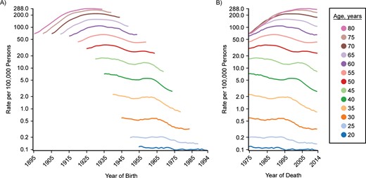
Cohort (A) and period (B) trends for lung and bronchial cancer mortality in US females, SEER Program, 1975–2014. C-P score = 0.56; deviance explained: 97.0%. SEER, Surveillance, Epidemiology, and End Results.
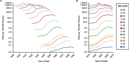
Cohort (A) and period (B) trends for prostate cancer incidence in US males, SEER Program, 1975–2014. C-P score = −0.49; deviance explained: 93.2%. SEER, Surveillance, Epidemiology, and End Results.
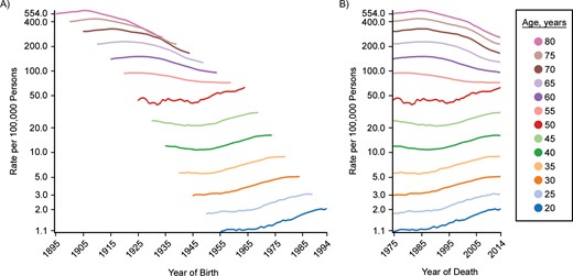
Cohort (A) and period (B) trends for colon and rectal cancer incidence in US males, SEER Program, 1975–2014. C-P score = 0.21; deviance explained: 60.6%. SEER, Surveillance, Epidemiology, and End Results.
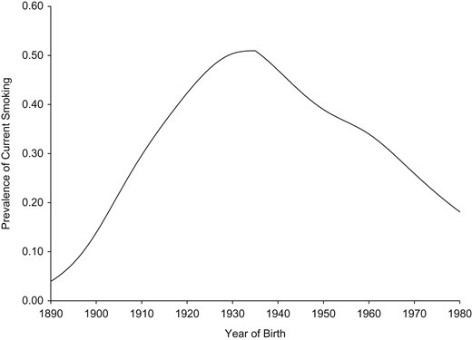
Prevalence of current smoking at age 30 years for US females, by birth cohort, 1965–2009. Estimates were extracted from the article by Holford et al. (22).
Figure 3 shows trends in male prostate cancer incidence by cohort and period. The period graph (Figure 3B) is more nearly parallel than the cohort graph (Figure 3A). This is especially apparent in the hump for the early 1990s among persons aged 65 years or older. Effective screening would be expected to produce greater period parallelism because this would affect all participating ages when the screening program is initiated. In addition, screening tends to move the date of diagnosis forward, thus yielding a bump like that seen in the 1990s. Mariotto et al. (23) estimated trends in patterns of prostate-specific antigen testing in the United States, shown in Figure 6. Testing grew rapidly for men of all ages from 1989 to 1993, corresponding to the period of increased incidence of prostate cancer.

Proportion of US males with at least 1 prostate-specific antigen (PSA) test during a given year, by age, 1988–2000. Data were derived from the estimates of Mariotto et al. (23).
Finally, Figure 4 shows trends for incidence of male colon and rectal cancer. In this case, trend lines appear to be distinctly different for men over age 50 years compared with younger men. For men over age 50, the period graph (Figure 4B) appears to be more nearly parallel, but for men aged 50 years or less, it is more difficult to make a clear distinction between period and cohort. In some respects, the cohort graph (Figure 4A) appears to be more nearly parallel, but there are also suggestions of a period effect. Colorectal cancer screening has been recommended for persons over age 50 since 1997 (24, 25). We expect screening to be seen as a period effect for ages over 50, that is, parallelism in the period graph (Figure 4B). For those younger, parallelism is more apparent in the cohort graph, suggesting risk factors that vary with generation (e.g., lifestyle factors). Further work is needed to understand these trends more fully. For example, period parallelism among persons over age 50 started well before 1997, when a multidisciplinary panel recommended clinical guidelines for screening (24), but changes to clinical practice often start before an official recommendation is issued and may take time to fully implement. Screening is not the only factor to change over time, and these factors must also be considered. An analysis of the impact of risk factors, including screening and treatment (26), made use of MISCAN (27), a carcinogenesis model that allows one to include multiple risk factor trends in the analysis.
Table 1 shows results of fitting age-period-cohort models to the female lung cancer incidence data. The first 3 columns begin with only age and drift (i.e., the linear component of period and cohort). Subsequent models add period, cohort, and both. Columns 4–6 break down the contributions into more specific contributions of period and cohort, either adjusted only for age or also adjusted for the other. When both period and cohort are included, scaled deviance decreases by 114,491.96 (i.e., 118,025.82 − 3,533.86 = 114,491.96), which explains 97.0% of the deviance. This gives the combined effects of period and cohort; that is, they have a strong contribution overall. The proportion of change in deviance when period alone is added to the model compared with the change when both period and cohort are added is 0.38. However, the proportion of change when period is added to a model that includes cohort is 0.06. Correspondingly, the proportion explained is 0.94 for cohort by itself and 0.62 when cohort is added to a model that includes period. The difference between these two measures yields the C-P score, 0.56—that is, 0.94 − 0.38 = 0.62 − 0.06 = 0.56, depending on whether the other factor is or is not controlled. Notice that adjustment for the alternative factor does not change the value in this statistic. The positive sign indicates a greater contribution from cohort. A negative difference would have indicated a greater contribution for period. For example, prostate cancer shows 87.4% of the deviance explained by period and cohort. However, the C-P score is −0.40, indicating that period predominates.
Scaled Deviances for Age-Period-Cohort Models Fitted to Data on Female Lung and Bronchial Cancer Mortality, SEER Program, 1975–2014a
| Model | df | Deviance (G2model) | Source | Δdfb | ΔDeviance (G2source) | Proportion |
| A-drift | 2,534 | 118,025.82 | ||||
| AP | 2,496 | 74,769.10 | P|A-drift | 38 | 43,256.72 | 0.38b |
| AC | 2,432 | 10,379.39 | C|A-drift | 102 | 107,646.43 | 0.94c |
| APC | 2,394 | 3,533.86 | P|AC | 38 | 6,845.53 | 0.06d |
| APC | C|AP | 102 | 71,235.24 | 0.62e | ||
| APC | P + C|A-drift | 140 | 114,491.97 |
Abbreviations: A, age; C, cohort; df, degrees of freedom; P, period; SEER, Surveillance, Epidemiology, and End Results.
aPercentage of deviance explained = 114,491.96/118,025.82 × 100 = 97.0%. .
b.
c.
d.
e.
We have already noted the more complex pattern for male colorectal cancer incidence. Overall, the percentage of deviance explained is 60.6%, less than in the previous 2 examples. The C-P score is only 0.13, which indicates a predominance of cohort, but only slightly. We noted the change at age 50 years, which suggests that these age groups should be considered separately. For persons over age 50 years, 70.2% of the temporal trend is explained and the C-P score is −0.38, that is, a predominance of period. However, for those aged 50 years or younger, only 16% of the trend is explained and the C-P score is 0.17—a much weaker contribution overall, with cohort predominating slightly. A more complex model that includes interactions of period and cohort with age may work better.
The difference in colorectal cancer trends for younger and older adults has been noted by others, who point out trends that are increasing among persons under aged 50 years or younger and decreasing for those who are older (28–31). Not only do the trends have different directions but the patterns more closely follow cohort and period, respectively. This has led some investigators to suggest consideration of screening at younger ages (32, 33), although further work is needed to better understand all costs from screening the population.
Table 2 shows the average numbers of cases in cells contributing to estimates within different age categories for male colorectal cancer incidence. For men aged 20–24 years, the average number of cases (0.70) is less than 1, considerably smaller than in the other categories. In this case, the selected radius is 12 years, which includes 59 cells for the smoothed estimate. The relatively small number of cases per cell increases the variance, which is reduced by using more cells.
Window Selection for Male Colon and Rectal Cancer Incidence, by Age Group, SEER Program, 1975–2014
| Age Group, years | Average No. of Cases | Window Radius, years | No. of Cells |
|---|---|---|---|
| 20–24 | 0.70 | 12.00 | 59 |
| 25–29 | 2.45 | 12.00 | 59 |
| 30–34 | 6.30 | 12.00 | 59 |
| 35–39 | 10.55 | 10.00 | 44 |
| 40–44 | 21.40 | 8.49 | 33 |
| 45–49 | 38.10 | 6.40 | 22 |
| 50–54 | 80.80 | 2.00 | 4 |
| 55–59 | 103.95 | 11.66 | 57 |
| 60–64 | 143.93 | 9.00 | 37 |
| 65–69 | 179.93 | 7.81 | 29 |
| 70–74 | 191.65 | 6.32 | 21 |
| 75–79 | 188.75 | 6.08 | 20 |
| 80–84 | 155.90 | 5.10 | 15 |
Abbreviation: SEER, Surveillance, Epidemiology, and End Results.
In Figure 4, trend lines are smooth, except for age 50 years. Web Figure 2 shows the goodness-of-fit measure for each age plotted against window radius. As is explained in Web Appendix 2, the selected smoothing radius for persons aged 50 years is 2 years (see Table 2). Only 4 cells are added to the reference cell, many fewer than for other ages. This results in less smoothing, and thus the more jagged appearance of the trend line for age 50 years.
Figure 7 shows a scatterplot of the percentage of deviance explained by adding cohort and period to a model with age and drift plotted against the C-P score. This is shown for male cancer incidence at all major sites reported by SEER. This provides a framework for understanding the magnitude of the C-P score in the context of the other cancer sites. For the colon and rectum, the percentage explained is higher than that for many sites, but the C-P score is close to the middle. For the lung and bronchus, on the other hand, the percentage is high, suggesting strong temporal contributions that are dominated by cohort. In contrast, a very high percentage of deviance is explained for prostate cancer, and the C-P score is relatively large but negative, suggesting that period is dominant.
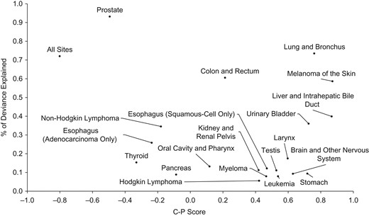
Percentage of deviance explained by the C-P score for all major male cancer incidence rates reported to the Surveillance, Epidemiology, and End Results Program, 1975–2014. C-P score is the difference between the contributions of cohort (C) and period (P) divided by the contributions of adding both to an age-drift model.
DISCUSSION
Age-period-cohort models have often been used to understand potential risk factors that may contribute to temporal trends. We have described an approach for visualizing temporal trends that can be useful before a formal modeling effort is undertaken. To better visualize the contributions of cohort and period, it is helpful to use yearly estimates. In most populations, the number of cases or deaths in 1 year may not be large enough to yield sufficient precision. Smoothing removes some of the random fluctuation that can hide more nuanced effects like parallelism.
The study of rarer disease categories or smaller subgroups poses limitations. Fewer cases in a year will tend to give rise to larger windows, which will increase bias in the estimates. In addition, large windows reduce the standard error of the estimates, while masking trend curvature. The analytical challenge is to select a window that is large enough to yield a precise estimate while not being so large that it introduces substantial bias.
Software for fitting age-period-cohort models is available from a variety of sources (14), including the National Cancer Institute (15). These methods, including the approach described in this article, assume independence of the number of cases in each age-period year. Chernyavskiy et al. (34) developed an approach that considers correlated outcomes. Further work would be helpful to assess the impact of such an extension to the approach we have described here.
The examples discussed here relate to cancer, but the approach used would clearly be helpful for other disease trends. For example, cigarette smoking is a causal risk factor for heart disease as well as lung cancer, although there are aspects of the etiology and treatment of each condition that are quite different. The approaches described here can help investigators to better understand trends and to derive control strategies for a population.
ACKNOWLEDGMENTS
Author affiliations: Department of Biostatistics, School of Public Health, Yale University, New Haven, Connecticut (Theodore R. Holford); Division of Cancer Control and Population Sciences, National Cancer Institute, Bethesda, Maryland (Huann-Sheng Chen, Eric J. Feuer); and Information Management Services, Calverton, Maryland (David Annett, Martin Krapcho, Asya Dorogaeva).
This work was supported in part by National Cancer Institute contract HHSN261201500415P.
Conflict of interest: none declared.

