


Abstract
We use high-quality UK panel data to document the extent that pre-existing labour market and financial inequalities were exacerbated by the pandemic between April 2020 and September 2021. Some inequalities worsened, others did not, and in some cases, initial widening of labour market inequalities was subsequently reversed. We find no evidence of an overall divergence in labour market outcomes by gender. Initial changes for ethnic minorities and the young were largely reversed by March 2021. Those in the top third of the long-run income distribution experienced income falls, but also increased saving. Net wealth increased not for only the affluent, but also for middle deciles of the long-run income distribution. These deciles were most protected by the furlough scheme. Those at the bottom of the income distribution were more likely to report a decline in net wealth over the year.
1. Introduction
In common with the rest of the world, the UK went through an historical health shock in 2020–1, with widespread economic implications. In the second quarter of 2020, GDP fell by 13.5%—more than at any time since the Great Depression—and total hours worked fell by 18% (Office for National Statistics, 2021a,b). And yet, at the same time, the savings rate peaked at over 29%. These apparently in-congruent aggregate patterns beg the question of what has transpired at the individual level, across demographic groups, types of job, and the income distribution, and further how these patterns changed as the pandemic evolved.
We use new, high-quality panel data from Understanding Society to document the economic impacts of the pandemic at an individual level, and in particular where and to what extent pre-existing labour market and financial inequalities have been exacerbated. We track the same set of individuals through the pandemic, from February 2020 to September 2021, asking questions on their economic situation on a near-monthly frequency. This panel has several advantages: first, we are able to see how different groups adapted (or not) to the changed circumstances over time through the pandemic; second, we are able to observe individual transitions, for example across firms and industries, and use these to understand aggregate movements. Further, the high-frequency and longitudinal COVID-19 Study links to individuals’ long-run, pre-pandemic economic status through Understanding Society, the UK’s long-running annual household panel. This link provides important contextual information for pandemic experiences, such as long-run income. Finally, this link also allows for highly credible population inferences.
We focus on two closely related issues: the evolution of individual labour market experiences; and the corresponding evolution of incomes, saving and borrowing, and changes in net wealth. Labour markets, incomes, and wealth were all impacted, but government policies meant that the impacts differed depending on the extent of furlough protection, the enforced closing down of some sectors, and the extent of the ability to work from home. We find a nuanced and sometimes surprising story. Our analysis is primarily of the first year of Covid to spring 2021: this covers the period of substantial government interventions and restrictions.
Starting with the labour market, we find no evidence of an overall divergence in employment outcomes by gender throughout the pandemic. This contrasts with studies of the USA (Albanesi and Kim, 2021). However, women in couples with children more likely to stop working than men. The first wave of the pandemic had a particular negative effect on the employment of ethnic minorities and the young. These groups had largely recovered their relative position by March 2021. Those aged over 50 saw smaller initial employment losses than the young, but saw continuing falls in employment and a much weaker recovery in hours worked than other age groups as the pandemic progressed.
Some of these initial differential effects seem to be driven by the impact of government policies. The UK government pursued a policy of protecting jobs by financing the furloughing of workers, but this was not available to all workers. Minorities and the young were less likely to be furloughed. The recovery of these groups as the pandemic progressed was largely through changing job and industry. By contrast, those in precarious employment were badly hit at the start of the pandemic, were less likely to be furloughed, and their recovery was more muted.
Those at the bottom of the long-run income distribution were less likely to be furloughed than those in the middle, but those on benefits received increased universal credit. Those at the top were more likely to be furloughed than at the bottom, but because furlough support was capped, they still experienced reductions in household income compared to the median and these reductions persisted.
Turning to saving, borrowing, and net wealth, savings rates have risen markedly compared to pre-pandemic rates, but not for the poorest 30% of the long-run income distribution, and it is the richest whose savings rates have risen the most. Mirroring these savings increases, about 25% of individuals across the distribution repaid debt, except in the bottom decile where the fraction increasing debt dominated. These developments are reflected in changes in net wealth: in the bottom deciles of the distribution, the fraction seeing a decline of more than 10% is greater than the fraction seeing an equivalent gain. But above the third decile, those experiencing a gain of more than 10% exceeded those experiencing a loss of that magnitude, with the differential increasing further up the distribution. On the one hand, one of our key findings is that wealth inequality increased through the pandemic, but on the other hand, net wealth increased quite far down the long-run income distribution.
There is already a substantial literature on the impact of COVID-19, the resulting lockdowns and the impact on households. Much of the literature focuses on the initial impacts. In the UK, Blundell et al. (2021), Brewer and Gardiner (2020), Crossley et al. (2021), and Adams-Prassl et al. (2020) document heterogeneity in the initial impacts on labour markets. Benzeval et al. (2020a), Crossley et al. (2021), and Hupkau and Petrongolo (2020) show that, unlike the USA, there was very little difference in outcomes for paid work between men and women. Blundell et al. (2022) compare inequality in the UK at the start of 2021 with 2019. They find that while inequality in gross income worsened, inequality in disposable income has declined, partly due to government programs. Comparing across countries, Stantcheva (2022) documents that employment declines and pre-tax income losses were larger among lower income households. However, government support measures meant that overall income inequality decreased. In terms of spending, Bourquin et al. (2020) and Hacıoğlu-Hoke et al. (2021) document heterogeneous consumption effects. For the USA, Albanesi and Kim (2021) document the sharp early rises in unemployment, and Montenovo et al. (2020) and Zamarro and Prados (2021) highlight that these rises were particularly among women where labour force participation had fallen markedly. On spending behaviour, Chetty et al. (2020) show for the USA how concern about health led to suppressed consumption and economic hardship.
A smaller set of studies look at how inequalities evolved through subsequent lockdowns in 2020 and 2021, as we do. Cribb and Wernham (2022) show there was a decline in post-tax income inequality in the UK between the financial years 2019–20 and 2020–21. Zhou and Kan (2021) document the within-individual changes in labour income, time-use, and mental well-being. Nonetheless, the picture of what has happened to labour markets beyond the first impacts and the implications for household finances is unclear.
Our contribution is to follow the same individuals over a prolonged period to show how the paths of labour markets and financial resilience evolved across the pandemic, compared to their long-run situation. This matters because the consequences of the pandemic, particularly for various inequalities, changed substantially over the year. Further, we combine measures of labour market outcomes with household finance outcomes to give a full picture of economic resilience and inequality through the pandemic.
The rest of the article proceeds as follows. Section 2 lays out context, data, and methods. Sections 3 and 4 present the main results on individual labour markets, and on saving and wealth, respectively. Section 5 concludes.
2. Context, data and methods
2.1 The UK policy context
The backdrop to our analysis is how the UK government imposed various closures on the UK economy, and also how the government supported workers and households. The UK went into the first ‘lockdown’ on 23 March 2020, and the economy contracted substantially in March and April. This enforced closure of many businesses led to substantial reductions in the demand for labour. The economy began to grow again as measures were relaxed. Measures began to tighten again from early September 2020 with a second lockdown starting in England on 5 November for 4 weeks, and then a third starting on 6 January until the end of March 2021.1 As outlined below, our panel data provide data from before the first lockdown until 6 months after the end of the third, and is linked to the extensive pre-pandemic panel.
To provide economic support, the UK government introduced the Job Retention Scheme on 20 March 2020, soon followed by the Self-Employment Support Scheme. Workers on the Job Retention Scheme were ‘furloughed’ by their firms: initially, 80% of pay would be covered by a government subsidy, subject to a maximum of £2,500 a month, and this was conditional on the worker not providing any hours of work. As a result, rates of unemployment remained just above 4% through the first wave of the pandemic (Office for National Statistics, 2021a). Through the rest of the year, the generosity of the furlough scheme was reduced, and from July 2020 employees were allowed to be partially furloughed. Variants of the furlough scheme remained in place until the end of September 2021. At its peak in May 2020, there were 9 million workers furloughed, but even in April 2021, there were still over 4 million (HM Revenue and Customs, 2021). In contrast to the furlough scheme, the USA provided support operated through additional payments to the unemployed and through tax credits, and the reported unemployment rate rose to 14% (Bureau of Labor Statistics, 2021). The UK government also provided new incentives for firms to hire younger workers through a ‘Kickstart’ scheme introduced in September 2020. This subsidized the wage costs of workers aged 19–24 who were hired from unemployment. By August 2021, 63,000 kickstart jobs have been created (HM Government, 2021).
On the financial side, the government induced banks to offer mortgage payment holidays from 17 March 2020 for 3 months. These payment holidays were then extended throughout the year. For those renting, there was a ban on rental repossessions. Unlike the USA, there were no tax rebates for households, and the partial VAT cut brought in by the UK government from July 2020 only covered restaurants and accommodation.
To summarize, through most of the year after the start of the pandemic, the focus of government support was on keeping workers in jobs, rather than stimulating the economy. The limited attempts to stimulate the economy were, each time, knocked back by increasing COVID restrictions, and through September 2021, UK GDP had only recovered to 96% of its pre-COVID level (Office for National Statistics, 2021b).
2.2 The COVID-19 study
Our analysis is based on the nine waves of the publicly available Understanding Society COVID-19 Study (henceforth COVID-19 Study). These were fielded in the last weeks of April, May, June, July, September, and November 2020, and of January, March, and September 2021. Individuals answering a COVID-19 Study survey for the first time were also asked retrospective questions about the period just preceding the onset of the pandemic (February 2020), so that together these nine waves provide a panel data set spanning 18 months, including the first full year of the pandemic and a pre-pandemic baseline.
The COVID-19 Study is built upon Understanding Society: the UK Household Longitudinal Study (henceforth the Main Study). The Main Study (University of Essex Institute for Social and Economic Research, NatCen Social Research, and Kantar Public, 2019) is a mixed-mode survey, collecting data from participants annually by face-to-face or web interview, and it is one of the largest household panel studies in the world. It began in 2009 but carries on from the earlier British Household Panel survey, which ran from 1991 to 2008. The COVID-19 Study employs more frequent web surveys to record the experiences and behaviour of Main Study participants during the COVID-19 pandemic. Each web survey is designed to take about 20 min to complete, and has a mix of repeating and rotating content.
All individual members of the Main Study who were aged sixteen or over in April 2020, and who belonged to active households, were invited to participate in the COVID-19 Study.2 On April 17 potential respondents were sent a pre-notification letter introducing the study and offering a small incentive for each web survey they completed. Subsequently, invitations to each web survey were sent by e-mail and/or SMS text message, or by post. The fieldwork period for each web survey lasted 7 days, and reminders were sent on days 2, 3, and 6.
For our analysis, the fact that the COVID-19 Study follows participants from the Understanding Society Main Study has two key advantages. First, respondents to the COVID-19 study can be linked to data they provided to the Main Study, often going back for more than a decade. Such data provides important context to the data collected during the pandemic. We can document not only how economic impacts of the pandemic vary across individuals but how those impacts vary by pre-pandemic economic position.3 In particular, we created a measure of ‘average pre-COVID-19 income’ as our key marker of economic position. This measure averages equivalized household net income across up to three previous waves of the Main Study, and assigns individual respondents to quintiles of income on that basis.4 Net income includes earned and unearned income, net of tax and inclusive of any benefits received. It is important to note that the COVID-19 study is individual-based, and supports inferences about the distribution of income (for example) across adults rather than across households. Household income and other household-level variables are viewed as attributes of individuals. We aim to draw inferences about the economic impacts of the pandemic on the UK population. The second key advantage of the COVID-19 Study tracking participants from the Understanding Society Main Study is that it facilitates credible population inferences. The Main Study is based on probability samples, achieves year-on-year retention rates of 85–90%, and maintains a sophisticated weighting strategy to deal with deliberate initial over-sampling of some subpopulations and with subsequent attrition. That strategy has been developed, tested, and positively assessed over many years (see Benzeval et al., 2020a for a review). The implication is that the issued sample for the COVID-19 Study is known to provide a strong basis for population inferences.
Of course, not all of those who were invited to the COVID-19 Study subsequently participated. Among those who had completed an annual interview in the last complete wave of the Main Study (Wave 9) the first two waves of the COVID-19 Study achieved response rates of 49%, with subsequent waves declining somewhat (full details are in Institute for Social and Economic Research, 2020b). These retention rates are significantly below those that the Main Study achieves. This is unsurprising given that the COVID-19 Study necessarily has a more restricted interview mode and a much shorter fieldwork period in which participants can respond. It is worth noting that these response rates are comparable to the response rates of large government surveys in the UK.5 Nevertheless, a very significant effort has been made to model, and correct for, selection into the COVID-19 Study. In this effort, the ability to link each respondent and, crucially, each non-respondent to their Main Study data is valuable in two ways. First, selection into the COVID-19 Study is modelled using the rich background information available for each respondent and non-respondent. Retention predictors are chosen from a large set of potential variables and are selected using a Least Absolute Shrinkage and Selection Operator with tuning parameters chosen by minimizing the Extended Bayesian Information Criterion. Estimated retention probabilities are then used to adjust each respondent’s Main Study weight to account for differential selection in the COVID-19 Study. The result is a set of inverse probability weights (IPWs) for inclusion in the COVID-19 Study that support inferences about the same (UK) population as the Main Study. The same methods are applied to develop both longitudinal weights (for the COVID-19 Study as a whole) and cross-sectional weights (for each wave of the COVID-19 Study). The development of these weights is described in detail in Benzeval et al. (2021).
The second role of the linked Main Stage data is to allow for evaluation of the COVID-19 weighting strategy. Consider any population parameter that can be estimated in the Main Study data. This could be a mean, a higher moment, or regression slope involving variables collected in the Main Study. Such a statistic can now be estimated in one of two ways: with the full sample of Main Study participants and associated Main Study weights, or with the subset of Main Study participants that responded to the COVID-19 Study with the COVID-19 Study weights. Under the (joint) null that each set of weights captures the inclusion probabilities for the respective samples, both estimators should be consistent for the parameter of interest. They should therefore be ‘close’. Crossley et al. (2021) and Benzeval et al. (2021) report formal statistical tests based on this intuition, applied to the COVID-19 Study. Those tests demonstrate two things. First, the COVID-19 Study IPWs work very well. Crossley et al. (2021) and Benzeval et al. (2021) find limited bias, relative to Main Study estimates, across a range of target parameters. Second, Crossley et al. (2021) and Benzeval et al. (2021) use the same testing strategy to evaluate ‘calibration’ weights that scale COVID-19 respondents to weighted Main Study wave 9 cell frequencies, with cells defined by age, gender, and education. This is of interest because a number of other web surveys fielded during the pandemic use non-probability samples combined with such calibration weights (e.g. Adams-Prassl et al., 2020) or quota samples targeting similar cell benchmarks (e.g. Belot et al., 2021). The COVID-19 Study IPWs should be expected to significantly outperform simpler calibration weights, because they draw on a much richer set of predictors, selected by machine learning methods. Crossley et al. (2021) and Benzeval et al. (2021) confirm this empirically, by direct comparison of these weighting strategies. They find that, at least in the case of the COVID-19 Study, calibration weights lead to many more statistically and economically significant biases. Of course, the COVID-19 Study IPW strategy is only possible because of the link to the long-running Main Study; similar options were often unavailable to other studies.
Additional information on the Understanding Society COVID-19 Study can be found in Institute for Social and Economic Research (2020a,b).
2.3 Sample and methods
Respondents to the nine waves of the COVID-19 Study number 19,763 unique individuals. We restrict our sample to 14,394 individuals of working age. Of these, 13,427 have complete information on hours, gender, age, ethnicity, and long-run income. Note, however, that not all COVID-19 Study participants responded to all waves. Our final samples by wave are: 11,809; 10,181; 9,599; 9,326; 8,668; 7,984; 7,899; 8,419; and 8,680. All estimates are weighted. In the analysis below, we use this unbalanced panel and the available cross-section weights for each wave to make monthly estimates. We have replicated our analysis with the balanced panel and available COVID-19 Study longitudinal weights (i.e. a single set of weights for all waves), and find very similar results. Standard errors are also appropriately adjusted for survey design effects.
3. Labour markets and earnings
We begin by showing how labour market outcomes have evolved from before the pandemic in February 2020 through to the end of September 2021. Our main focus is on the fraction working positive hours, as distinct from the fraction employed. Many of those classed as employed worked zero hours because of the UK government furlough scheme whereby the government paid the wages of workers, so they remained employed but without working any hours. We report the fraction of those working zero hours who remained employed as a measure of being ‘on furlough’.6 The prevalence of furlough is a marker of industry distress, but also of financial support to workers.
We start by showing how shocks differed by industry and by the characteristics of the job. We then turn to showing how the labour market shock differed according to the characteristics of individuals, in terms of gender, ethnicity, and age. These differences generate differences in how the shocks to the labour market impact across the income distribution. We show the pattern of those working positive hours and on furlough by long-run income decile, which is derived from the linked pre-pandemic panel data. This ties in to our subsequent analysis of the impacts on household finances across the income distribution.
3.1 Differences by job type
In Fig. 1, we take the subsample of those employed in February 2020, and focus on how the fraction working positive hours evolves, we split the sample by their job characteristics pre-pandemic. Specifically, we show industry (panels a and b); and contract characteristic (panel c and d).

Labour market impacts by job characteristic. (a) and (b) Industry and (c) and (d) contract type.
Notes: Unbalanced panels of 9,347 and 10,827 individuals, respectively (with 2,225 inapplicable because not working in February 2020). ‘Positive hours’ is the fraction who report actually working some hours, independent of reported employment status. ‘Employed (of zero hours)’ is the fraction of those working zero hours who are in employment, conditional on employment in February 2020. Industry and occupation are recorded at the previous (pre-pandemic) main study interview. Error bars denote 95% confidence intervals.
Source: Authors’ calculations based on Understanding Society.
All industries experienced a sharp decline in labour market activity at the time of the first lockdown. There were particularly large declines in work after the initial lockdown in retail, manufacturing, and hospitality. There was then recovery across all industries by September 2020, albeit not to pre-pandemic levels. The effects of the subsequent lockdowns between November and March were very different from the first: for most industries, there was only a limited reduction in work, but hospitality was again badly hit. This difference across the lockdowns shows the extent that workers in industries, such as manufacturing and construction, were able to keep working, partly due to more targeted restrictions in the subsequent lockdowns and partly because of adapting work practices. The right-hand graph, reporting our measure of furlough, shows that 90% of those working zero hours were still employed in the initial stage of the pandemic. This fell at the end of the first lockdown as the fraction working positive hours increased. The subsequent lockdowns impacted heavily on hospitality, where there was widespread use of furlough.
Across contract types, declines were most marked for those in precarious employment, with a decline in the fraction working positive hours of 60%age points for those on zero hours contracts. Half of this initial decline had been recovered by September 2020, followed by a partial reversal. Despite this fall in the fraction working positive hours, these workers were the least likely to receive support from the furlough scheme.
Workers changed jobs and industries to find work, and there were substantial differences in the rate of job switching according to workers’ initial industries and in the rate of returning to work. Table 1 shows the proportions of workers who were working zero hours in April 2020; and of those, the proportions who had resumed working positive hours by spring 2021 when government restrictions had eased substantially.7 Those initially working in the hospitality sector were much less likely than those in other industries to have resumed working in March 2021 reflecting the patterns in Fig. 1. Of those who had resumed working positive hours in March 2021, around a third were working with a different employer. Those who stopped working in the wholesale and retail trade were more likely to resume working than those in the hospitality sector. However, many were working in new jobs, and 19% in a new industry. By contrast, manufacturing workers who stopped working positive hours in April 2020 mostly remained with their previous industry and employer when they resumed work: of those who were working by March 2021, 93% remained in manufacturing and 84% were with their previous employer.
Percentage working zero hours in April 2020 who had resumed working in March 2021
| Given zero hours in April | ||||
|---|---|---|---|---|
| Zero hours in April | Working pos. hours again in March 21 | New job | New industry | |
| All | 31 | 68 | 24 | 13 |
| Gender | ||||
| Male | 29 | 72 | 25 | 14 |
| Female | 32 | 65 | 23 | 13 |
| Ethnicity | ||||
| White majority | 31 | 68 | 22 | 11 |
| Ethnic minority | 33 | 70 | 46 | 36 |
| Age | ||||
| 20–29 | 42 | 68 | 38 | 28 |
| 30–49 | 26 | 74 | 21 | 10 |
| 50–65 | 31 | 62 | 16 | 7 |
| Long-run income | ||||
| Low | 41 | 62 | 36 | 23 |
| Middle | 33 | 67 | 19 | 11 |
| High | 21 | 75 | 23 | 9 |
| Worker type | ||||
| Fixed hours | 27 | 73 | 20 | 12 |
| Flexible hours | 24 | 72 | 17 | 6 |
| Emp. sets (sure min.) | 41 | 63 | 32 | 25 |
| Emp. sets (no min.) | 64 | 35 | 51 | 38 |
| Self-employed | 41 | 65 | 54 | 12 |
| Occupation | ||||
| Managers, senior officials, administrative | 26 | 69 | 18 | 10 |
| Sales, customer service, elementary | 45 | 57 | 37 | 28 |
| Process, plant, machine operatives, skilled trades | 44 | 75 | 20 | 11 |
| Associate professional, technical | 21 | 78 | 24 | 11 |
| Personal service | 39 | 63 | 26 | 17 |
| Professional | 17 | 80 | 22 | 7 |
| Industry | ||||
| Manufacturing | 36 | 75 | 16 | 7 |
| Wholesale, retail trade | 40 | 69 | 31 | 19 |
| Hospitality | 63 | 44 | 34 | 24 |
| Professional | 18 | 82 | 19 | 10 |
| Administrative | 21 | 76 | 32 | 23 |
| Education | 28 | 77 | 15 | 8 |
| Health and social work | 18 | 68 | 23 | 5 |
Notes: Of total, 6,199 individuals interviewed in March 2021 who were working in February 2020 (the sample size in column 1). Of these, 2,072 worked zero hours in April (the sample size in columns 2–4). ‘Working’ is counted as working a positive number of hours. ‘New job’ and ‘new industry’ mean the individual changed job or industry between February 2020 and March 2021 (the fractions reported are conditional on working in March 2021). Those self-employed in both February 2020 and March 2021 are counted as ‘same industry’, while those moving from employment (or employment with self-employment) to self-employment are counted as ‘new industry’. Worker type is measured in February 2020. ‘Emp.sets (sure min)’ are contracts where the employer chooses the hours of the worker, but guarantees a minimum number of hours; ‘Emp. sets (no min)’ are contracts where the employer chooses the hours of the worker and does not guarantee to offer any hours. Industry and occupation are recorded at the previous (pre-pandemic) main study interview.
Source: Authors’ calculations based on Understanding Society.
Table A.2 and Table A.3 in the Online Appendix report the proportions of those in different industries, occupations, and demographic groups who changed either their employer or industry between February 2020 and March 2021 without conditioning on working zero hours in April 2020.
3.2 Differences by individual characteristics
We now turn to considering impacts by different demographic characteristics. We show the differential labour market impacts by gender, ethnicity, age, and long-run household income. We use figures to show the evolution of impacts, and regression analysis to test for significant differences. Table 2 reports this regression analysis of the differential changes in outcomes across groups, with the coefficients in the first three columns representing the change in differences with the omitted group relative to the pre-pandemic baseline (February 2020). Each column corresponds to one of three outcomes (employment, positive hours, hours) and within each column, each panel reports the interaction terms (interacting time with group) from separate ‘difference-in-difference’ regressions which also include group and month fixed effects. The fourth column shows month–group interactions for a regression of the proportion of those working zero hours who are still employed (i.e. furloughed) in each month. Since there is no pre-pandemic baseline for this variable, these terms indicate the difference in furlough probabilities relative to the omitted group in each month.
Labour market impacts
| (1) | (2) | (3) | (4) | |
|---|---|---|---|---|
| Employed | Positive hours | Hours | Employed (of 0 hours) | |
| A. Gender | ||||
| April 20 × Female | 0.01 | 0.02 | 3.27*** | 0.02 |
| (0.01) | (0.01) | (0.49) | (0.02) | |
| November 20 × Female | 0.01 | 0.00 | 1.55** | 0.12** |
| (0.02) | (0.02) | (0.69) | (0.06) | |
| March 21 × Female | 0.02 | 0.01 | 1.62** | 0.01 |
| (0.01) | (0.02) | (0.65) | (0.05) | |
| B. Ethnicity | ||||
| April 20 × Ethnic minority | −0.03** | 0.04* | 2.39*** | −0.19*** |
| (0.02) | (0.02) | (0.77) | (0.05) | |
| November 20 × Ethnic minority | 0.02 | −0.00 | −0.74 | −0.10 |
| (0.03) | (0.04) | (1.33) | (0.09) | |
| March 21 × Ethnic minority | 0.02 | 0.05 | 3.18* | −0.26*** |
| (0.04) | (0.04) | (1.64) | (0.08) | |
| C. Age | ||||
| April 20 × 20–29 | −0.04*** | −0.07*** | −0.76 | −0.12*** |
| (0.02) | (0.02) | (0.80) | (0.04) | |
| April 20 × 50–65 | −0.00 | 0.01 | 0.62 | −0.01 |
| (0.01) | (0.01) | (0.51) | (0.02) | |
| November 20 × 20–29 | 0.00 | −0.06* | −0.62 | −0.05 |
| (0.03) | (0.03) | (1.28) | (0.08) | |
| November 20 × 50–65 | −0.03* | −0.04** | −1.98*** | −0.11** |
| (0.01) | (0.02) | (0.67) | (0.05) | |
| March 21 × 20–29 | 0.01 | −0.01 | 0.64 | −0.03 |
| (0.03) | (0.03) | (1.25) | (0.07) | |
| March 21 × 50–65 | −0.03** | −0.04*** | −1.70** | −0.15*** |
| (0.02) | (0.02) | (0.67) | (0.05) | |
| D. Pre-Covid-19 income | ||||
| April 20 × Low income | −0.02 | 0.05** | 2.94*** | −0.10** |
| (0.01) | (0.02) | (0.89) | (0.05) | |
| April 20 × High income | 0.01 | 0.12*** | 3.79*** | −0.04 |
| (0.01) | (0.02) | (0.72) | (0.03) | |
| November 20 × Low income | −0.01 | −0.01 | −0.59 | −0.14* |
| (0.03) | (0.03) | (1.24) | (0.08) | |
| November 20 × High income | 0.01 | 0.06*** | 1.25 | −0.20*** |
| (0.02) | (0.02) | (0.89) | (0.06) | |
| March 21 × Low income | −0.01 | 0.02 | 1.08 | −0.13 |
| (0.03) | (0.03) | (1.24) | (0.08) | |
| March 21 × High income | −0.01 | 0.04* | 0.09 | −0.17*** |
| (0.02) | (0.02) | (0.88) | (0.07) | |
Notes:
* (p < 0.10),
** (p < 0.05),
*** (p < 0.01).
Unbalanced panel of 13,427 individuals. Columns 1–3 correspond to estimates from a linear regression model where the outcome is regressed on group dummies, month dummies (eight dummies), and their interaction. Column 4 corresponds to estimates from the same model, but where only the month dummies and interaction terms are included. Interaction terms for April and November 2020, and March 2021, are presented. The groups are gender, ethnicity, age (20–29, 30–49, 50–65), and pre-COVID-19 income (low, middle, or high which corresponds to being in Quintile 1, 3, or 5 of the pre-COVID-19 household net income distribution, respectively). The group dummies included in each regression model are defined by the category of the panel (e.g. the models in panel A include only a dummy for gender, etc.). ‘Employed’ is the fraction employed, where this includes both employees and the self-employed. ‘Positive hours’ is the fraction who report actually working some hours, independent of reported employment status. ‘Hours worked’ is the mean weekly work hours, where those not working are assigned zero hours. ‘Employed (of zero hours)’ is the fraction of those working zero hours who are in employment, conditional on employment in February 2020.
Source: Authors’ calculations based on Understanding Society.
3.2.1 Differences by gender
Figure 2, and the first panel of Table 2, show that there are no marked differences in the impact on employment or the fraction working positive hours by gender. This limited gender difference is in contrast to popular belief and to the gendered impact of COVID seen in the USA, where women were harder hit than men. Zamarro and Prados (2021) find that women were about 6 percentage points more likely than men to be unemployed in the 6 months after onset of COVID. Our measure of being on furlough shows that among those working zero hours, women were more likely to be employed and hence on furlough, but this effect is insignificant.

Labour market impacts by gender.
Notes: Unbalanced panel of 13,427 individuals. ‘Employed’ is the fraction employed, where this includes both employees and the self-employed. ‘Positive hours’ is the fraction who report actually working some hours, independent of reported employment status. ‘Employed (of zero hours)’ is the fraction of those working zero hours who are in employment, conditional on employment in February 2020. Error bars denote 95% confidence intervals.
Source: Authors’ calculations based on Understanding Society.
We explore whether the small gender gap we find is due to differences in the industry that men and women were employed in pre-pandemic. Figure 3 shows the proportion of workers in different industries who are women and the share of workers in different industries who stopped working (i.e. who went from positive to zero hours) in April 2020. Initially, workers in industries with more women were less likely to stop working. While women made up a large proportion of workers in some badly affected industries—such as hospitality—women account for a large fraction of workers in health and social work and in education, where they were more likely to remain working through the first lockdown.

Share of industry female by proportion of workers going to zero hours.
Notes: Figure shows the share of women in different occupations in February 2020 against the proportion of workers who ceased working positive hours in April 2020. Dots are scaled according to the proportion of workers employed in each occupation in February 2020, where occupation is recorded at the previous (pre-pandemic) main study interview. The red line is a linear regression weighted by the proportion of workers in each occupation.
Source: Authors’ calculations based on Understanding Society.
To explore this further, we run regressions on a sample of those working positive hours in February 2020 of an indicator for working positive hours on a gender (woman) dummy. We run specifications with and without controls for industry, and separately for different family types and at different points during the pandemic.
Figure 4 plots the coefficient on the gender dummy from these regressions. We do not report results for gender differences among single-parent households with children due to small sample sizes (in particular, very few single-parents are male). The fall in labour supply for women is larger than for men once industry controls are included in the early phases of the pandemic, although the differences are still not statistically significant. There is some evidence that the gap in employment is larger between men and women in multiple-adult households with kids. One potential reason for these differences may be increased childcare responsibilities during the pandemic being disproportionately borne by women in the UK, as shown by Andrew et al. (2021).8
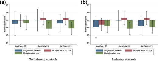
Difference in fraction of male and female workers still working positive hours. (a) No industry controls and (b) Industry controls.
Notes: Figures show coefficients (percentage point difference) from a regression of working positive hours at different points in the pandemic on gender with and without controls for industry. The sample is workers initially working positive hours in February 2020. Industry is recorded at the previous (pre-pandemic) main study interview. Error bars denote 95% confidence intervals.
Source: Authors’ calculations based on Understanding Society.
3.2.2 Differences by ethnicity
One of the most striking aspects of the labour market impacts of the pandemic was the differential impact on the employment of minority ethnic groups in the first lockdown, as first highlighted in Crossley et al. (2021). Similarly, panel b of Fig. 5 and the second panel of Table 2 show that minority ethnic groups suffered much larger declines in employment during the initial lockdown. This seems to have been in part because they were less supported by the furlough scheme: panel c in Fig. 5 shows that among those working zero hours, minority ethnic groups were less likely to still be employed. However, employment rates among ethnic minorities improved between July and September 2020, and by March 2021 the gap in employment rates between ethnic minorities and the white ethnic majority had returned to its pre-pandemic level of around 10 percentage points.
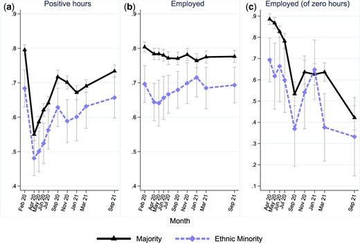
Labour market impacts by ethnicity.
Notes: Unbalanced panel of 13,427 individuals. ‘Employed’ is the fraction employed, where this includes both employees and the self-employed. ‘Positive hours’ is the fraction who report actually working some hours, independent of reported employment status. ‘Employed (of zero hours)’ is the fraction of those working zero hours who are in employment, conditional on employment in February 2020. Error bars denote 95% confidence intervals.
Source: Authors’ calculations based on Understanding Society.
We show in Table 1 (above) that this recovery among ethnic minorities came from changing employer and industry. In particular, among those who had stopped working positive hours in the first lockdown, individuals from ethnic minorities were much more likely to return to working with a new employer or in a new industry. Totally, 46% of ethnic minority workers who had returned to work in March 2021 were working with a new employer, compared to 22% of those in the white ethnic majority.
3.2.3 Differences by age
Figure 6 and the third panel of Table 2 report the differential impacts by age. Much has been written about the impact of the pandemic on the young in particular (Gustafsson, 2020; Dias et al., 2020). Our results show that, compared to the middle-aged, the initial impact on the fraction working positive hours was greater for those age 20–29. Between February and April 2020, the fraction of those aged 20–29 working positive hours fell 8 percentage points more than those aged 30–49. This is driven by a larger fall in employment for the young (panel b of Fig. 6) and less use of furlough (panel c). However, the bounce back for the young was much more marked, with employment levels already close to pre-pandemic levels by March 2021.

Labour market impacts by age.
Notes: Unbalanced panel of 13,300 individuals. ‘Employed’ is the fraction employed, where this includes both employees and the self-employed. ‘Positive hours’ is the fraction who report actually working some hours, independent of reported employment status. ‘Employed (of zero hours)’ is the fraction of those working zero hours who are in employment, conditional on employment in February 2020. Error bars denote 95% confidence intervals.
Source: Authors’ calculations based on Understanding Society.
By contrast, the relative position for those aged 50–65 continued to deteriorate. Panel b of Fig. 6 shows the ongoing decline in employment throughout the year. Panel c suggests that the ongoing decline in the fraction working positive hours was not driven by furlough, and may reflect labour market withdrawal. By March 2021, the gap in employment between those in that age group and those aged 30–49 had increased by four percentage points relative to pre-pandemic levels, and it continued to widen.
Job changes may have played a role in the faster employment recovery of younger workers. Table 1 shows that workers aged under 30 who stopped working in April 2020 were more likely to resume work in a new job or a new industry than older workers. Totally, 38% of those aged under 30 who had resumed working in March 2021 after stopping working in the first lockdown were working in a new job by March 2021 compared to just 16% of those aged over 50. Similarly, 28% of workers aged under 30 who stopped working in the first lockdown, but who had resumed working March 2021, were working in a new industry, compared to just 7% of those aged over 50.
3.2.4 Differences by long-run household income
A key dimension of inequality is by pre-pandemic affluence. We measure this by long-run average income of the household across the 3 years pre-pandemic. Figure 7 and the fourth panel of Table 2 show differences in labour market outcomes for the bottom, middle, and top quintiles. The fraction working positive hours fell by less for the most affluent compared to the middle group, but the employment patterns matched closely. This implies that the middle-income group was more likely protected by furlough, as seen clearly in panel c. For the least affluent, there is a substantial level difference in engagement with the labour market, but the pattern over time of the fraction working positive hours is similar. The difference compared to the middle group is that, among those working zero hours, the least affluent were less likely to be furloughed.

Labour market impacts by long-run income.
Notes: Unbalanced panel of 8,053 individuals. ‘Employed’ is the fraction employed, where this includes both employees and the self-employed. ‘Positive hours’ is the fraction who report actually working some hours, independent of reported employment status. ‘Employed (of zero hours)’ is the fraction of those working zero hours who are in employment, conditional on employment in February 2020. Low, middle, and high income corresponded to being in Quintile 1, 3, and 5 of the pre-COVID-19 income distribution, respectively. Pre-COVID-19 income quintiles are assigned on the basis of net household income averaged across up to three previous waves of the main study. Income includes earned and unearned income, net of tax and inclusive of any benefits received, equivalized by household composition. Error bars denote 95% confidence intervals.
Source: Authors’ calculations based on Understanding Society.
4. Household finances
The shocks to labour markets highlight the economic challenges that different households have faced, arising directly from COVID and from the non-pharmaceutical interventions to prevent its spread. The way that these shocks impact on earnings and household finances is affected by employment and income support policies. In this section, we report the overall impact of COVID on earnings and income, and then on savings, debt, and resulting net wealth, as well as the extent that households fell into arrears. Our focus is on how households at different points in the income distribution are impacted.
4.1 Earnings and income
The labour market shocks across different households translate into lost earnings for many. We calculate the fractions experiencing at least a 20% fall in earnings in different months compared to the baseline in February 2020, and the fractions experiencing at least a 20% increase in earnings. In Fig. 8, we report the fractions within each decile to present a more detailed picture than reporting them by terciles.

Fractions experiencing a 20% change in earnings by income decile. (a) Fall in earnings and (b) gain in earnings.
Notes: Unbalanced panel of 9,510 individuals (with 2,511 inapplicable because of not working in February 2020 and 795 not reporting February 2020 earnings). Earnings changes are from January/February 2020. Earnings are measured at the individual level and are net of tax national insurance, and pension contributions. Income deciles are assigned on the basis of net household income averaged across up to three previous waves of the main study. Income includes earned and unearned income, net of tax and inclusive of any benefits received, equivalized by household composition.
Source: Authors’ calculations based on Understanding Society.
The fractions losing at least 20% of earnings are substantially higher than the fractions gaining, especially at the bottom of the distribution and at the start of the pandemic. Of those in the bottom decile, 35% experienced at least a 20% decline in earnings compared to February 2020, but even within decile, there were winners and losers. The figures show the recovery after the initial impact, and the resilience of the labour market through the subsequent lockdowns. This evolution of earnings reflects the patterns in labour market profiles.
In Fig. 9, we show how these earnings changes pass through into income changes. Our interest in this article is on the unequal impacts, and so we consider impacts on households relative to the change faced by the median household.9 The patterns in Fig. 9 show that the falls in income experienced by the median individual were not statistically different from the poorest. At the bottom of the distribution, incomes were protected more by the increase in universal credit than by furlough. At the top of the distribution, at the end of the first lockdown in July 2020, the top of the distribution had lost out more than the median. This reflects panel c in Fig. 7 that showed furlough was more prevalent in the middle tercile. Further, the generosity of the furlough scheme was capped at £2,500 a month, and so this offered less protection to the top. Even after a year of COVID had passed, the lost income at the top remained. This leads to the conclusion that the offsetting effect of government responses meant that the overall impact of the pandemic was not an exacerbation of pre-existing inequalities in the dimension of household income.
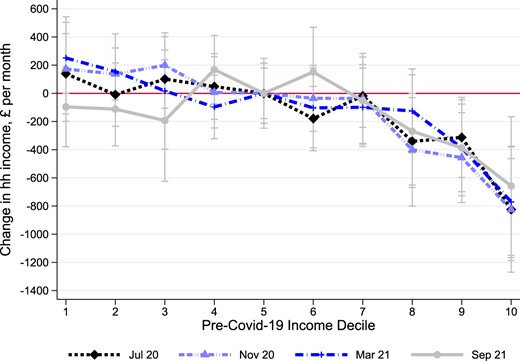
Change in household income relative to median change.
Notes: Unbalanced panel of 8,236 individuals. Income refers to the household and includes earned and unearned income, is net of tax and inclusive of any benefits received. Changes are relative to the change in the 5th decile of the pre-COVID-19 income distribution in each month. Percentage changes are calculated as the percentage change in mean decile income. Pre-COVID income deciles are assigned on the basis of net household income averaged across up to three previous waves of the main study. Income includes earned and unearned income, net of tax and inclusive of any benefits received, equivalized by household composition.
Source: Authors’ calculations based on Understanding Society.
4.2 Changes in saving, debt, and net wealth
We turn in this section to explore the impacts on savings, debt, and net wealth across the long-run income distribution. We define the savings rate as the amount of non-negative active saving divided by individual labour earnings.
Figure 10 reports the median savings rate by long-run income decile. We show the savings rate pre-pandemic in 2018–19, in July and November 2020, and in March and September 2021. In the bottom three deciles, the median person in each decile was not saving pre-pandemic and did not save through the pandemic. By contrast, in the top half of the distribution, the savings rate is increasing in the amount of long-run (permanent) income. Further, for those in the top of the distribution, the savings rate was substantially higher during the pandemic than pre-pandemic.

Savings rate across the income distribution.
Notes: Unbalanced panel of 8,110 individuals. Savings rates are a fraction of weekly net earnings reported in the corresponding monthly survey but for 2018–19, earnings are taken from July 2020. The amount saved is calculated from the question ‘About how much on average do you personally manage to save a month?’ in 2018–19 (wave 10) and ‘About how much have you personally managed to save in the last 4 weeks?’ in the corresponding COVID wave (July, November, or March). Income deciles are assigned on the basis of net household income averaged across up to three previous waves of the main study. Income includes earned and unearned income, net of tax and inclusive of any benefits received, equivalized by household composition.
Source: Authors’ calculations based on Understanding Society.
Saving rates were higher in March 2021 than in the first stages of the pandemic. This was because employment and earnings had recovered, and yet opportunities to spend were again constrained. This explains the increase in saving even lower down the distribution. These findings relate directly to the question of where pent-up demand for consumption lay: accumulated wealth that could be spent was held by the better off. However, savings rates remained above pre-pandemic levels even through September 2021.
These average median savings rates mask considerable differences in the impact on savings within each income decile. The top panel of Fig. 11 shows the fraction of individuals that reported an increase in saving or a decrease in saving by income decile, at different points in the pandemic. In the bottom half of the distribution, the fraction reporting increased saving is offset by the fraction decreasing saving. Further up the distribution, the fraction increasing saving becomes more dominant: over 40% of individuals in the top decile reported an increase in savings.

Changes in saving and debt across the income distribution.
Notes: For savings, unbalanced panel of 9,739 individuals; for debt, unbalanced panel of 10,688. Saving increases (decreases) are counted where a respondent answers a lower (higher) amount to the question ‘About how much on average do you personally manage to save a month?’ in 2018–19 (wave 10) than to ‘About how much have you personally managed to save in the last 4 weeks?’ in the corresponding COVID wave (July, November, or March). Debt categories are constructed from a question asking about changes to non-mortgage debt in the last 4 weeks (three possible response options: ‘gone up’, ‘stayed the same’, ‘decreased’). Income deciles are assigned on the basis of net household income averaged across up to three previous waves of the main study. Income includes earned and unearned income, net of tax and inclusive of any benefits received, equivalized by household composition.
Source: Authors’ calculations based on Understanding Society.
This heterogeneity in financial consequences is reflected in the patterns of debt. The lower panels of Fig. 11 show the fractions reporting increases or decreases in debt by income decile. Within each decile, the fraction reducing their debt was substantially greater than the fraction increasing debt. This is not the case in the bottom decile in July: for the poorest, more people increased debt than decreased it.
Figure 12 draws together the implications of the labour market changes and support, adjustments in borrowing and saving and the effects of capital gains from rising share and house prices. Figure 12 shows how differences in saving and debt translate into the net wealth of households through plotting separately the fraction of the population whose wealth had increased or decreased by at least 10% over the first year of Covid.10 The figure shows clearly that wealth gains are higher for richer households, and wealth losses are lower. However, the proportion of individuals reporting an increase in net wealth of 10% or more over the pandemic exceeds the proportion reporting a decrease of 10% or more for all long-run income deciles except the bottom two. Middle-income groups had their income protected, and so the lack of consumption spending translated into extra saving and increased net wealth. For those in the bottom two deciles, wealth declined more than it increased. There was less protection of income despite the increase in universal credit because there was less uptake of the furlough scheme for these workers and less ability to reduce or substitute consumption.

Change in total net wealth (January/February 2020 to March 2021).
Notes: Seven thousand nine hundred and seven individuals were interviewed in March 2021. Respondents were asked whether their household total net wealth had gone up or down by 10% or stayed about the same, since January/February 2020. Income deciles are assigned on the basis of net household income averaged across up to three previous waves of the main study. Income includes earned and unearned income, net of tax and inclusive of any benefits received, equivalized by household composition. Error bars denote 95% confidence intervals.
Source: Authors’ calculations based on Understanding Society.
Our conclusion on the overall effects on the wealth distribution is that the pandemic led to an increase in the concentration of wealth at the top of the income distribution, but that net wealth increased quite far down the income distribution.
Underlying these differences in wealth and saving are differences in labour market shocks. For those experiencing a loss, and who are not protected by furlough, there is a direct effect of reduced income leading to reduced consumption, which can be offset partly by individuals increasing borrowing or using up saving. The extent of the decline in consumption will depend on how long any reduction in income is expected to last: the shorter the duration, the easier it is for a household to maintain their desired consumption plans.
In addition to this direct effect, there are four further effects on all households, whether or not they have experienced a fall in earnings. First, demand for consumption may have fallen due to health concerns that make particular types of consumption less attractive, pushing up savings rates. This impact is likely to be greater for luxuries such as eating out or holidays abroad, which are easier to postpone, rather than necessities and is likely to be stronger for those with higher incomes (Browning and Crossley, 2000). Second, concerns about future employment or future income may lead individuals to defer spending and accumulate savings and pay down debt for precautionary reasons. Third, the ability to spend declined due to supply restrictions on access to goods and services arising from restrictions imposed on businesses by lockdown and social distancing, as well as due to supply chain disruptions. Finally, rising home and asset values during this time served to increase the wealth of those with property and investments.
The heterogeneous patterns within deciles shown in Figs 11 and 12 suggest that some individuals were able to use reduced consumption to boost their savings and pay down debt; others, particularly in the lower deciles, experienced earnings losses, were unable to save, and increased debt.
4.3 Arrears
This discussion of the impact on saving and on debt does not capture whether or not households are in financial distress. Changes in saving or debt can reflect decisions to smooth out resources over time, rather than precipitating serious financial issues. To assess whether the labour market and earning shocks precipitated financial hardship, we show in Fig. 13 the fraction of individuals who were behind in paying bills, and the fraction behind in paying housing costs. We report the fractions within each decile of long-run income, and we show these fractions for households before the pandemic in 2018–19, and then from April 2020 through March 2021.
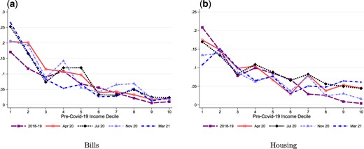
Behind with bills or housing by decile. (a) Bills and (b) housing.
Notes: Unbalanced panel of 12,826 and 10,364 individuals, respectively. Behind with bills refers to the full population, while behind with housing to individuals who do not own their homes outright or live rent-free. Income deciles are assigned on the basis of net household income averaged across up to three previous waves of the main study. Income includes earned and unearned income, net of tax and inclusive of any benefits received, equivalized by household composition.
Source: Authors’ calculations based on Understanding Society.
The fraction who were behind with their bills rose markedly, by about 5%age points, from a high base at the start of the pandemic for those in the lowest deciles. Further up the distribution, the fraction behind with bills was low pre-pandemic and remained low. For housing, the fraction behind with payments fell for much of the distribution. The pandemic did not have a greater effect on arrears, partly because of the mortgage payment holiday scheme. Approximately 12% of households with mortgages in our data were on payment holidays in the first months of the pandemic. This scheme has been studied by Albuquerque and Varadi (2022), who show some benefits in terms of consumption smoothing.
5. Conclusions
Several papers, including Adams-Prassl et al. (2020), Crossley et al. (2021), Hupkau and Petrongolo (2020), and Hacıoğlu-Hoke et al. (2021), analyse the immediate effects of the pandemic and highlight the unequal impacts on different individuals. This article provides a more nuanced picture of how the 18 months after the onset of Covid evolved by following individuals through the pandemic.
Our results raise various questions for future research. The finding that, in contrast to the USA, Covid in the UK did not impact differentially on labour market outcomes for women compared to men may have arisen because of the different policy responses in the USA and the UK/Europe. The former protected economic livelihoods through extending unemployment benefits, and the latter through work furlough schemes. We have seen in the UK that the recovery in labour markets for women matches that for men, but we do not know the long-term impacts of differential responsibilities for childcare that were documented at the start of the pandemic in Hupkau and Petrongolo (2020), Zamarro and Prados (2021), and Andrew et al. (2021). More generally, what remains unknown is the long-run impact on skill accumulation and the willingness to work of prolonged periods out of the labour force, and the induced switching of job and industry. Finally, the question raised by our findings of substantial wealth accumulation and the heterogeneity in wealth accumulation across the distribution is whether these financial inequalities will persist.
We are in a very good position to address these crucial long-term questions in the UK because the Covid Study followed Understanding Society participants. This means that ongoing data will be collected from many of those same individuals in future waves of the Main Study.
Supplementary material
Supplementary material is available online at the OUP website. These are the data and replication files and the Online Appendix.
Funding
This research was funded by the Nuffield Foundation under the grant ‘Saving, Spending and financial resilience in the wake of the pandemic’ (WEL/FR-000023226). The Nuffield Foundation is an independent charitable trust with a mission to advance social well-being. It funds research that informs social policy, primarily in Education, Welfare, and Justice. It also funds student programmes that provide opportunities for young people to develop skills in quantitative and scientific methods. The Nuffield Foundation is the founder and co-founder of the Nuffield Council on Bioethics and the Ada Lovelace Institute. The Foundation has funded this project, but the views expressed are those of the authors and not necessarily the Foundation. Visit www.nuffieldfoundation.org. P.L. also acknowledges Co-funding from the ESRC-funded Centre for the Microeconomic Analysis of Public Policy at IFS (grant number ES/T014334/1). The Understanding Society COVID-19 Study is funded by the Economic and Social Research Council (ES/K005146/1) and the Health Foundation (2076161). Fieldwork for the survey is carried out by Ipsos MORI and Kantar. Understanding Society is an initiative funded by the Economic and Social Research Council and various Government Departments, with scientific leadership by the Institute for Social and Economic Research, University of Essex. The research data are distributed by the UK Data Service.
Footnotes
Restrictions differed in Wales, Scotland, and Northern Ireland but tightened and loosened around the same times as they did in England.
An active household is one that participated in at least one of the last two waves of the main study.
A future benefit, not exploited in the current article, will be the ability to link COVID-19 Study data to data from future waves of the Main Study to study the long-run impacts of the pandemic.
Ninety-five per cent of the sample uses the full three observation average, 4% uses two observations and the remaining cases use one observation only.
For example, the Labour Force Survey has a response rate of about 55% at the first wave, falling with subsequent waves and about 40% overall. The Family Resources Survey, which is the basis for official income statistics, had a response rate of 52% in 2017/18.
The survey has some direct questions on furlough, but the details of the program changed over time, and so we use our measure to provide consistency over time.
Table A.1 in the Online Appendix reports the proportions who had resumed work by September 2021.
We also ran similar regressions for the differences in employment changes (as opposed to changes in the proportions working zero hours). These show no significant differences between men and women.
Further, in a careful analysis of the household income data collected by the COVID Study, Crossley et al. (2022) conclude on the one hand that the data suffer from under-reporting but on the other hand, that the degree of under-reporting is not related true level of household-income. In other words, the under-reporting will not impact a measure of the change in income relative to the median change.
We expect changes in wealth to be particularly salient for households at this time: there was widespread discussion of house prices, savings, and returns. The COVID Study asked directly about changes in wealth, rather than levels, and in a categorical way to make it easier for respondents to answer.
Acknowledgements
In addition to the authors, there is a core team central to the collection and preparation of the Understanding Society COVID-19 Study, which included in particular Michaela Benzeval, Jon Burton, and Annette Jäckle. Jamie Moore at the University of Essex collaborated on the weights that are used with the COVID-19 Study. Further details and initial analysis of the Understanding Society COVID-19 Study are available in Benzeval et al. (2020b). We are grateful to Alexandra Brown for research assistance. All errors are our own.
