


Abstract
We present evidence for chaotic dynamics within the spin-down rates of 17 pulsars originally presented by Lyne et al. Using techniques that allow us to resample the original measurements without losing structural information, we have searched for evidence of a strange attractor in the time series of frequency derivatives for each of the 17 pulsars. We demonstrate the effectiveness of our methods by applying them to a component of the Lorenz and Rössler attractors that were sampled with similar cadence to the pulsar time series. Our measurements of correlation dimension and Lyapunov exponent show that the underlying behaviour appears to be driven by a strange attractor with approximately three governing non-linear differential equations. This is particularly apparent in the case of PSR B1828−11 where a correlation dimension of 2.06 ± 0.03 and a Lyapunov exponent of (4.0 ± 0.3) × 10−4 inverse days were measured. These results provide an additional diagnostic for testing future models of this behaviour.
1 INTRODUCTION
Pulsars are spinning neutron stars whose emission is thought to be driven by their magnetic fields (see, e.g., Manchester & Taylor 1977). Their dynamics exhibit a wide-ranging degree of stability, with the fastest spinning and oldest ‘millisecond pulsars’ generally being the most predictable. Petit & Tavella (1996) showed that these millisecond pulsars can be as stable as atomic clocks on large time-scales.
Because pulsars are so stable, it is surprising when we see them misbehave. Departure from normal behaviour, characterized by steady emission and rotation, can occur in a variety of ways. Some pulsars have nulling events, where the emission seems to turn off for a while and then suddenly turn back on (Backer 1970). Even more extreme behaviour can be seen in the intermittent pulsar B1931+24, which behaves like a normal pulsar for 5–10 d, and then is undetectable for about 25 d (Kramer et al. 2006). Recently, even longer term intermittency (spanning hundreds of days) has been reported in two other pulsars (Camilo et al. 2012; Lorimer et al., in preparation). Finally, another related class of pulsars known as rotating radio transients seem to sporadically turn their emission on and off on a wide range of time-scales.
It is even more shocking when we see changes in the dynamics of a pulsar. Though pulsars are expected to gradually spin down over time, due to an energy loss from magnetic braking (Gold 1969), other changes in the dynamics are highly unexpected. These fluctuations often give us insight into the interior and the environment of a pulsar. One such phenomenon, known as a ‘glitch’, is a sudden discrete increase in rotation that has been attributed to superfluid vortices within the interior of the pulsar (Anderson & Itoh 1975).
Since the dynamical fluctuations in pulsars were unexpected, a bulk of the irregularities were considered to be ‘timing noise’ (Hobbs, Lyne & Kramer 2006). When these irregularities were observed over a 20 yr time span, large time-scale fluctuations in the spin-down rate became clear. Lyne et al. (2010) described the irregularities as ‘quasi-periodic’ and were able to relate them to the pulse shape. There have been several different processes proposed for these fluctuations from precession (Jones 2012) to non-radial modes (Rosen, McLaughlin & Thompson 2011). Yet, the mechanisms that govern these fluctuations and their connection to the pulse shape are still a mystery. Quasi-periodicities are often a sign of a non-linear chaotic system. Previous chaotic studies on pulsars (Harding, Shinbrot & Cordes 1990; Delaney & Weatherall 1998, 1999) focused on emission abnormalities and timing noise for particular pulsars.
In this paper, we search for chaotic behaviour within the spin-down rate of 17 pulsars presented by Lyne et al. (2010). In Section 2, we give a brief introduction to chaotic systems and their behaviours. In Section 3, we present techniques to form an evenly sampled time series with the same structural information as an unevenly measured series. In Section 4, we demonstrate methods to search for different chaotic characteristics within a time series and test our algorithm with known chaotic systems. In Section 5, we discuss our results and their implications. The techniques presented here are very general and can be used on almost any time series. Therefore, we have written this paper explicitly in the hope that these techniques will be more approachable and that they will be used more frequently within the pulsar community.
2 CHAOTIC BEHAVIOUR
In everyday conversation, the word chaos is often interchangeable with randomness, but in dynamical studies these are two distinct ideas. Chaos is continuous and deterministic with underlying governing equations, while randomness is more complex and uncorrelated; values at an earlier time have no effect on the values at a later time.
One of the characteristics of chaos has been colourfully described by Lorenz (1993) as the ‘butterfly effect’. Lorenz asks, ‘Does the flap of a butterfly’s wings in Brazil set off a tornado in Texas?’ This is used to illustrate an instability, where a system is highly sensitive to initial conditions. The consequence is that if there is a small displacement in the initial conditions, the difference between the two scenarios will grow exponentially to cause significant changes at a later time. This instability does not arise in linear dynamics and is a chaotic phenomenon in non-linear systems (Scargle 1992). We will utilize this chaotic trait in Section 4.3.
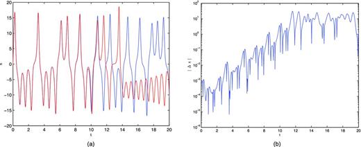
(a) The x component of the Lorenz equations whose initial conditions differed by 10−3 in x. (b) The difference between the two scenarios in (a) over time. An overall increasing exponential trend can be seen.
Here σ, ρ and β are positive parameters. Lorenz (1963) derived this system from a simplified model of convection rolls in the atmosphere. In the original derivation, σ is the Prandtl number, ρ is the Rayleigh number and β has no proper name but relates to the height of the fluid layer. As for the governing variables, x is proportional to the intensity of the convective motion, y is proportional to the temperature difference of the ascending and descending currents, and z is proportional to the distortion of the vertical temperature profile from linearity (Lorenz 1963). Since then, the Lorenz equations have appeared in a wide range of physical systems.
It is important to note that there are no analytical solutions to most non-linear equations. Often to produce a solution, as used in Fig. 2, the system is marched forward with small enough time steps that enable linear relationships to be used to simulate a function. We can see from the governing equations that any function that is produced will be highly dependent on the other variables. When these time functions are plotted with respect to each other, as seen in Fig. 2(a), they trace out a rather odd surface.
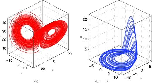
Three-dimensional visualization of two chaotic attractors. (a) The Lorenz attractor from t = 0 to 100 with σ = 10, ρ = 28, β = 8/3 and x0 = 0, y0 = 10, z0 = 10.2. (b) The Rössler attractor from t = 0 to 500 with a = 0.2, b = 0.2, c = 5.7 and x0 = −1.887, y0 = −3.5, z0 = 0.097 89.
The complex shapes that the dynamics form are known as ‘strange attractors’. They are called ‘attractors’ because, regardless of the initial conditions, the functions will converge to a path along these surfaces. They are ‘strange’ because they are fractal in nature. The dimension of the attractor will be a non-integer that is less than the number of equations. We will discuss this more in Section 4.2.
The convergent path along the attractor is controlled by the parameters in the governing equations. When a control parameter is slowly increased, the system exhibits a series of behaviours (Scargle 1992). This series is known as the ‘route to chaos’. The behaviours usually unfold as constant ⇒ periodic ⇒ period two ⇒ … chaos (Olsen & Degn 1985), as demonstrated in Fig. 3, where period two is a repeating path that travels twice around the attractor. As the parameter is increased, this behaviour continues to where the path cycles three, four or more times to return to the same location, until it suddenly becomes chaotic, where the path will never repeat.
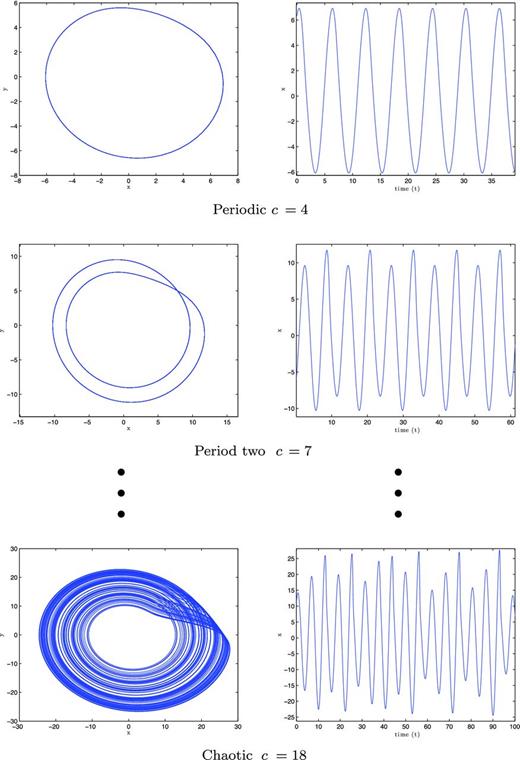
The route to chaos for the Rössler equations with a = b = 0.1.
3 LINEAR ANALYSIS
We wish to search for chaotic and non-linear behaviour in the spin-down rate presented in fig. 2 of Lyne et al. (2010). There they isolated a subset of 17 pulsars with prominent variations in their frequency derivatives. These time series are ideal for non-linear studies because they directly relate to the dynamics of a pulsar. Before non-linear analysis can be done, we need to compensate for some of their limitations.
3.1 Mind the gap
When dealing with large time-scales, such as those encountered in astronomy, it is not always feasible to record data at regular intervals. This produces a time series that sporadically samples a continuous phenomenon. When the time spacing between two points in the series is relatively small, little information is lost about the continuum inside that region. If the spacing is large, more information is lost, which can cause a change in the structure of the data.
To avoid such changes, we would like to analyse the largest section in the time series that best samples the phenomenon. We start by finding the statistical mode of the spacing, which gives us the step size that is the closest to being evenly sampled. We then compare this with the spacings in the series. If a gap is greater than three times the mode spacing, we assume that this region has significant information loss. The time series is now broken into several sections that are separated by these large gaps, an example of which can be seen in Fig. 4(a). We extract the longest section of data which is then normalized on both axes for more efficient computing, as seen in Fig. 4(b).
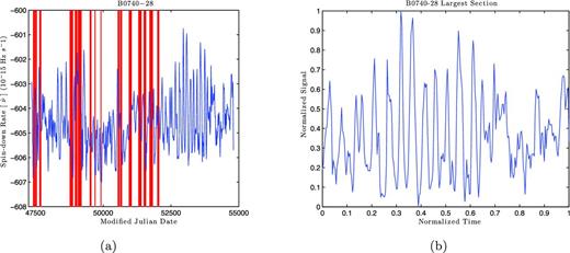
(a) The time series recorded for PSR B0740−28. The vertical red bars highlight the gaps that are greater than three times the mode spacing. (b) The largest section for PSR B0740−28 after being normalized on both axes.
3.2 Turning-point analysis
We want to ensure that the new time series is depicting a phenomenon and is not solely a consequence of noise. If the time series samples a continuous function well, then we should expect a smooth curve with a large number of data points between maxima and minima, or what are known as turning points. If the time series samples a random distribution, then we should expect several rapid fluctuations which will cause a large number of turning points. We can see an example of this in Fig. 5, where the well-sampled continuous sine wave has very few turning points, while the random series, with the same number of data points, has considerably more.
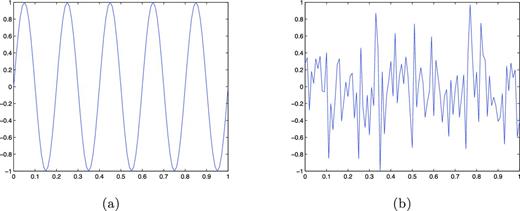
(a) Sine function: an example of a continuous function. (b) Random time series with the same number of data points as the sine wave.
In order to compare a series to noise, we need to have some expectation of the number of turning points that should be in a random series. It takes three consecutive data points to create a turning point. When randomly sampling, it is virtually impossible to have two values that are exactly the same. Therefore, the values of the three data points will have the relationship u1 < u2 < u3 (Kendall & Stuart 1966). These values can be rearranged in six different combinations, as seen in Fig. 6, where we find that four will produce a turning point (Kendall & Stuart 1966).
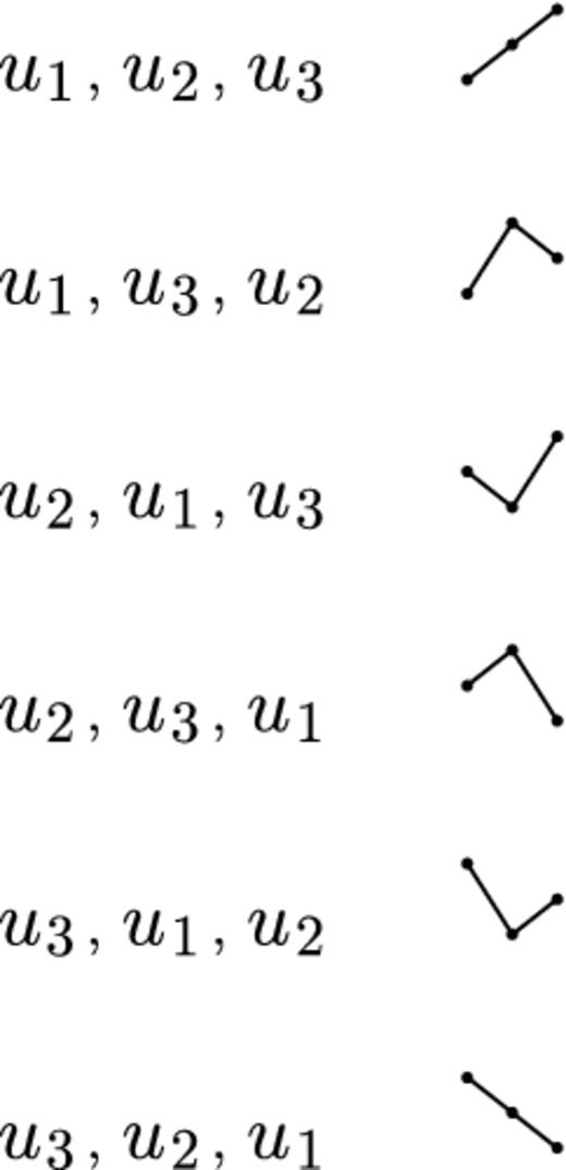
Illustrations showing the combinations of data points for which u1 < u2 < u3. See the text for details.
If the number of turning points is greater than the expected value, the series is fluctuating more rapidly than expected for a random time series (Brockwell & Davis 1996). On the other hand, a value less than the expected value indicates an increase in the number of data points between each turning point.
To be confident that the signal is not a result of random fluctuations, we will only keep the series that have a total number of turning points that are five standard deviations less than the expectation value of a series of the same size. If a time series has a total number of turning points greater than this value, it is indistinguishable from noise and will not be used. This does not necessarily imply that there is not a phenomenon present, rather that the data may not sufficiently sample the phenomenon.
In Table 1 we have listed the values for the time series that was extracted from the corresponding pulsar. Unfortunately, the last four pulsars failed to pass the detection threshold and are excluded from any further analysis.
The 17 pulsars listed in order of their distance away from μT. Here T is the total number of turning points in the extracted series. n is the total number of data points in that series. μT is the expected number of turning points for a random series of size n, and σT is the standard deviation of the expected value. The space marks the five standard deviation threshold.
| No. of σT’s away | |||||
|---|---|---|---|---|---|
| Pulsars | T | n | μT | σT | T is from μT |
| B1828−11 | 56 | 259 | 171.33 | 6.76 | −17.06 |
| B0740−28 | 105 | 270 | 178.67 | 6.90 | −10.67 |
| B1826−17 | 34 | 123 | 80.67 | 4.64 | −10.05 |
| B1642−03 | 53 | 154 | 101.33 | 5.20 | −9.29 |
| B1540−06 | 19 | 74 | 48.00 | 3.58 | −8.10 |
| J2148+63 | 25 | 81 | 52.67 | 3.75 | −7.37 |
| B0919+06 | 31 | 90 | 58.67 | 3.96 | −6.99 |
| B1714−34 | 7 | 39 | 24.67 | 2.57 | −6.87 |
| B1818−04 | 23 | 73 | 47.33 | 3.56 | −6.84 |
| J2043+2740 | 12 | 44 | 28.00 | 2.74 | −5.84 |
| B1903+07 | 30 | 79 | 51.33 | 3.70 | −5.76 |
| B0950+08 | 29 | 76 | 49.33 | 3.63 | −5.60 |
| B1907+00 | 32 | 80 | 52.00 | 3.73 | −5.36 |
| B2035+36 | 14 | 43 | 27.33 | 2.71 | −4.93 |
| B1929+20 | 11 | 33 | 20.67 | 2.35 | −4.11 |
| B1822−09 | 56 | 108 | 70.67 | 4.34 | −3.38 |
| B1839+09 | 13 | 31 | 19.33 | 2.28 | −2.78 |
3.3 Cubic spline
Most signal processing techniques assume that a time series is evenly sampled, and when the series is spaced randomly these algorithms severely increase in complexity. Therefore, we would like to form an evenly sampled series that has the same structure as our own. Since we have selected a section that is nearly evenly spaced and we are reasonably confident that a signal is resolved, we can use a cubic spline interpolation to approximate the structure in between data points. After the data have been splined, we then resample with a step size equal to the statistical mode of the original spacing. This is done with the intent of limiting a significant increase in the time resolution.
3.4 Fourier transform
Having more data points will be beneficial in upcoming analyses, but caution must be taken to avoid introducing structures or signals that are not present in the series. If we take the Fourier transform of the data, we will have an amplitude and a phase at each frequency below the Nyquist frequency. It is important to note that we receive both amplitude and phase only when the data are evenly sampled. These can in return be used to construct an approximate time function for the series. This function can then be sampled at any rate without adding any significant non-pre-existing frequencies as described below.
3.4.1 Noise reduction
Even though the turning point analysis convinced us that our series is not governed by noise, this does not mean that there is no noise in the data. Before generating the new time series, we take the opportunity at this point to perform noise reduction.
We are now able to approximate a time function by doing a reverse Fourier transform up to the cut-off frequency. Since the Fourier series is a sum of periodic functions, the new time series will, by definition, repeat back upon itself. This can cause noticeable errors towards the beginning and end of the time series, as seen in Fig. 7, and to avoid this we will not sample within the first and last 5 per cent of the time recorded. We then generate the time series by evenly evaluating the time function until we have 5550 data points. This leaves us with approximately 5000 data points within the desired range.
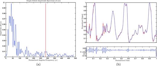
(a) The Fourier transform amplitudes of PSR B1642−03. The vertical red line marks the cut-off frequency. (b) Top: the pulsar data (red) overlaid with the Fourier time function with the same cadence (blue). Bottom: the difference of the two curves. Note that at the end of the series the magnitude of the difference increases sharply.
4 NON-LINEAR ANALYSIS
For the non-linear analysis, we use a combination of the tisean software package presented by Hegger, Kantz & Schreiber (1998) and our programs written in the matlab programming language. We intend to have the matlab programs available to the reader on the MathWorks file exchange website to help aid in the understanding of the algorithms.
4.1 Attractor reconstruction
With only one observable, it seems that we are unable to reproduce an attractor, but surprisingly the dynamic series contains all the information needed for its reconstruction.
4.1.1 Method of delays
4.1.2 Time delay
It soon becomes evident that picking the proper time delay is crucial. If the time delay is too small, then each element will be very close in value, forming a tight cluster. If the delay is too large, then the elements are unrelated and the attractor information is lost. If we were simulating a solution to the non-linear equations, we would need to find a time-scale where linear effects are dominant and to make sure that our step size was within this range. We would like to do the same thing but for the time delay, because the orthogonal axes will differ by a dynamically linear trigonometric function.
There are a wide range of algorithms that are used to find this appropriate time delay, but the simplest ones fail to account for non-linear effects (Hegger et al. 1998). The algorithms that do account for these effects are not very intuitive. We decided to use adaptations of turbulent flow techniques which can be seen in Mathieu & Scott (2000).

An ideal example of autocorrelation coefficients. The blue curve is the autocorrelation coefficients. The red dashed curve is a parabolic fit to the autocorrelation on small time-scales. λ is the time-scale estimate where linear relationships are believed to be dominant.
We can estimate the linear region by fitting a parabola to the small Δt region of ρ(Δt). The positive root of this parabola is our estimate, λ, for a linear time-scale. This means that time-scales up to λ should be dominated by linear effects, but to make sure we are well into this region, we set the time delay to half of this value. We can see how well this estimate works in Fig. 9, where the topology of the attractor has been conserved.
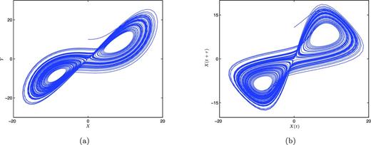
(a) The Lorenz attractor X–Y plane under the same condition as in Fig. 2(a). (b) The reconstructed attractor from only the X values with τ = 0.1345, which was estimated using the autocorrelation coefficients.
When these techniques are applied to the pulsar time series, a similar topology appears among the best-sampled pulsars, which is seen in Fig. 10. This seems to suggest that these are different paths along the same attractor, demonstrating a route to chaos. One could see PSR B1540−06 as periodic behaviour, B1828−111 as period two behaviour, and B1826−17 and B1642−03 as chaotic. To be sure that this is truly the case, we need to measure the dimension of each topology.
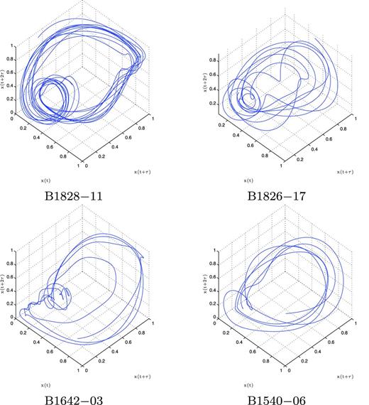
The topology of the pulsar time series after being embedded in three-dimensional space.
4.2 Measuring dimensions
We often see dimensions as the minimum number of coordinates needed to describe every point in a given geometry (Strogatz 1994). For example, a smooth curve is one-dimensional because we can describe every point by one number, the distance along the curve to a reference point on the curve (Strogatz 1994). This definition fails us when we try to apply it to fractals, and we can see why by examining the von Koch curve.
As shown in Fig. 11, the von Koch curve is an infinite limit to an iterative process. We start with a line segment S0 and break the segment into three equal parts. The middle section is swung 60° and another section of equal length is added to close the gap to form segment S1. This process is repeated to each line segment to produce the next iteration.
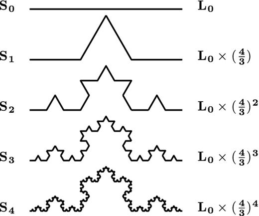
Iterations leading to the von Koch curve. Sn denotes the segment on iteration n and the far-right column is the total length of the corresponding segment. The von Koch curve is when n → ∞.
With each iteration, the curve length is increased by a factor of |$\frac{4}{3}$|. Therefore, the total length at an iteration n will be |$L_{n}=L_{0}\times (\frac{4}{3})^n$|. When this is iterated an infinite amount of times, it produces a curve with an infinite length. Not only that, there would be an infinite distance between any two points on the curve.
We would not be able to describe every point by an arc length, but we would be able to describe them with two values, say the Cartesian coordinates. Our original definition would define this as two-dimensional. However, this does not make sense intuitively, since this is not an area. Therefore, this is something in between, one plus some fraction of a dimension. This is known as a fractal dimension.
4.2.1 Correlation dimension
There are several different algorithms that are used to measure this fractal dimension, but nearly all depend on a power-law relationship. The most widely used is the correlation dimension, first introduced by Grassberger & Procaccia (1983).
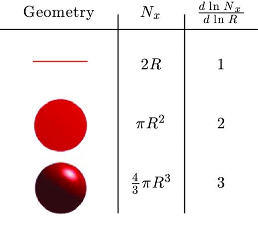
Nx is the number of data points within the radius R. Nx will be proportional to the equations for each given situation. We can see that |$\frac{\mathrm{d}\ln {N_{x}}}{\mathrm{d}\ln {R}}$| will produce the correct dimension for each of these situations.
To estimate D, one would plot ln C versus ln R. If the power relationship held true for all R, we would see a straight line with a slope of D. However, due to the finite size of the attractor, all points could lie within a large enough R. We can see in equation (10) that this would cause C(R) to converge towards a value of 1. At low enough R, we will reach a resolution limit, where only the centre data point is inside the test sphere. This causes the C(R) to converge to zero. Therefore, the power law will only hold true over an intermediate scaling region.
We could safely avoid this resolution limit if 10 points were in each of our test spheres. This would correspond to |$C(R)=\frac{10}{N}$|, which we use as our lower limit of the scaling region. To set an upper limit, we say that if 10 per cent of all points are in each test sphere, we would start to approach the scale of the attractor. Therefore, we set our upper bound at C(R) = 0.10 to close off a rough scaling region.
With this definition of dimension, one can see how there is a transition between integers. We can increase the number of data points of a line within R by simply folding that line inside a test radius, perhaps like S1 in Fig. 11. In order to have a power-law relationship across all sizes of R, we need to have a similar fold on all scales, known as self-similarity. If we were to steepen the angles of each fold, this would increase the number contained and also increase the dimension. We can do this until the folds are directly on top of one another to ‘colour in’ a two-dimensional surface. We could then repeat the process by folding the two-dimensional surfaces to transition to three dimensions. Folding like this is seen as the underlying reason why strange attractors have their fractal dimensions and is explored in-depth by Smale (1967) and Grassberger & Procaccia (1983).
4.2.2 Theiler window
If the attractor were randomly sampled, we would be ready to measure the dimension, but the solutions are one-dimensional paths on a multidimensional surface. Therefore, we have two competing dimension values which will corrupt our measurement. What we wish to do is to isolate only the attractor dimension, the geometric correlations, and remove the path relationships, the temporal correlations.
We can see that picking the appropriate w is non-trivial. If we pick a window that is too small, we fail to remove the temporal correlations, and if the window is too large it would significantly reduce the accuracy of the geometric measurement.
4.2.3 Space–time separations
In order to estimate a safe value for the Theiler window, Provenzale et al. (1992) introduced the space–time separation plot. It shows the relationship between the spatial and temporal separations, by forming a contour map of the percentage of locations within a distance, for a given time separation.
An example of this is seen in Fig. 13, where we used the stp program in the tisean package. We can see that the locations with small time separations are close to one another. As the time separations increase, so do their spatial separations until they reach some asymptotic behaviour. The substantial fluctuations at larger times are contributed to the cycle period of the attractor (Kantz & Schreiber 2004). Temporal correlations are present until the contour curves saturate (Kantz & Schreiber 2004). In Fig. 13, this transition seems to occur around a time separation of 40 steps. This is a similar quantity that appears in all of our data sets, but to be safe we choose a more conservative value of w = 100 steps for the rest of our analysis.
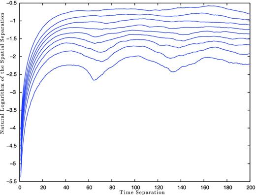
Space–time separation plot, generated using the tisean package, for PSR B1642−03 with m = 3. The contours indicate the percentage of locations within a distance at a given time separation. The different curves correspond to 10 per cent increases starting with the lowest curve at 10 per cent to the top curve at 90 per cent.
4.2.4 Embedding to higher dimensions
We are now ready to measure the dimensions of the topologies that were created in Section 4.1. If these topologies are true geometric shapes, their dimensions will not change when placed in a higher dimensional space. This means that as long as our embedding dimension, m, is greater than the attractor dimension, our correlation dimension measurement will be constant. On the other hand, if we were to embed a random distribution, it would be able to occupy the entire space and would have a correlation dimension equal to the embedding dimension.
Though we have picked a rough scaling region in Section 4.2.1, |$C\approx \frac{10}{n_{{\rm s}}}$| to 0.10, this does not mean that the true scaling region extends through this entire range. Therefore, we sweep the region with a window size from a third of the total logarithmic range to the entire range, searching for the minimum deviation in the correlation dimension measurements over the embedding dimensions. This ensures that we are picking the ‘flattest’ possible section over a significant scale.
When this technique is applied to the four pulsars from Fig. 10, two pulsars plateau very nicely. PSR B1828−11, as seen in Fig. 14, averages to a correlation dimension of 2.06 ± 0.033 and PSR B1540−06 to 2.50 ± 0.09, for embedding dimensions greater than 3. The other two pulsars fail to converge to a constant. We attribute this non-convergence to the sparse coverage, where each pass around the attractor is too far apart to get a proper measurement.
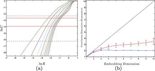
(a) ln C versus ln R for PSR B1828−11. The dashed horizontal blue line marks the rough scaling region, |$C=\frac{10}{n_{{\rm s}}}$| to 0.10. The solid horizontal red lines mark the flattest scaling region that is larger than a third of the rough scaling region. (b) The flat blue line denotes the correlation dimension measurements, within the scaling in (a), versus embedding dimension. The line at 45° is what a purely random time series would be in that given m. The sloped red line is the mean and standard deviation of 10 surrogate data sets (see the text).
4.2.5 Surrogate data
We want to guarantee that any plateaus are due to geometric correlations and cannot be produced by random processes. Therefore, we would like to test several different time series with the similar mean, variance and autocorrelation function as the original data set. These data sets are known as surrogate data.
The idea of surrogate data was first introduced in Theiler et al. (1992), but we use an improved version that was presented in Schreiber & Schmitz (1999) for our surrogate data sets. They start by shuffling the order of the original time series and then take the Fourier transform of this shuffled series. Keeping the phase angle of the shuffled set, they replace the amplitudes with the Fourier amplitudes of the original time series. Then, they reverse the Fourier transform and create the desired surrogate data set. Schreiber & Schmitz (1999) iteratively do this until changes in the Fourier spectrum are reduced. Fortunately, this is all done in the program surrogates in the tisean package (Hegger et al. 1998), which we used for our analysis.
We form 10 surrogate data sets for each pulsar and run them through the same non-linear analysis as the post-processed time series. We then find the average and standard deviation for the surrogates’ correlation dimension for each embedding dimension to trace out the region where we should expect other surrogates to lie. We are confident that the original time series is not due to a random process if its correlation dimension measurements lie away from this region.
As seen in Fig. 14, PSR B1828−11 is well outside the surrogate region, suggesting that it is a true dimension measurement. The measurements for PSR B1540−06, as seen in Fig. 15, marginally miss this boundary, but because this pulsar is highly periodic the Fourier spectrum is dominated by a single frequency. This restricts the complexity of the surrogate to where little change in dimension is expected. We will see more on this in Section 4.2.6.
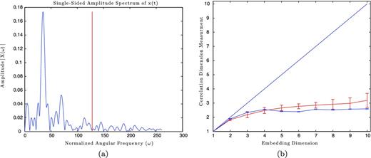
(a) The amplitudes of the Fourier series versus normalized frequency for PSR B1540−06. The vertical red line marks where we set the cut-off frequency. (b) The blue error bars show the correlation dimension measurement, and the red error bars show the surrogate data region for PSR B1540−06.
4.2.6 Correlation benchmark testing
Though each part of the algorithm works independently, we want to ensure that it all works together correctly. Therefore, we need to run through the process with a time series from known attractors under similar conditions to our original data in order to see if we receive similar dimensions. For this analysis, we choose the Lorenz and Rössler attractors, whose dimensions have been documented as being 2.07 ± 0.09 and 1.99 ± 0.07, respectively (Sprott 2003).
We first generate the x-component time series for a corresponding attractor, making sure that our initial conditions are well on the attractor. Then, we extract a section from this time series out to the same number of turning points as used in the pulsar time series. This extracted section is then normalized on both axes, as we did in Section 3.1. We then resample the normalized time series by applying a cubic spline to the normalized times for the pulsar time series. This ensures that the new time series has the same time spacing and number of turning points as the pulsar time series. This new time series is then run through the algorithm to see if the proper dimension is achieved.
An example from the correlation dimension measurements is seen in Fig. 16, where we can see that due to the simplicity of the Rössler attractor in the frequency domain the surrogate data region only deviates by a small amount. We refer to this as a borderline detection. We also classify detections as being inside or outside based on their proximity to the surrogate region. Regardless, the correlation dimensions for both attractors plateau for all of the pulsar time series.
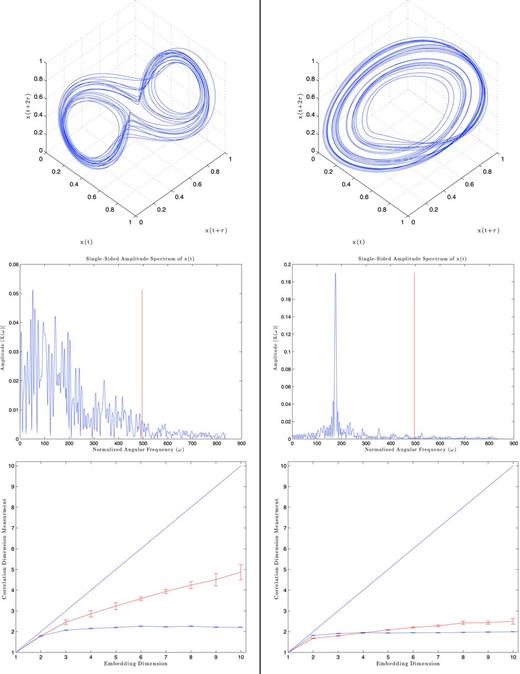
Benchmark results for PSR B1828−11. Left column: the Lorenz attractor results. Right column: the Rössler attractor results. Top row: the reconstructed attractors. Middle row: the Fourier transforms where the vertical red line marks the cut-off frequency from Section 3.4.1. Bottom row: the correlation dimension measurements (blue error bars) with the surrogate region (red error bars).
The results from all of the series are listed in Table 2. We can see that the algorithm does rather well considering that we start with less than 300 data points. Although the algorithm is not refined enough to pinpoint the dimension, it is sufficient to determine the number of governing variables. If we round the dimension measurement to the nearest integer and then add 1, we will receive the proper number of variables for any series that is either outside or borderline to the surrogate region.
The weighted average for the correlation dimension for m > 3 for the corresponding pulsar and attractor. The surrogate region column marks whether the plateau line was either inside (I), outside (O) or borderline to (B) the surrogate data region. The average row is the weighted average of the correlation dimension measurements that were either marked as O or B.
| Lorenz | Rössler | |||
|---|---|---|---|---|
| Correlation | Surrogate | Correlation | Surrogate | |
| Pulsar | dimension | region | dimension | region |
| B1828−11 | 2.20 ± 0.06 | O | 1.96 ± 0.02 | B |
| B0740−28 | 2.11 ± 0.03 | O | 2.16 ± 0.08 | B |
| B1826−17 | 2.00 ± 0.10 | O | 1.96 ± 0.04 | B |
| B1642−03 | 2.05 ± 0.07 | O | 2.00 ± 0.10 | B |
| B1540−06 | 1.90 ± 0.20 | O | 2.30 ± 0.10 | B |
| J2148+63 | 2.33 ± 0.05 | O | 2.13 ± 0.02 | B |
| B0919+06 | 1.90 ± 0.10 | O | 2.00 ± 0.10 | I |
| B1714−34 | 1.85 ± 0.01 | I | 2.87 ± 0.07 | I |
| B1818−04 | 1.70 ± 0.05 | O | 2.26 ± 0.08 | B |
| B2044+2740 | 1.83 ± 0.03 | O | 2.10 ± 0.10 | O |
| B1903+07 | 2.11 ± 0.09 | O | 2.00 ± 0.20 | I |
| B0950+08 | 1.68 ± 0.09 | O | 2.00 ± 0.20 | B |
| Average | 2.00 ± 0.20 | 2.00 ± 0.10 | ||
4.3 Measuring the butterfly effect
Though our correlation dimension measurement can narrow the number of governing variables, it is not definitive enough on its own to say that our attractors are chaotic. Therefore, we need to search for other signs of chaos in our topologies to ensure that they are indeed strange attractors.
4.3.1 Lyapunov exponent
As mentioned in Section 2, the butterfly effect is only present in chaotic systems. We should only see an exponential divergence in nearby locations over time if the system is non-linear. The exponent of this increase is a characteristic of the system and quantifies the strength of chaos (Kantz & Schreiber 2004). This is known as the Lyapunov exponent.
If λ is positive, the system will be highly sensitive to initial conditions and therefore chaotic. If λ is negative, the system would eventually converge to a single fixed point. If λ is 0, then this would represent a limit cycle where the path keeps repeating itself and is said to be marginally stable (Kantz & Schreiber 2004).
In actuality, the separations do not grow everywhere on the attractor, and locally they can even shrink, and with contributions from experimental noise it is more robust to use the average to obtain the Lyanpunov exponent.
Similar to the correlation dimension, the Lyanpunov exponent is invariant to the number of embedding dimensions as long as m > d. Therefore, we calculate S(Δt) from m = 2 to 10 to ensure that the slopes in the linear regions remain constant. When noise is present in deterministic systems, it causes a process similar to diffusion where δΔt expands proportionate to |$\sqrt{\Delta t}$| on small scales (Kantz & Schreiber 2004). This causes S(Δt) to have a |$\frac{1}{2}{\rm ln}{(\Delta t)}$| behaviour, which produces a steep increase over short time intervals.
When this is applied to PSR B1828−11, as seen in Fig. 17, three distinct regions appear. On small scales, we can see a convergence region due to a combination of a noise floor and non-normality (Hegger et al. 1998). Because of these effects, it takes the neighbourhood a while to align in the direction of the largest Lyapunov exponent. Once the neighbourhood has converged, we see a similar linear behaviour across all the embedding dimensions. This continues until the curves start to saturate to a value on the scale of the attractor for that particular embedded dimension.
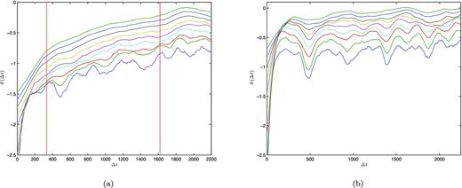
(a) S(Δt) versus time elapsed for PSR B1828−11. Each curve is for a different embedding dimension from 2–10 starting at the lowest curve. The vertical red lines mark the region where least-squares regression was applied. This corresponds to an average maximum Lyapunov exponent of λmax = (4.0 ± 0.3) × 10− 4 inverse days. (b) S(Δt) for a surrogate data set for B1828−11.
The positive slope of the linear region suggests that B1828−11 is a chaotic system with a maximum Lyapunov exponent of (4.0 ± 0.3) × 10−4 inverse days. When the same procedure is done to a surrogate data set of B1828−11, no linear region is observed. Once the surrogate neighbourhood passes the convergent region, it directly saturates around a constant value. This constant saturation would suggest a Lyapunov exponent of zero, which is what is expected for a linear dynamical equation. The surrogate’s strikingly different behaviour would imply that the linear region in B1828−11 is a real detection and is not a consequence of a random process.
When this is applied to the other pulsars there are no other definitive detections. Either the convergent region is dominant causing a direct saturation, or the total time of the measurement is too small to positively state a separation between the convergent and linear regions. We will expand on these ideas more in the following section.
4.3.2 Lyapunov benchmark testing
Again we want to ensure that the algorithm is working in its entirety to produce the known values of the Lyapunov exponent. Therefore, we follow the same procedure as in Section 4.2.6, matching the same number of turning points and sampling spacing of the pulsar. Because PSR B1828−11 is our only detection, we concentrate our attention on its benchmark results.
The Lyapunov exponent changes with different parameters in the governing equations. Because of this we use the most common chaotic parameters for the Lorenz and Rössler attractors.4 Under these conditions, the maximum Lyapunov exponent for the Lorenz attractor is λmax ≃ 0.9056 and for the Rössler is λmax ≃ 0.0714 (Sprott 2003).
The results for the benchmark testing of B1828−11, as seen in Fig. 18, seem to produce conflicting results. The algorithm estimates a maximum exponent for the Rössler attractor to be a reasonable λmax = 0.080 ± 0.003, but for the Lorenz attractor it estimates an unreasonable value of λmax = 0.28 ± 0.05.
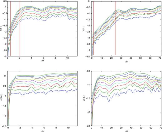
Benchmark results for PSR B1828−11. Left-hand column: the Lorenz attractor results. Right-hand column: the Rössler attractor results. Top row: the S(Δt) for reconstructed attractors. Bottom row: the S(Δt) surrogate data for the appropriate attractors.
The cause of this discrepancy can be seen in the surrogate results. There we can see that the convergence time-scales are affecting our estimates. For the Rössler attractor, the time for the neighbourhood to converge is about five time units, while the exponential behaviour will last on time-scales of |$\frac{1}{\lambda _{\rm max}} \approx 14$| units. Therefore, the Rössler attractor is outlasting the convergence time and will be able to demonstrate its exponential behaviour. The Lorenz attractor with these parameter values is more sensitive to initial conditions and will only exhibit its exponential behaviour on a time-scale of |$\frac{1}{\lambda _{\rm max}} \approx 1$| unit, which is on the same scale of its convergence time. Therefore, the S(Δt) for the Lorenz attractor is not portraying its true behaviour.
This convergence time is partly inherent to the system and partly due to noise. Because of this there are two ways to correct this behaviour. The first is to simply reduce the noise in the time series. The other way is to increase the sampling period of the measurements in order to start with smaller neighbourhoods which will give the exponential behaviour several orders of magnitude to appear. Unfortunately, we are unable to comfortably remove any more noise in the algorithm. Also, to reduce the neighbourhoods by orders of magnitude, we have to increase the number of data points by orders of magnitudes, which is currently beyond our system’s capabilities.
Because of this convergence time, our algorithm is sensitive to lower levels of chaos with smaller Lyapunov exponents and is not able to distinguish between higher levels of chaos and the convergence region.
5 CONCLUSIONS
By using a careful combination of turning point analysis, cubic splining and Fourier transforms, we have constructed an algorithm that resamples an unevenly spaced time series without losing structural information. We have demonstrated this through an array of benchmark testing with known chaotic time series under similar conditions to a given pulsar time series. This testing has shown that there are no significant changes in the correlation dimension or the maximum Lyapunov exponents, when it was detectable.
These techniques were applied to the pulsar spin-down rates from Lyne et al. (2010), where PSR B1828−11 exhibits clear chaotic behaviour. We have shown that the measurements of its correlation dimension and maximum Lyapunov exponents are largely invariant across embedding dimensions. This, combined with its strikingly different reactions compared to its surrogate data sets, has shown that the chaotic characteristics in this pulsar are not caused by random processes.
The positive measurement of λmax = (4.0 ± 0.3) × 10−4 inverse days confirms that B1828−11 is chaotic in nature. For a system of equations to be chaotic there needs to be a minimum of three dynamical equations with three governing variables. The correlation dimension measurement of B1828−11, D = 2.06 ± 0.03, implies that there are a total of three governing variables, meeting the minimum requirements for chaos. One governing variable is clearly the spin-down rate of the pulsar. At this time we can only speculate on the other two. We know that the magnetic fields of a pulsar can change its dynamics and change the pulse profile. It has also been shown that changes to the superfluid interior can affect the long-term dynamics of a pulsar (Ho & Andersson 2012). Therefore, these seem to be great candidates. Beyond this, the subject is still a mystery and needs to be explored with non-linear simulations. Regardless of the model chosen, it is possible to perform some of the methods presented here, on the simulated data, to see if similar chaotic behaviours are present.
Knowing that B1828−11 is governed by three variables, the reconstructed attractor in Fig. 10 would be an accurate depiction of its strange attractor. Because this is visually similar to the other attractors in Fig. 10, we would find it peculiar if their dynamics were not somehow related. Unfortunately, the techniques in this paper were unable to confirm this relationship. If these pulsars continue to be observed with an increased cadence, this would improve the correlation dimension and Lyapunov exponent measurements, perhaps to the point where these similarities could be quantified. With these measurements and a working model, estimates for the parameters can be given, which will give us further insight into the interior and/or exterior of these pulsars and how this relates to their dynamics.
A linear trend was removed in order to make the time series stationary, because we are solely interested in the fluctuations. When B1828−11 is referenced in the rest of the paper, it is implied that this linear trend has been removed.
Here, Δts is the step size of the time series and w is an integer value.
The error calculation is presented in Appendix B.
Lorenz: σ = 10, r = 28, b = 8/3; Rössler: a = b = 0.2, c = 5.7.
REFERENCES
APPENDIX A: TURNING POINT VARIANCE DERIVATION
This derivation is presented in Kendall & Stuart (1966) but is rewritten here for the reader’s convenience.
